Long Term Nasdaq 100 vs PM Ratio Charts
Hello, Goldtent community! My name is Harry Huxford and I’ve been a lurker here for a few years. Thank you FGC and all other Goldtent contributors for the TA knowledge you’ve shared here. I’ve learned so much and feel honored to be able to share my own charts. This is my first post!
I wanted to share some long term Nasdaq 100 ($NDX, QQQ) ratio charts against PM assets.
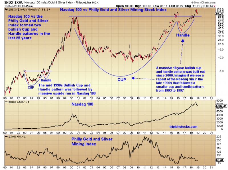
First up is Nasdaq 100 vs the $XAU Philly Gold and Silver Mining Index
Here we see two bullish Cup and Handle patterns that formed in the last 25 years. The first one in the mid 1990s, and much larger one from 2000 through 2018. A huge rally in the Nasdaq 100 followed the breakout from the first cup and handle in 1996. Fast forward to 2018 and we see the ratio attempting to break out of a second much larger Cup and Handle. If we see a repeat of the 1996 breakout, could we be on the verge of another massive run in the Nasdaq 100? (Tech Bubble 2.0?)
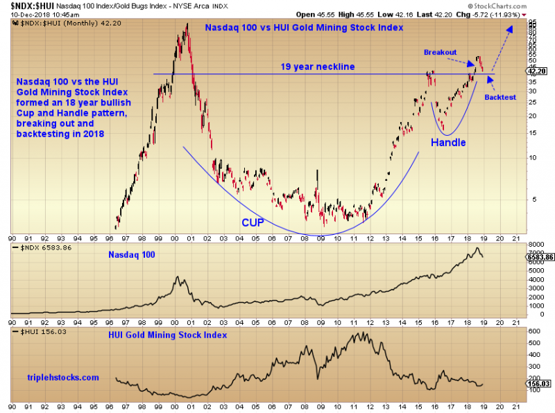
Second is Nasdaq 100 vs the $HUI Gold BUGS Index
Here we also see a massive ~19 year Cup and Handle with breakout and backtest attempt.
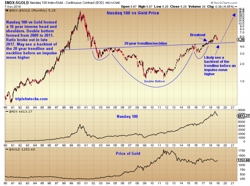
Third is Nasdaq 100 vs Gold Price ($GOLD)
Here we see an inverse head and shoulders pattern from 2002 that broke above the neckline in late 2017. We also see a double bottom in the ratio in 2009 and 2011. Will we see a backtest of that 20 year trendline/neckline?
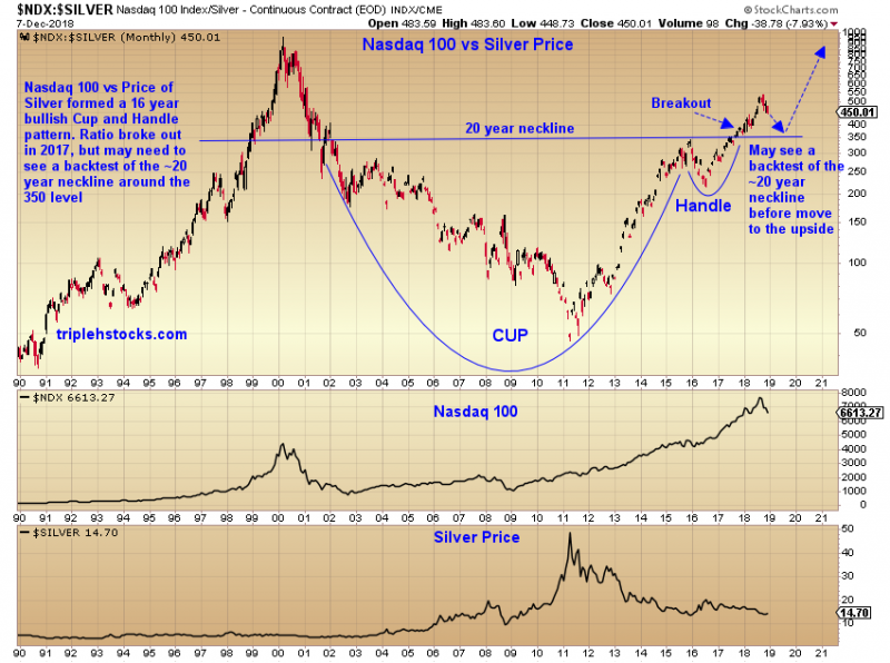
Fourth is Nasdaq 100 vs Silver Price ($SILVER)
Here we see a massive Cup and Handle with a breakout in 2018. Along with the NDX/Gold ratio, will we see a backtest of the 20 year neckline?
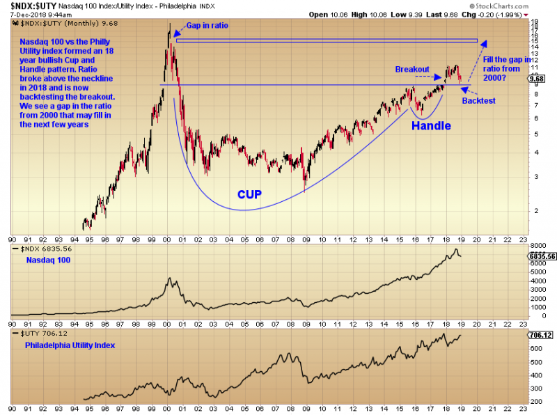
Finally, a look at the Nasdaq 100 vs the $UTY Utility Index
Utilities aren’t PM assets, but it’s very interesting to see that this ratio built out a massive Cup and Handle with breakout. Looks like the backtest is currently in progress. The Utility index has been steadily rising for the most part of 2018 while the NDX corrected. We also see a gap in the ratio in early 2000 that may fill once the backtest is complete and the Nasdaq 100 impulses higher.
The implications of these charts are probably bearish for PMs but very bullish for the Nasdaq 100. I wonder if we will see a repeat of the 2000 Tech Bubble within the next decade? As the ratios of these charts all look like they are poised to re-test their respective ratio highs from the year 2000.
welcome Harry! good post,different perspective
Thanks Harry, and welcome. Very interesting charts and very bearish for PM’s if the pattern plays out.
Thanks, Harry, for all of your efforts.
Wow Harry
Thats a great first post
You have been a good student !
Top shelf stuff.
Sorry but we here at Goldtent have a policy to stick by
Shoot the Messenger
Wow indeed! Nice work!
Thanks Harry
Great work Harry!
Thank you all for the warm welcome!