Gathering Evidence – The Swiss Franc, Gold Bulls and Exponential Graphs
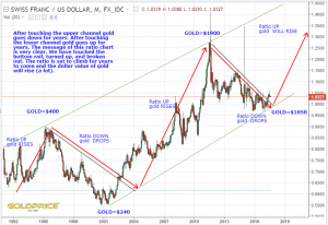
You might remember I showed this chart some months back. I thought I’d update it for you. As long as this ratio is trending up, we’re on the right side of the trade (in PM’s). We’ve hit the bottom rail and broken out. This is more evidence that the normal cycle is progressing nicely.
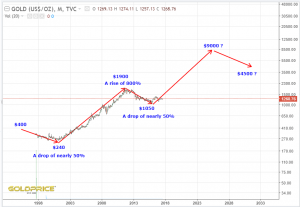
I added the high and low values for gold and started thinking about those numbers and what they’re telling us. Straight away you can see that they’re exponential, not linear. The highs are increasing by an order of magnitude at each peak. the corrections are fairly predictable at almost 50%. This means that if we want to look at where we’re going in the years ahead, we need an exponential (log) view. The symmetry and mathematics are almost too perfect, but that’s not surprising when you think about it. Just look at the graph of US debt – it’s an almost perfect exponential curve. The symmetry, timelines and mathematics all point to around $9000 on the log chart. That is a lot more than the $2470 I calculated and posted a few days ago using a traditional linear chart and the rules of symmetrical triangle breakouts. I think I need to consider this some more, but I guess we’ll know, because my $2470 target would get taken out long before our mid 2020’s peak for this gold bull.
What do you think ? Am I out of my mind ?


Maybe you are, but then we invest in companies that own a hole in the ground in the middle of nowhere that they then drill into to try and find gold and other PMs. I am not sure we know what normal is anymore
Great work NS and thanks.
Log of course, I doubt Euro will double in value and gold only goes to $2400, gold should go up at least 2 to 3 times in non-USD currencies if we compare with previous bull market
Cheers Alex. As always, time will tell, but a full awareness of all the possibilities is really important. I’m not really looking at the downside possibilities, because I’m comfortable as long as we hold the $1180 area, and the more time that passes, the less likelihood there is that we break below it.
Ha ha, spot on there OJ
Northstar …I’m so excited and I just cant hide it…i’m about to loose control and I think I like it.
Lol. This prediction is based on history, mathematics and just a little sprinkling of hope. It does make a lot of sense though and I’d actually rate it with a moderate probability at this point. All my analysis is negated if the $1180 area of support fails. If not, it’s on, like Donkey Kong