$Gold Looks OK, But The Miners Need To Turn Upwards Here

I’ll let the charts speak for me

I came close to bailing out of a large chunk of my PM miners today, but I decided to wait and see what tomorrow brings. Getting a little nervous, like plenty of others no doubt.

Gold Price Up / HUI Down

Whatever the reason, and wherever they go next, the following is true. The HUI had progressed further than gold in terms of their moving averages. The HUI had powered through both its 50 and 200 week moving averages. Gold had been lagging. They have now ‘met in the middle’, quite literally. The HUI has retraced to a position between the 50 and 200 week moving average, and gold has advanced to get itself into the same position – between the 50 and 200 week moving average. One played catch-up, whilst the other retraced a little. Now that they are both in the same place with respect to their moving averages, what next ? Here are the charts for you to have a look at and ponder.

Perhaps they remain ‘trapped’ for a while, and the next significant move will be triggered by what’s going on in the US/Europe/China. If that’s the case, I have to remain bullish, because that’s a whole load of uncertainty and turmoil, and we all know how PM’s react to that. Eventually.

Gold Breaks Above $1250

This is a good sign if it holds. Broken clear of $1250 resistance.

Liftoff !

Let’s see if we can hold onto the gains.

Rare Earth, Lithium, Cobalt

I’ve posted on these two before. Quest Rare Minerals and Lico Energy Metals. If we’re in a bull market, we should see healthy pauses/pullbacks like this one, but then a resumption of the uptrend. Like the PM stocks, these have been sending me to sleep lately, but lets wait and see…

$BPGDM

Another chart to mull over…

$1243 – Will It Or Won’t It ? How strong Is Our Baby Bull ?

$1243 has been acting as resistance – it’s the downward sloping 200 week moving average. If the indicators are to be believed, there is a good chance of breaking through very soon.

Bullish For Gold ?

Our old friend, the Philadelphia Index

£Gold Breaks Back above £1000 – About 15% Off All Time Highs

Cup of tea anyone ?

The Big Question

Just a gold chart going back to 1970. Nothing too technical. No matter how much I stare at this, the conflicting views keep pulling me one way, then another. Of course, the shorter term charts will give the bull/bear/buy/sell signals, but it’s the longer term direction that fascinates me. Looking at the unstable world we live in, with so much political turmoil, national debt, a soaring stock market, and the undervalued miners, the little voice in my head is saying we’re on the verge of a huge move to the upside.

Cameco Update

Tokyo Electric recently tried to cancel an order with Cameco worth over a billion dollars http://business.financialpost.com/news/mining/cameco-corp-vows-to-fight-back-as-japans-tepco-cancels-1-3-billion-uranium-contract

They’ve had some more positive headlines recently http://www.fool.ca/2017/02/15/cameco-corp-upgraded-is-the-stock-ready-to-explode/

So how do the charts look ? Here’s a look at the daily chart going back to 2000

Reminds me of another big wedge in gold (coincidence ?)…

They’re both heading towards a decision point. Anyway looking more closely at Cameco and zooming in a bit, you can see price bouncing nicely off support…

The daily chart may help tell us which way this is going…

I know that some think it may be another year or so before the Uranium sector reaches escape velocity, but this looks bullish to me at the moment.


Northern Dynasty – Get Out Fast

I just did.http://seekingalpha.com/article/4045672-northern-dynasty-minerals-ltd-pebble-deposit-commercially-viable

Quest Surges 19%

I posted on this one last week. Up another 19% today.

HUI Backtesting 50 Week Moving Average

Rambus – Weekend Report…The US Dollar : “Rumors of My Death are Greatly Exaggerated”

https://rambus1.com

Bottom Left To Top Right

Not strictly TA, but at least it’s not politics/religion 😉

Obvious I know, but interesting to see the relative rates of increase.

Liking Lico

I have a handful of these in my portfolio. Beaten down, unloved stocks, that I’ve read about and heard recommended, done some background research and invested a relatively small amount, knowing it’s a risk, but with some really good upside potential. 100% in the last 3 months or so, and 1000% from the bottom 18 months or so ago.

What about the longer term ? You can put the recent move into perspective by zooming out a bit…


On A Quest

Quest Rare Minerals to be precise. Lets see if the moving averages support price here.

Reading The Charts – HUI

After yesterdays close, I thought I would start looking at the evidence on the charts. I’ve already posted about the miners having broken above their 50 and 200 week moving averages, MACD bullish crossover and approaching bullish TRIX crossover. Gold is trailing and still has to close above it’s moving averages. The orange circles on the following HUI chart, highlight these bullish indicators. I was hoping for a higher close though, because it seems to be leaving us with a rising wedge. I don’t know much about the myriad of chartology scenarios, but isn’t this formation bearish ? I should say that I’m still in the bull camp, and expect pullbacks to be just a part of the medium to long term march upwards towards last Summers highs. If we are in a new bull (and I believe we are), those highs from last Summer need to be surpassed.

Northern Dynasty On The Move Again

Up 10% at the time of writing. Some indicators are now on the high side, but MACD has really only just got going. Will we see another explosive move in the next few weeks ?

GDX Weekly

All looking good here too. Small, short-term pullbacks, no doubt, but the chart says the trend is up.

Miners Leading

But it’s important gold makes a move soon…


I’m pretty sure it will, but you really can’t take your eye off the ball. As long as gold breaks through those moving averages and we get a TRIX cross, this will be a good few weeks/months.

HUI Perspective

Just another chart 😉

Quest Rare Minerals

It’s nicer to post when a stock is rising, but I mentioned this one a couple of times, and it’s down today, so I thought I’d have a look at it for anyone interested. I’m holding this one for the medium to long term.

Uranium Resources Inc

Prompted by Optionals post, here’s my observations on URRE

My Last Chart For Today

Energy Fuels (along with Lico and Quest, I took a position just after Christmas). I don’t see too much downside, but upside (if and when it happens) is an exciting prospect. Here is the longer term chart…

And zooming in on more recent price action…

Edit: Apologies for my spelling  – comment box on second chart should say, ‘I would like to see these indicators make a more decisive move upwards’


Another One To Keep An Eye On

Quest Rare Minerals. Interesting chart…

Edit – my mistake, as Silverboom just pointed out, the moving average, bullish crossover occurred a few weeks ago. So this may well be in for a good year…

Lico Energy Metals

Doing well at the moment. Worth a look ?


Edit – Here’s the stock price chart on a non log scale !

Edit: Up another 15% at the moment, that’s over 30% in 2 days.

Gold Looking Good

Just a chart with some annotations. Hope some find it informative 🙂

HUI Closes Above 50 Week Moving Average

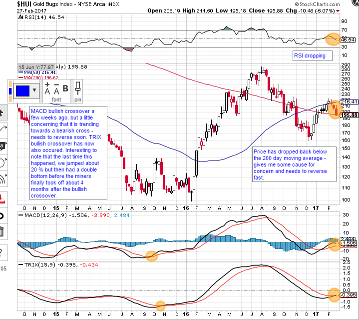
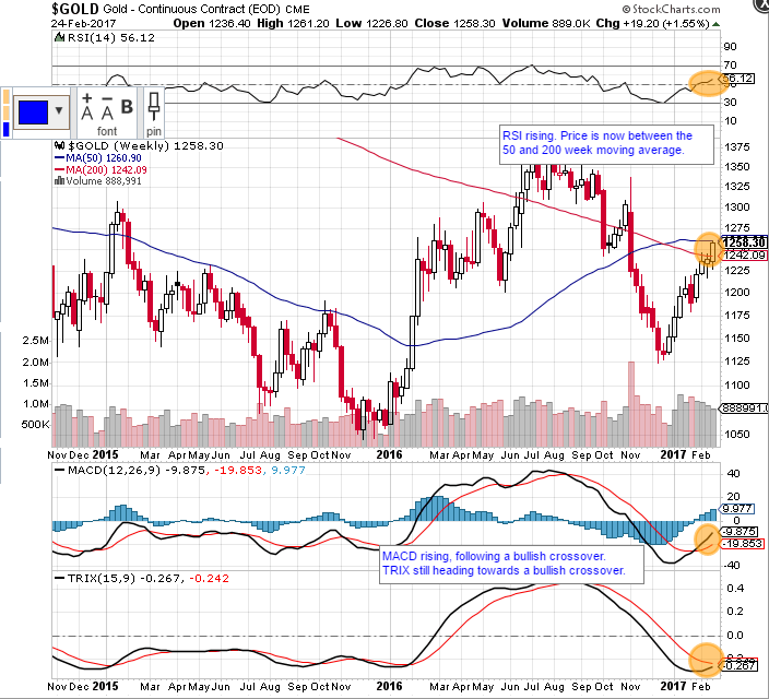
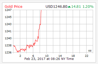
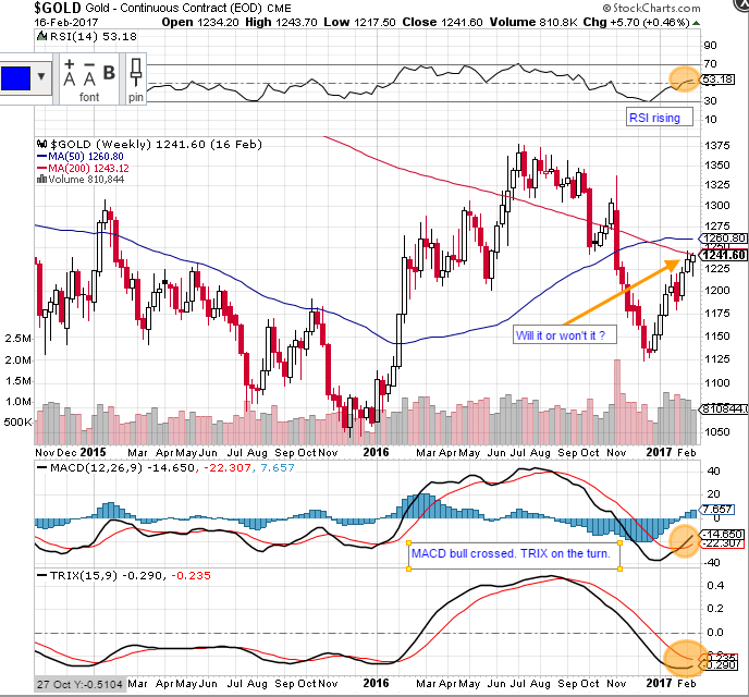
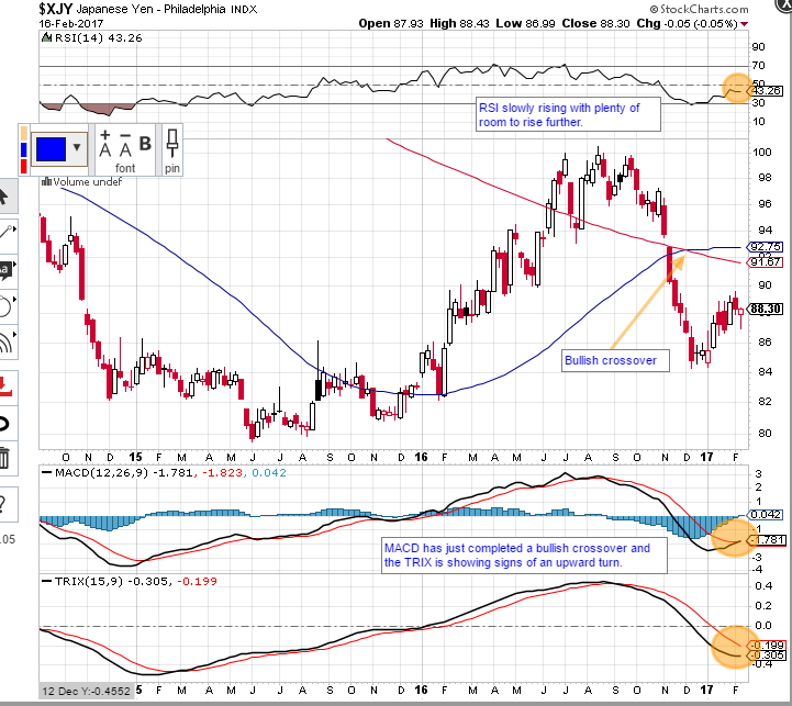
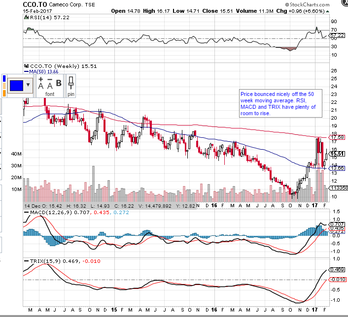
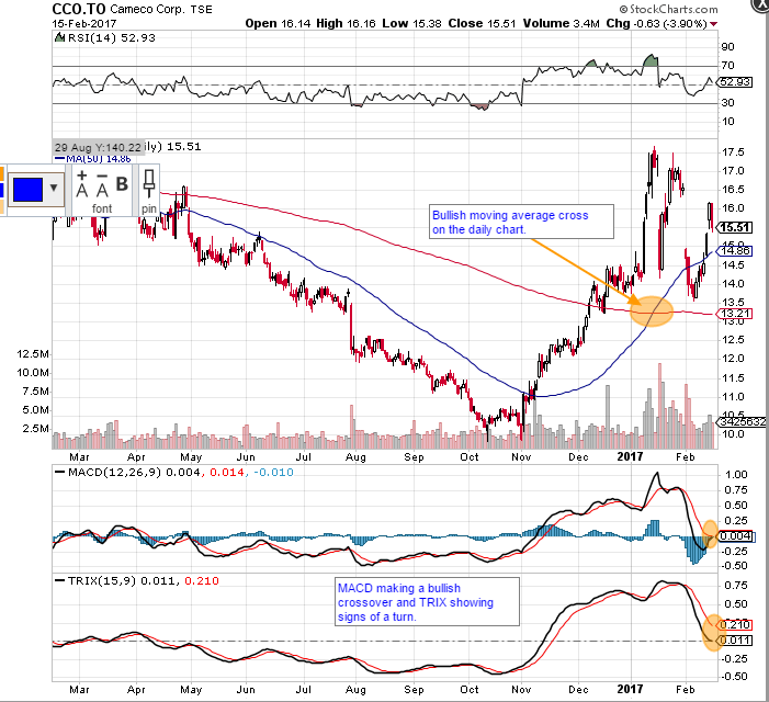
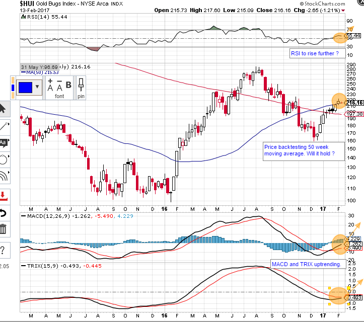
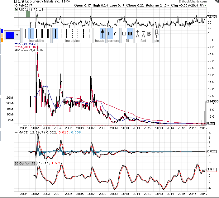
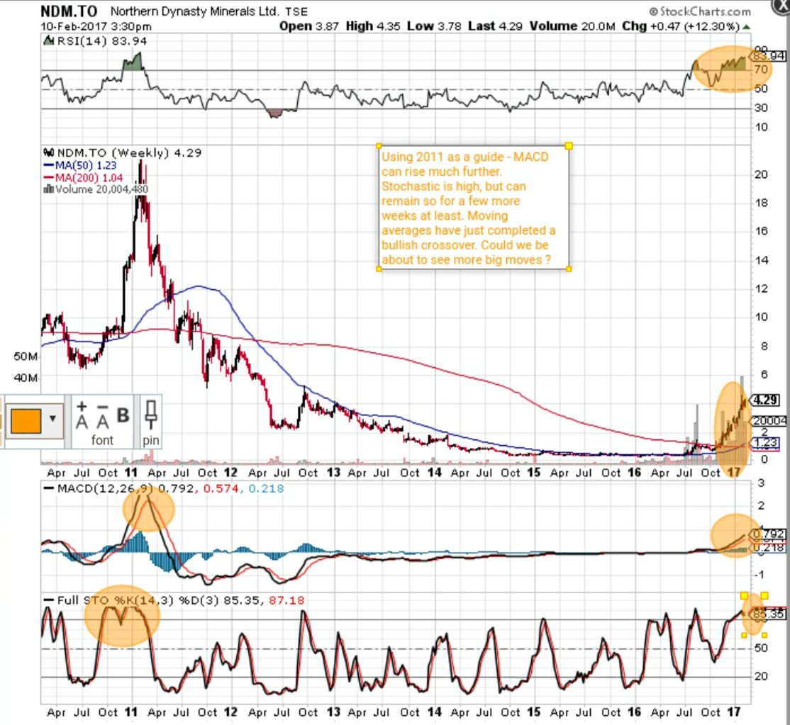
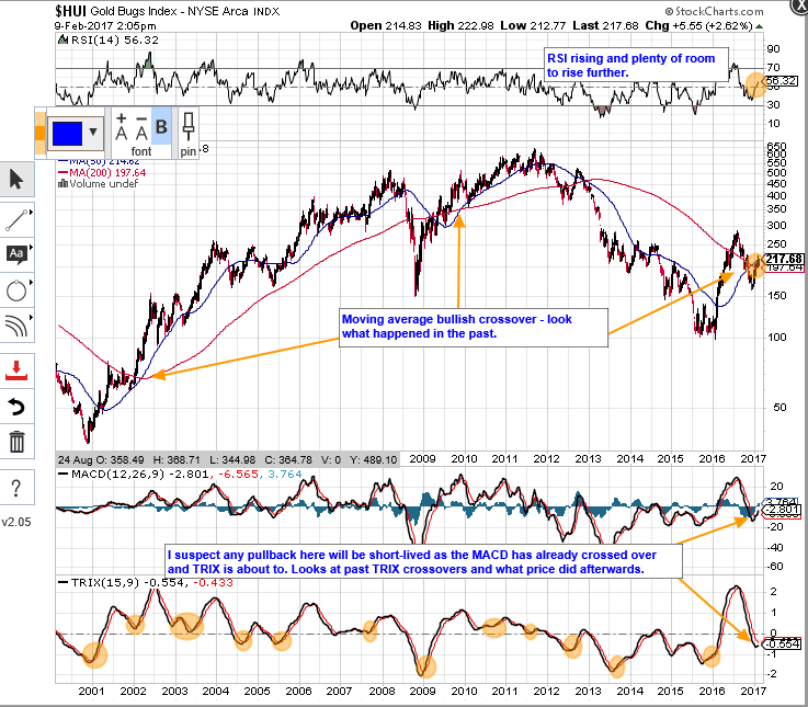
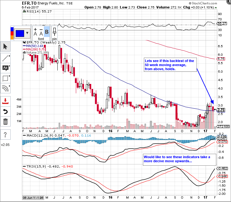
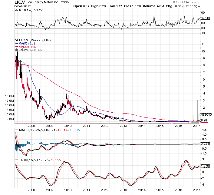
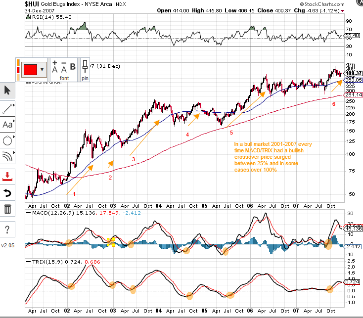
Finally got there ! The indicators have been signalling this since I posted this chart a few weeks ago…


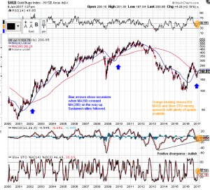
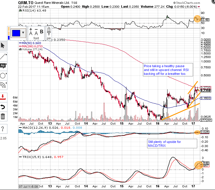
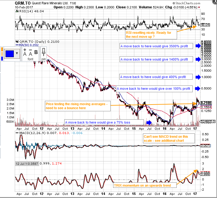
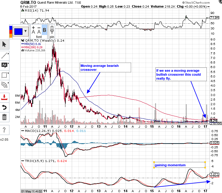
And then we had this a little while later…

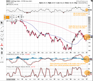
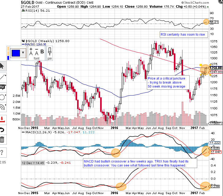
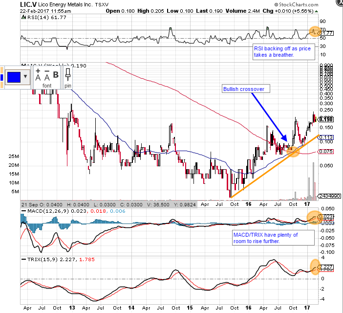
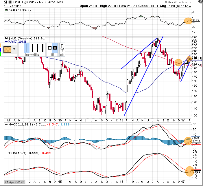
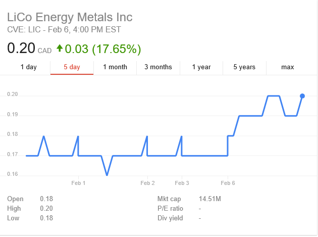
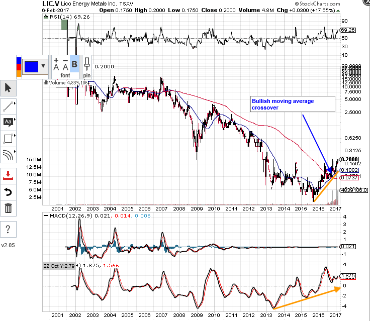
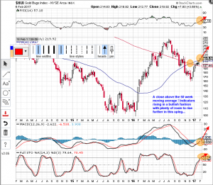
And here we are today with this…

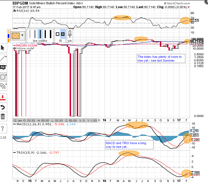
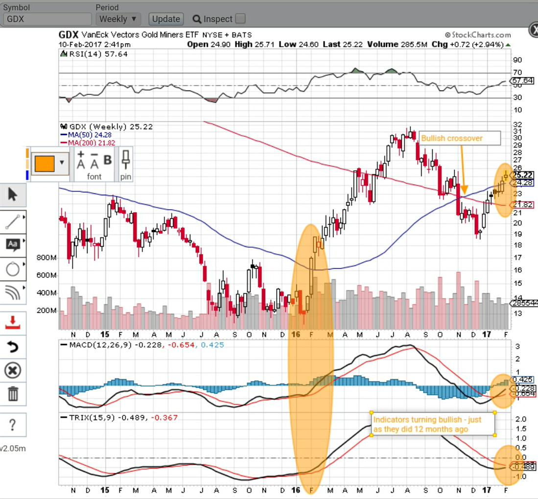
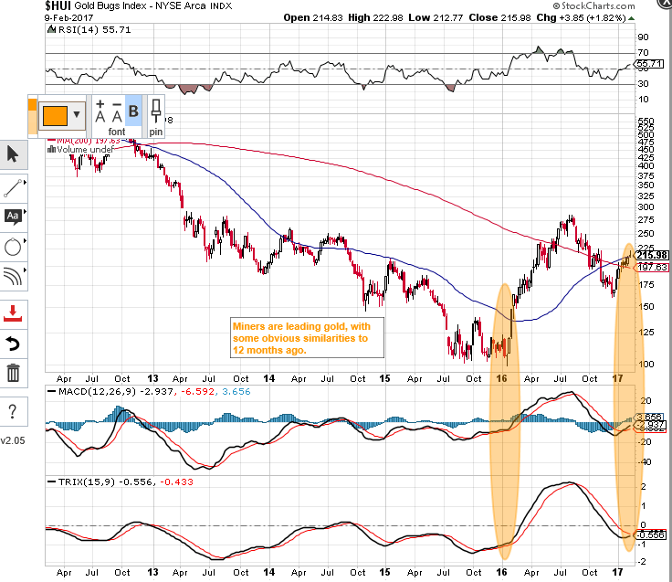
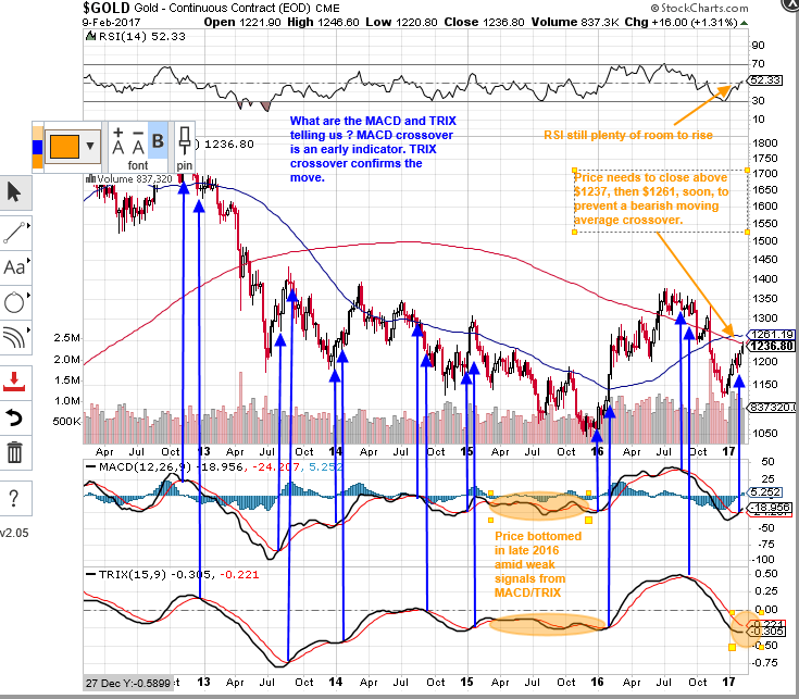
When the indicators turn we’ll have a pause or a meaningful correction, but for now it just looks to be full of bull.


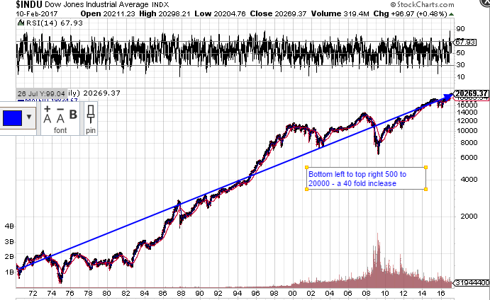
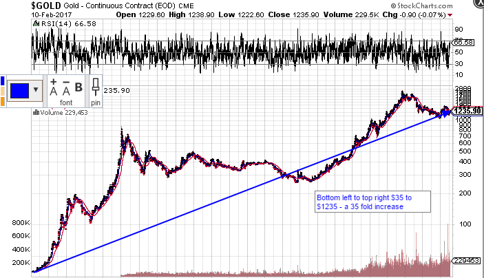
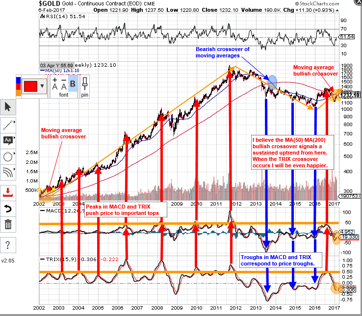
I keep looking at that 50 week/200 week moving average crossover and wondering just how high this baby can go. I know also that it doesn’t pay to be a perma-bull and things can turn pretty fast. If the dollar has another leg up, I reckon it’ll slow the advance, but maybe not do the damage it usually does. If the dollar doesn’t rise much further and suffers a further fall, things will likely take off really fast for the PM’s and miners.

Another Take On The Dollar

As always, I’m trying to keep it simple and just looking at what the charts are saying. I’ve plotted the chart/indicators using weekly data rather than daily. I hope I haven’t simplified things too much, but I’m sure that more experienced chartists will keep me right.

Simplicity

Where’s the dollar going ? What about the Yen ? Interest rates ? Government policy ? The EU ? Brexit ? Commodity cycles ? All very interesting and adds to the ‘weight of evidence’, but simple moving average convergence divergences speak volumes. The triple exponential average (TRIX) also confirms coming moves by tracking overbought/oversold conditions and values rising above zero indicate upward momentum (just starting to turn upwards now). A chart speaks a thousand words so here you go. The first one looks at the bull years 2001-2008, and the second one looks at the bear following the 2011 top and current price action.


No matter how hard I try, I just can’t see anything in these charts except BULL.