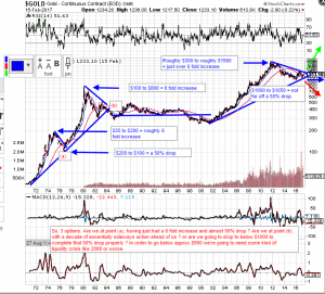
The Big Question
Just a gold chart going back to 1970. Nothing too technical. No matter how much I stare at this, the conflicting views keep pulling me one way, then another. Of course, the shorter term charts will give the bull/bear/buy/sell signals, but it’s the longer term direction that fascinates me. Looking at the unstable world we live in, with so much political turmoil, national debt, a soaring stock market, and the undervalued miners, the little voice in my head is saying we’re on the verge of a huge move to the upside.

How we trade/invest today, will “echo an eternity”…Agree Northstar–one day at a time…
Loving that reference, a favorite.
I believe it will depend on fundamentals. There is high possibility we have another Brexit like shock coming in Europe, from French, Dutch elections or Greek/Italian bank problems. Imagine what could happen if a small country leaves the Euro, or a bigger one like France. I believe trillions of bonds will decline in value and people will go for safer assets. And I am not even sure the Euro will decline, as Germany and the stronger Northern countries will remain in the Euro favoring a hard currency. Other things can happen in US, with Trump wanting to increase its influence in the Fed and favoring a weakening dollar policy. Not to forget that the balance sheet of ECB and FEd can not grow forever, sooner or later they will have to normalize and stop QE. This will increase LT rates and destabilize markets. So, Yes, if part of this comes to fruition in 2017/2018, I believe it will be gold bullish.
Agree, we should see a good move going forward.
Here is my take on that ultimate long term chart:
https://goldtadise.com/?p=391935
General market psychology is also similar. First half of the 70’s extreme market turmoil (down) PM’s up huge, last half of 70’s market relatively flat PM’s up huge (stagflation). Fast fwd to today, ’02-’11 mkt turmoil (down) PM’s up huge, as with stagflation in the late 70’s, today’s market doesn’t have to crash for the second leg up in PM’s. From here, based on gov’t debt levels it’s inflation-or-bust literally. Recall the massive Gov’t social/war program spending 60’s to early 70’s, similar scenario as with the Bush (one) to Obama’s era.
As in 1976, today the memory of ’08-’09 mkt crisis is fresh and the illness is still with us (QE/FrankDodd only delayed the inevitable clearing of markets and true price discovery). In the 70’s it was the repricing of oil that caused the temporary bump, this time it’s QE1-3 D-F etc.
The 70’s are my over-arching roadmap for what lies ahead albeit on roughly twice the timescale.
More chaos will propel gold. Only when war is near imminent, China has the means to ensure NK won’t rock the Peninsula, to keep it as a buffer but that won’t dissuade Japan installing it’s own THAAD to sustain it’s claim on East China Sea in addition to the US-Japan protection treaty. When this chart is lay over with Armstrong’s ECM, it gives an idea of possible trade disruptions from maritime navigation along China’s One Belt One Road economics strategy.
https://www.yahoo.com/news/china-warns-us-against-freedom-120511328.html
who dares win.
Some good points, and some scary shit.