PFIZER IS DOING A GIANT DOSE-FATALITY STUDY ON YOU USING THE COVID VAXES AND VAERS DATA
ME — As I post this article, I want to emphasize that the information would be shocking to anyone that doesn’t read Goldtent daily!
The info was first released some time ago during the period when the scamdemic was still being perpetrated by the previous Administration and therefore this analysis was ignored. I am pleased to see it being refocused upon now even though some may recall reading it previously. The mathematical case is overwhelming as is the conclusion that this was no random effect but a carefully controlled study by psychopaths. While there are several divergent topics covered in this article, one in particular is highly relevant to understanding why some people were affected worse than others. The jab effects are now becoming obvious so I am going to copy/paste just this important section because the graphs are critical to knowing what was done to our families, friends, acquaintances etc. I would have preferred to add this via a comment but would have lost the graphs. Please focus on these charts as they summarize the issue!
This Part 2 contains information that is so hard to believe and shocked me so much that I rewrote it twenty times to be sure readers understood. The essay below shows what we face. If you do not fully understand this story, you should at least scan the graphs below.
VAERS to prove we are human guinea pigs for the globalist killers.
The “hot lots” are poisons, and if you play Covid vax roulette, your chance of dying or being mortally wounded is about one in 200.
To understand what is happening with the Covid vaccine, imagine the food companies trying different doses of salmonella to determine how much damage they would cause.
He analyzed the Covid jab harms recorded by VAERS and created the charts below. This provides overwhelming evidence that the three manufacturers coordinated dose-response experiments to measure the toxicity and deaths from the different batches of their drugs. Controls without the poisons were likely used as well.
The odds of the results described below happening by chance alone seem nonexistent, but do not take my word for it. Look at the following summary, the references, and the videos.
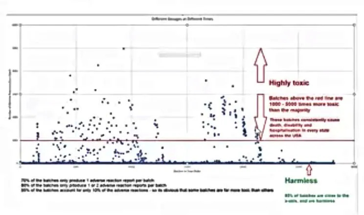
The entire study is shown in the first slide below. The horizontal axis is time. Each blue dot is a manufacturing batch or lot with thousands of bottles with the same serial number. The higher on the vertical axis a blue dot appears, the more deaths and other AEs were reported for the lot. The experiment was run over most of 2021.

- VAERS recorded 28,330 Covid shot batches or lots.
- The dot’s vertical height above the baseline reflects the VAERS AEs reported for each lot.
- About 95 percent of the batches are on the horizontal blue timeline at the bottom. These have few AEs and are relatively harmless. Some are likely saline controls (placebos).
- Although the dots/batches/lots above the blue baseline are all toxic, the hot lots are above the red line. These batches produce 1000-5000 deaths, disabilities, and other adverse events each and are 3000 to 5000 times riskier than the ones at the baseline.
- Since the lots above the red line are only .65 percent (.0065) of the total, there is about a 1/200 chance that any given jab contains these very toxic contents. After two injections, your chances of getting a bad one, of course, doubles. However, your risk of damage or death with subsequent jabs increases much more because the poisons accumulate, which magnifies the risk. For comparison, the risk of dying from most major elective surgeries is 1/1000.
- America was the target of this experiment. The conspirators spread vials from each numbered lot into every state to avoid local disease clusters that might be noticed. When the corporations did not take this precaution, the killer products could sometimes be identified. For example, Wyeth once used a hot lot of DPT vaccines in an area of Tennessee. It killed eight kids and made headlines. After that, the lots were mixed across state lines to make fatality grouping invisible.
Who did it? Pfizer, J & J, or Moderna? Yes.

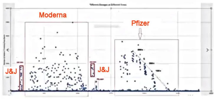
The same graph, annotated.
Johnson and Johnson ran the first tests. Their results are in the small red rectangle on the left. Next, casualties from Moderna are shown in the left-hand square. J and J did a brief second test (the middle red rectangle). Pfizer took over during the second half of the experiment, and their deaths and injuries are shown in the right-hand box.

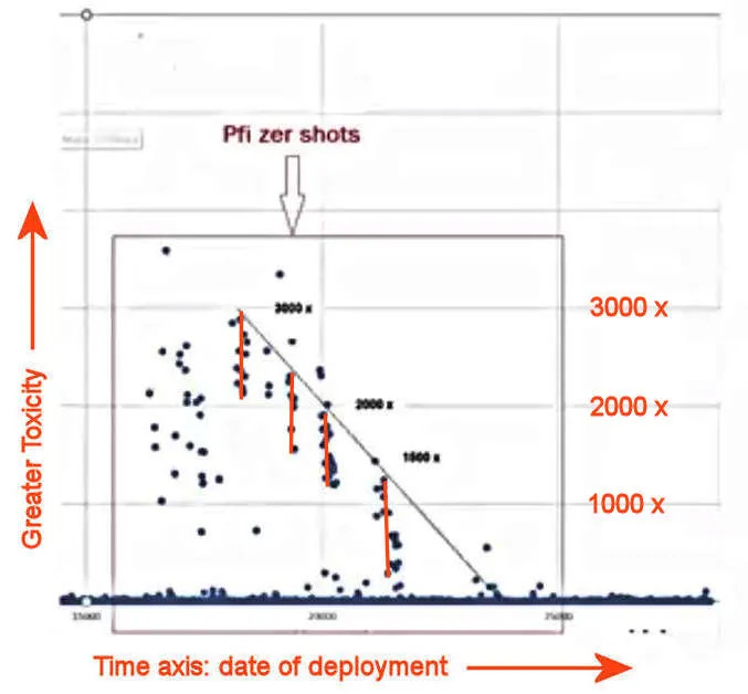
Detail: Pfizer’s testing period from the right (later) half of the chart, annotated.
Pfizer’s strict quality control proves they were running a death study.
- Pfizer seems to have systematically deployed batches of varying toxicity and lethality during the last half of the trial.
- The adverse reactions for each toxic lot, as revealed by the height of the blue dots above the baseline, are clustered in a limited vertical range and marked in the above graph by the vertical red lines. These likely reflect individual dosages deployed over each limited period.
- These results fit along the slanted plot line above. This is striking evidence that Pfizer started with a higher dose at the start (to the left) and then decreased it in five steps over the study period. It looks exactly like an injury and lethality dose-response study.
- There was a “clear” interval between each dose tested. Here, non-toxic, possibly placebo injections seem to have been used, and the adverse events declined to the baseline blue line. The trends are apparent when the injuries and deaths from the lots are plotted.
https://robertyoho.substack.com/p/how-to-grok-pharma-evil-part-2-vaers?
I understand what is being said here but there could only be a few, that I can believe in, reasons for the “shot”.
1/ To make a shit load of money
2/ To kill off as many unsuspecting people as possible without being noticed (possibly a test)
3/ A warp speed humanitarian effort to save as many lives as possible
or
4/ A perverted combo of the above which contradicts itself
The Truth always comes out and this operation is no different. So which is it?
4 years of witnessing this fiasco points to #2 (with #1 being a simple byproduct of the DND agreements with the pharma companies enabling massive profit without liability).
The warp speed “story” was the cover for a level of toxicity that otherwise should have been pulled in the first weeks after injections began — the vax injuries & deaths began immediately.
If correct that the intent is as much death as possible without notice — then big pharma will have worked out the bugs from the COVID trial and the next forced injections will be the EXACT level of toxic that is desired to achieve the desired result.
IE: If they want Florida to have 75% death rate and New York to have 15% –> this will be achieved via toxicity level and injection distribution.
Question — I can understand the psycho’s wanted to destroy 90% of humanity — but WHY is the US Gov’t DOD orchestrating the event?? Haven’t figured out the rationale yet (unless they were not informed of the toxicity levell — which seems unlikely as they controlled manufacturing)????
I’ll have to sleep on that one tonight.