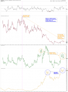
$XAU:GOLD RATIO
The $XAU is the Philadelphia Gold & Silver Miners Index. The ratio chart tells us how the miners are performing relative to the price of GOLD.
Below the ratio chart is the $XAU, and below that is $ GOLD.
To me the chart leans bearish, but I guess it could read either way.

Good chart. Thanks.
I have thought about this too.
However, I would keep an eye on the 200 WMA and 600 WMA on the XAU:gold ratio weekly chart.
Those MAs look like they will positively cross sometime in the late spring on 2023 if they continue their current trajectories. However, a MASSIVE stock market crash could prevent them from positively crossing just like in 2008.
I personally don’t think this is what is going to happen, but I am severely biased. I think we will get a positive cross, which will cement a new bull market in the metals and miners.
Also, when you look at the XAU itself, it’s 200 WMA has just positively crossed the 600 WMA for the first time since 2005. The fact that the XAU is testing the 200 WMA this week should constitute a buying opportunity more than a sign to get out.
A positive 200 WMA and 600 WMA cross is not always going to mark the beginning us sustained future gains, but it very often is.