The Big Picture
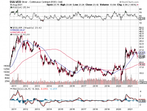
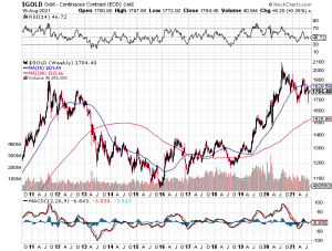
Amongst all the gloom and gnashing of teeth, let’s try to put the price action in Silver into some long term perspective. Since joining the “Tent” some 17 months ago I have referred to the 40 year cup and handle in Silver in a few posts and in other comments as have a few others as well. The 30 year cup from 1980 or so to the high in 2011 has led to a handle of now over 10 years. Starting at the March 2020 bottom Silver ran up $18 dollars from $12 to $30 in 5 months. While frustrating and tedious, the one year correction that has seen Silver give back $8 is not totally surprising.(Length of time a little bit) Unfortunately, the continuation of the Silver bull market will take as long as it needs to get most participants to give up and move on. As much as I thought and hoped it would have had it’s next leg up by now, it probably will stay in a quite, tight range until it’s usual seasonal buying period just after Thanksgiving. (Chart is weekly view of the ten year handle)  PS: I was going to confine my thoughts to Silver but took a look at Gold for the same ten year timeframe. Again, still in a bull market for both metals. The miners are strewn with plenty of broken charts (not all) so one has to really do their homework to find which will be the winners.
I think cup and handles that span such great periods of time are rather poor indications of the future. Just my opinion. It may be just the opposite. I don’t know. What is the considered opinion of the validity of many year cup and handles? Anyone? It just seems that any decision within that kind of vast time frame will always be a wild speculation.
I wouldn’t be so quick to dismiss it’s validity because of the timeframe. While you raise a very valid question, I don’t know if we really know the answer? Anyone out there ever see a 30 to 40 year chart pattern, especially cup and handle? I believe it is quite rare, if not unique and is one of the main reasons I have said on a number of occassions that silver will end up being the “greatest bull market in financial history”!
I think it’s more likely symmetry kicks in. Then, look out below.
http://www.macrotrends.net/1470/historical-silver-prices-100-year-chart
If you adjust for inflation appear to be in a bear market from 1980