Weight Of Evidence – Synchronised Markets
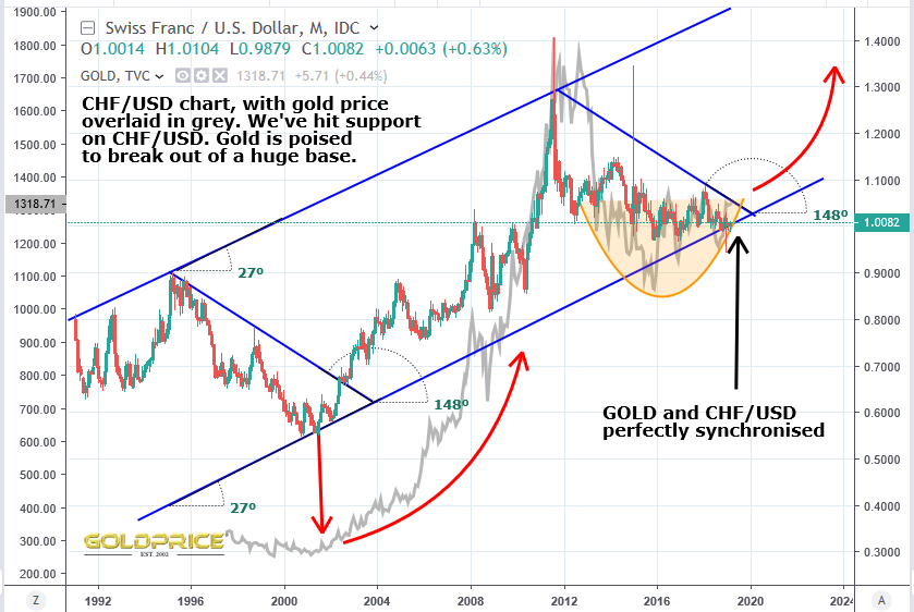
I’ve prepared two charts for you. In my view, together, they point the way for the near to medium term in the PM markets. Some may be worried that we may be in a position a bit like the 1990’s where we fail to breakout of this apparent ‘basing pattern’ in gold. We could drift sideways to down for the next 10 years like we did right through the ’90’s. I understand that, and I’ve posted many charts showing where we are in the grand scheme of things when it comes to the gold and Dollar cycles. For this breakout to have a greater chance of success, we need to have the cyclical ‘wind’ at our backs. Happily we do. We’re in the ‘up’ part of the gold supercycle, and the down phase of the Dollar supercycle. If you don’t buy into cycle theory, there are other places to look for clues. One is the CHF/USD ratio which is in a rising channel (because the USD index has been in a falling sequence of lower highs and lower lows since the 1970’s), and another is the much talked about Silver/Gold ratio.
I have to say the evidence is overwhelmingly suggesting that we are at a significant low in the PM space. First, the CHF/USD chart. Gold is completing its base at the precise time the CHF/USD ratio has hit its support line. Time and price on this ratio say that the next move is up. That is very bullish for PMs as you can see in the chart…
Now the SGR chart. I posted it yesterday, but I’ve presented it differently here, with some points on it to note…
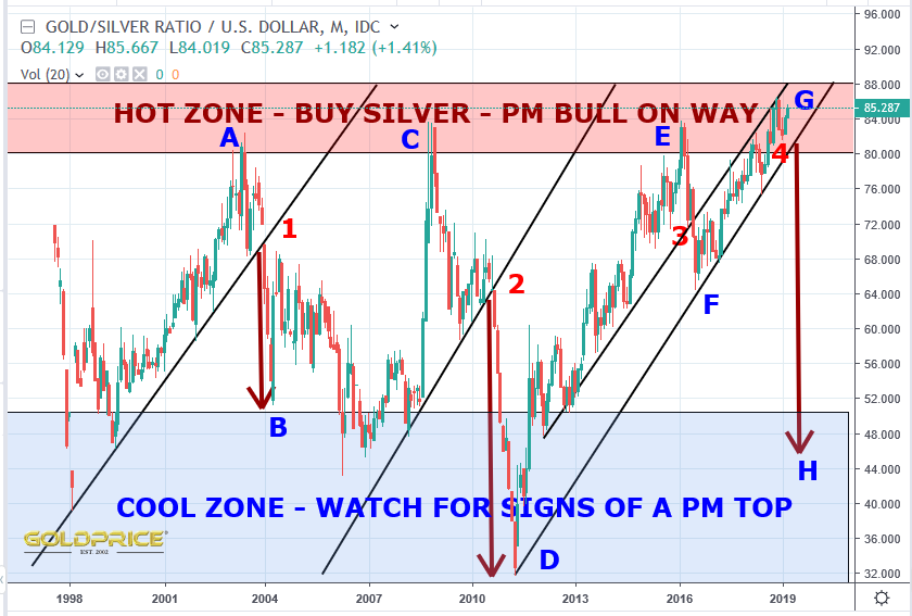
The main point for me is that we are in a rare position, up in the ‘hot zone’. We don’t tend to remain there for long, and we have a clear support line to watch. At points 1, 2 and 3 (especially 1 and 2), once that support is broken silver plays a very rapid game of catch up, rising faster in percentage terms than gold. A to B resulted in a 14% rise in gold and an 18% rise in silver, but in 2 years that turned into a 63% rise in gold and an 87% rise in silver. From C to D gold rose over 160%, but silver gained around 300%. E to F gold rose around 30%, with silver gaining 32% (that difference would’ve accelerated if the trend hadn’t been reversed). The reversal at F and move up to G has been the result of Fed ‘smoke and mirrors’. The trouble now is that they have been exposed. Their march to over 3% interest rates cannot happen. I think many of us knew that, but now there’s no doubt and the rate hike cycle is finished. That will turn these charts at these inflection points. The cycles knew it was coming and the above charts have confirmed it.
For several months i am watching GSR to break below 80. When that happens miners will across the board will explode to upside. In the meant time watch yield spreads for clue.
Great charts!!
Great stuff. Locked and loaded, Sir!
Agree great charts
But I hate having to bet on Bob….Bob is Manic Depressive and unpredictable