Quite elegant bullish geometries in current gold chart.
There are some quite elegant bullish geometries in current gold chart. I can’t say that I am convinced in any way but I like the look of them.
For ages now (since Jan 2016), I have been watching the thin blue and thin black pitchforks, so happy was I when gold hit $1124, when it hit and bounced off the base of my blue fork that I didn’t notice until now that there is a larger (thick) black fork almost but not quite parallel to the first one.
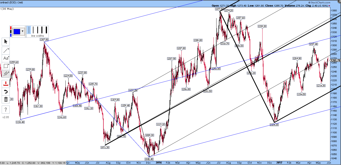
With a bullish hat on, the blue fork would represent what Jim Sinclair called an uptrend and the black one would represent a power uptrend if it were to govern price action.
I note that there has been a lot of trading on the lower line of the thin black fork lately. The very start of the bullish move was along that line (at bottom centre on the chart, circled below) and defined the slope of the move. The large fork is about twice the depth of the small one, therefore the recent trading has also been along the lower quartile line of that fork.
In any case, the new larger black fork is almost parallel and would be very bullish if it governs trading. Note also the action along the dotted red line.

Adding some more red lines shows that the $1045 low may be a key geometric point in this market. Lots of stuff radiating from there:

Sold red line shows the lining up of three lows. The two steeper dotted red lines show lines of initial support that became resistance. In that case, these bullish slopes have been rejected as too steep. so we could perhaps assume the market will never catch up with those lines.
The shallowest red dotted line is support at present with three recent touches. A move above $1280 would take trading in to the central portion of the new black fork, which would be very nice indeed.
Thanks for your hard work, very much indeed!