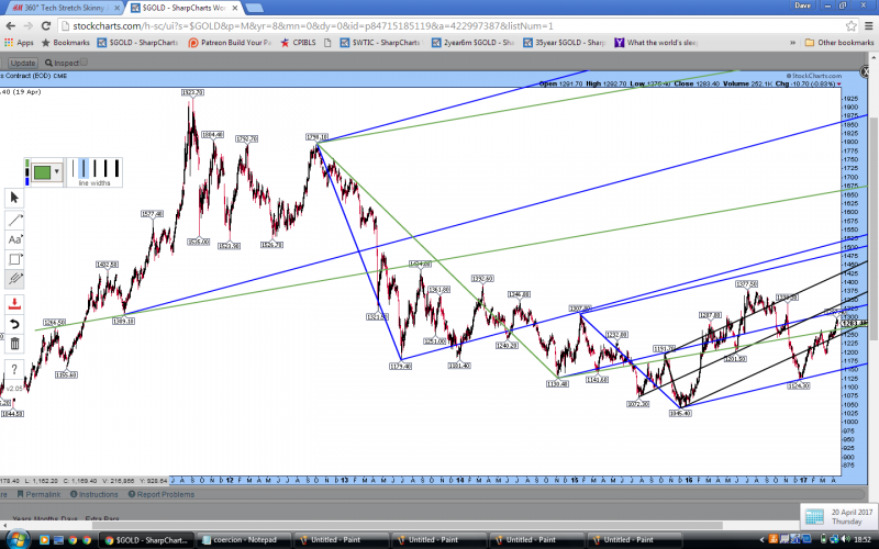
Forking around. Gradual transition from bear to bull market in gold?
Gradual transition from bear to bull market in gold?
I have long been thinking that the $1309 level at the start of 2011 was a key point in the gold bull market – the moment of transition from bull market to bubble.
It followed a near quadruple top that hit $1432.50 in late 2010 and was the reaction low to that top. At that point the shape of the gold market action had changed – it also was forming a 3 peaks and a domed house pattern.
I have taken my key pitchfork from this £1309 point and included the main swing high and main swing low from the bear market that ensued, at $1798.10 and $1179.40 (‘1800’ and ‘1180’).
To me, this defines the price action since to a fair degree and is the measurement of whether gold is back in a bull market. If the price re-enters this feature there is potential for $1850, then $2200 approximately.
I have drawn some more forks from the $1309 point to look at the symmetry and some hit key supports and resistances from the last few years’ price action.
Looking at the action along these forks:
Blue: start 1309, high 1798, swing low 1179, then resistance 1308!
Gold: start 1309, high 1978, swing low 1181 resistance 1377!
Green: start 1309, high 1798, swing low 1130, note touches on line, resistance 1270 broken out recently!
Purple: start 1309, high 1798, swing low 1072, traded below line to 1045 then support 1124! KEY?
Red: start 1309, high 1798, swing low 1045, not hit again.
In an extended bear market one might expect the pattern on the first three forks to continue as price ratchets down slowly over a long period of time as in 1980-1999.
However, the pattern has been broken on the green fork by the recent move to $1297 and this green line was already support at $1201 in mid 2016.
A bullish breakout could make the price objective the retest of the bottom of the gold fork again near to $1450.
So I am looking at the possibility of this gradual transition from bear to bull market as illustrated by the green parabola. The green parabola is not meant to be quantitative but it does hit a few resistance points. It really marks the upper limit of the price action more or less since late 2012. The caveat is that the green parabola is probably the most optimistic path for this market’s future.
A more balanced bullish scenario would be price going to hit the bottom of the gold fork above $1450 when it meets the green parabola in the next few months and then coming back down to test the bottom of the green fork perhaps in the low $1300s by that time. A bearish scenario would be failing to hold the bottom of the green fork at <$1250 over the next few weeks.
How this related to my current trading forks (with some omitted to avoid confusion)! If I finesse it a bit (cheat!) I can make the small and large forks parallel and that means quite a bit since the small fork is half as big as the large one and could be seen as a downside extension of it. Note the small blue fork has the recent $1124 low on it and that also appears on the large purple fork above. This market is a median line analysis dream.


Nice work Dave. The next few weeks are going to be crucial.
Dave, thanks and good sharing this perspective.
I particularly like your green parabola and the 1450. I wonder if you extend the chart into 2019, when would the green parabola test 1450 as that would likely test if the bull is on (BO above 1450) or the bulls would get trapped by a massive counter trend rally. Nearer to that level, other indicators would be telling if gold has got the power from a weakened $ and others. Thanks again for bringing up this perspective showing those resistant points.
Not sure Matthew about the green parabola and when it meets 1450. Thanks for the comment.
I just love the symmetry and that the number $1309 seems so key.
I like the way that the blue fork was resistance at $1308 in 2015 and the gold/yellow fork exactly matched the 2016 high at $1377.50. I hadn’t noticed it until I drew these forks just for an experiment.
There are other ways to draw lines such as action/reaction lines or different forks which would be very bullish but I am not convinced that the symmetry continues for ever!