Parabolas in gold – the closer I look, the more ambiguous it gets – so I will stop.
This is my last attempt at parabolas in gold, actually in GLD this time, for a change.
Although it is fairly easy to get parabolas to fit the lows and highs of the price action since April 2013, the parabolas do not fit all the points that accurately. I suppose you can’t expect them to be perfect.
However, I wanted to capture that failed bear market rally that happened between May 2013 and August 2013 perhaps into the end of 2013. The ‘upside’ was that the Dec 2013 low was not lower than the Jun 2013 low. That was the rally!
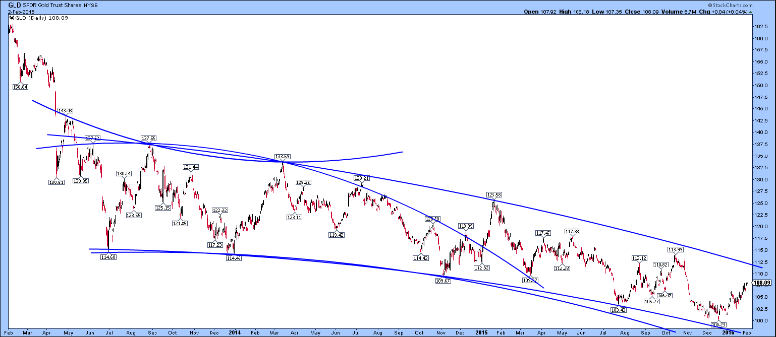
1. That’s important, because the lower low at $1130 in late 2014 was therefore an acceleration to the downside and really defines us our parabolas through 1180, 1180 and 1130 on gold (114, 114 and 109 on GLD).
So, I drew parabolas strictly through points ABC and also through EFG to see where they would have lead.
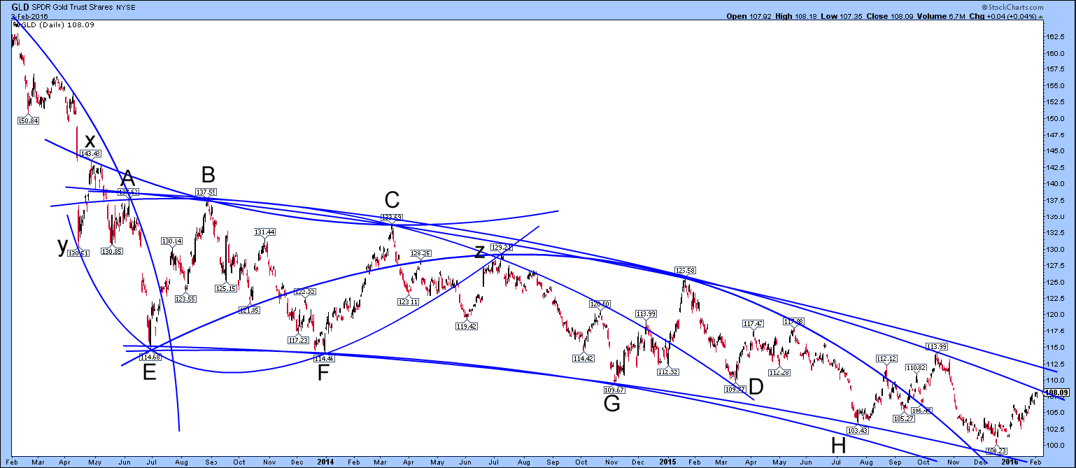
2. Drawing through ABC gives a slight upslope followed by a quickly steepening downtrend to Point D that became support at D. The price has sidestepped out of that downtrend a while ago. Positive news? Maybe.
3. Drawing through the intraday lows at EFG takes the line too steep and it misses point H. It fits later points better if you take the daily close on 28 June 2013 at point E instead of the spike low.
I always have trouble with this sort of thing because whenever you make a rule for yourself to use only intraday turning points or daily closes, it doesn’t quite fit unless you cheat!
4. Anyway, it seems like the downside acceleration of the price has perhaps abated a bit because point H and the next low seem to have missed their downside targets.
5. It shows that even with fairly well fitting parabolas it is very difficult to forecast accurate targets because the parabolas are so much more flexible than straight lines and you can get a variety of fits. You usually have to end up dumping one or two of the high or low points on the chart and the question becomes: which one(s)?
6. I also noticed that point z in the middle seemed to be an intersection point for several trendlines. This was where any attempt at a bear market rally seems to stop altogether for me in mid-2014.
7. I can’t see anything in the right hand part of the chart that seems to imply another very steep decline like the one in April 2013 at the left of the chart.
8. For me, the gold price seems to be completely in no-mans’ land right now, drifting maybe a trifle lower over time.
9. There is nothing bullish about the chart except that one day it must stop going down! I thought that a breakout above $1135 (GLD 109) would be bullish but if I draw the upper channel a different way like here, it seems to need $1150 (GLD 112). Basically, it’s not convincing to be bullish just based upon getting above the most pessimistically drawn trendline!
10. So, I cannot get interested in this market myself right now, speaking personally. It’s just all wait and see. It would be interesting to see how this pattern breaks eventually.
11. I can now understand why most people use straight lines on charts! Keep it simple! Back to pitchforks maybe? I guess that parabolas may be good for looking at the general trend rather than trading. Am I right? Can anyone enlighten me on an example of a great trade made using parabolas?