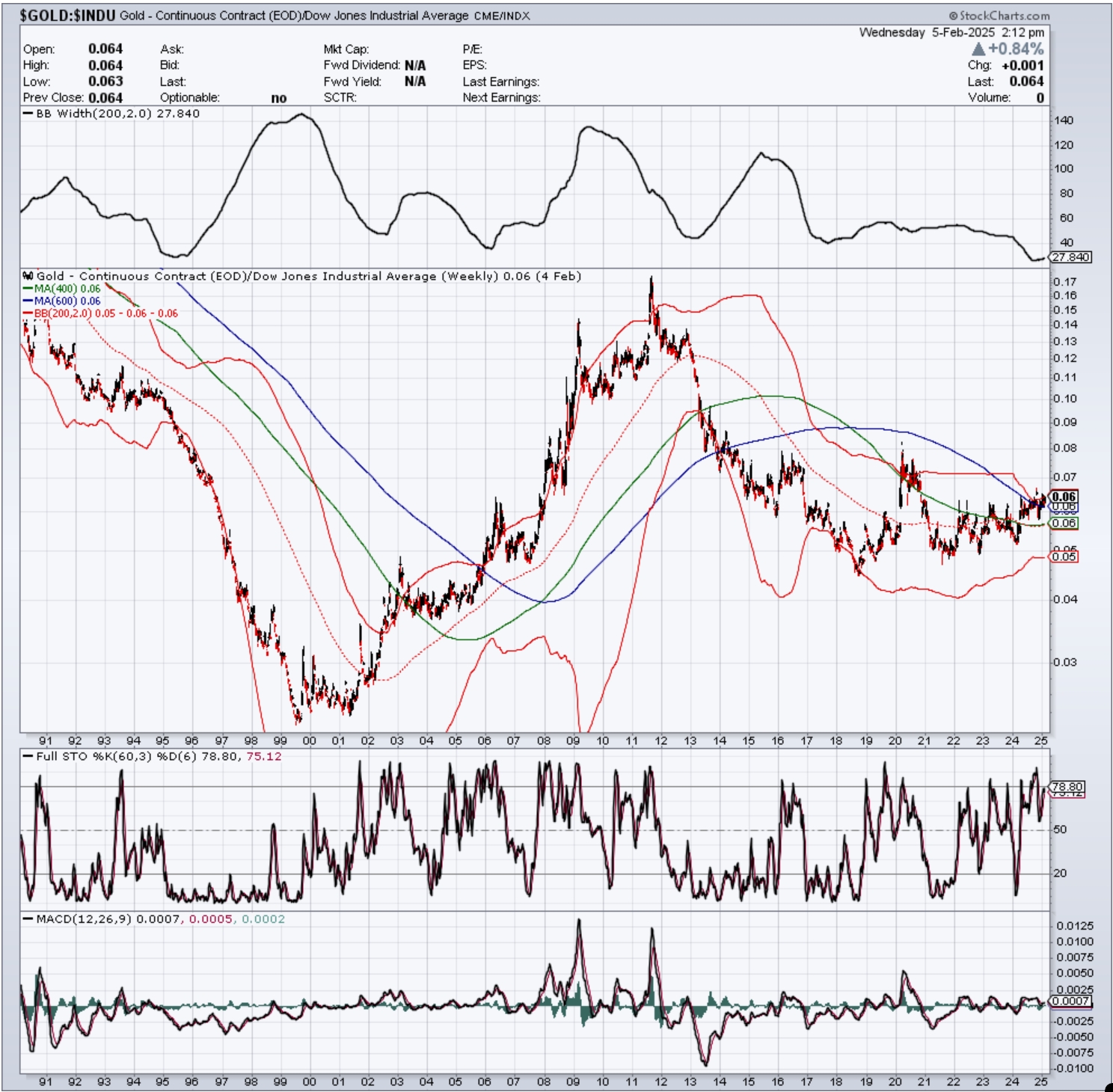
Gold vs the Dow….
This is a very interesting chart for a number of reasons.
The most notable of which is prior to 2018, the ratio was moving very steeply, either up or down. This is the first time since 1990 that the ratio has actually flattened out for such an extended duration. I would have thought COVID would have sent gold on a similar trajectory vs the Dow to what happened between 2000 and 2010, but it wasn’t to be. This period since 2018 is just different.
Second, look at the width of the 200 week Bollinger bands (indicated at the top of the chart). The bands haven’t been this narrow since 1995 when gold started an epic crash vs the Dow. Typically, when bands get this narrow, it suggests a long sustained and very powerful move to come, whether up or down. I am cautiously optimistic about the ultimate direction (upwards), but the super tight Bollinger bands themselves are agnostic regarding trend direction.
I also believe this ratio explains the massive underperformance of the gold miners. Afterall, why buy gold miners if the metal itself is clearly underperforming the broader market? And right now, gold is not yet in a clear bull market vs the Dow–it’s simply been trending sideways in a narrowing consolidation.
Yup, with you across the board.
And I track that ratio regularly using the long departed ETF “FSG”.
I fabricate a clone, like you do.
The monthly bands are shrinking slowly too.
FSG is still technically bullish, but bumping against the upper 2sd band.
I have no ratio sell alerts yet, but we are nearing the zone for those (by March).
I like this log chart. Mean reversion says we are stretched to the upside and odds favor gold outperforming stocks.
https://www.macrotrends.net/1378/dow-to-gold-ratio-100-year-historical-chart