Digging in the Attic and Found an Old Gold Chart
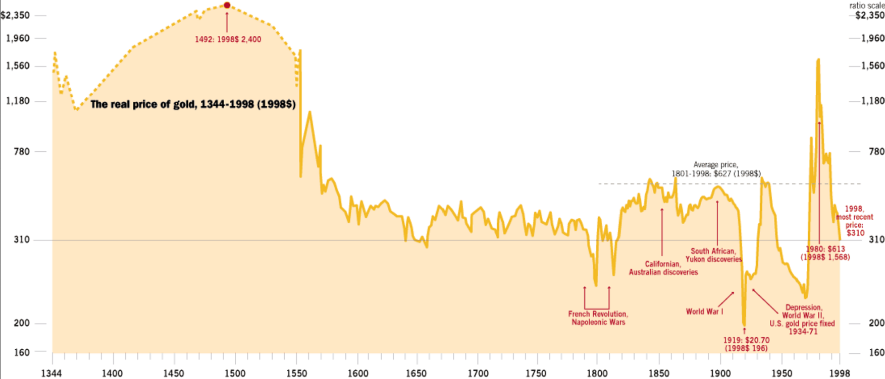
I cannot recall where I originally found the chart linked here. But I had saved it all these years since I found it so interesting at the time. Its last update was in 1998 when gold still traded for 310 dollars! Anyway I thought today was a good time to trot it out. Sadly I cannot authenticate it or give credit to the original author since its source is lost to time. Maybe someone here also has a copy and knows where it came from.
The interesting aspect of this chart is that the *real* price of gold shown has never exceeded 2400 dollars in the past 600 years. That is noteworthy and somewhat applicable to todays pricing. Have a look and draw your own conclusions. There is certainly a long term resistance line that needs to be overcome before gold will go higher. And according to this chart anyway, gold is indeed in bubble territory. Sorry to have to repeat it but gold is at the top of its long term price range and ripening for a secular reversal as the air finally comes out of the “everything bubble”
Respectfully Sir Farmer :
There was NO USA in the year 1300 1400 or 1500 or 1600 or 1700
How does one corelate whatever currency was used back then with the US Dollar ?
I do not see the use in this chart
Your point is taken though…this is THE Top
Do you have some PHYS you will be selling post haste ?
There was a British Empire and Sterling, Fully. Prices can be calculated based on older currencies. I will assume whoever drew this chart made such calculations. As far as selling gold?….are you kidding? I don’t touch the stuff anymore. Gold is toxic and a waste of time for investment purposes most of the time. It just leads to crying and regret.
The big event in gold in the last 100 years was the wave 3 move that took gold to its historical highs in the 1980’s but we won’t get another wave three move. So the best of times are already behind us and will not likely happen again. We have a wave 5 move is all. Then its a secular bear once more. Sorry….but I will be right about this.
The point is that the median price since the 1700’s has been around 350 dollars. So 2400 is waayyyyyyy out of line.
WHAT ?
Gold is 2400 NON inflation adjusted which is linkely below the $350 on this Chart
Gold is NOT 2400 in Year 1400 terms
Since the Dollar has lost value of about 98% from when the FED began in the 30s …how much is 2400 NOW ?
AND let me tell you my Gold Story
I was buying 2 one ounce Maples every week at a small travel Agent Kiosk in a Mall in Toronto ..around the turn of the century at $400
after a while when it reached about $1200 I sold about half of them and paid off my mortgage …If I had not bought these coins the Mortgage pay off would have need 3X more !
And another thing…1966 Silver 80% coins melt value still buys an Imperial gallon of Gas…see last weeks post
SO…Precious metals have held their value thru the years but nothing else has
Sadly I can’t vouch for the method used to derive the price of gold in the past as I no longer have the site information that might have explained how the author came up with the calculations. For this chart I was willing to give the original author the benefit of the doubt and assume he modeled this responsibly.
Lets look at a current chart instead, I will post it above shortly.
If gold were such a bad investment, why are so many central banks buying?
Because its Tier one capital. Same as cash. They are not speculating on price though. Central Banks buy the most gold at market tops than bottoms. They tend to sell at price lows.
Well, for me, having Tier One capital (real money) is a good insurance policy. Unlike all other currencies, gold has maintained its purchasing power for over 5000 years.
For every seller, there is a buyer.
Some Western banks sold at bottoms, smarter Eastern banks picked up the great deals, and continue to accumulate.
Agree Briguy
Insurance…Holds it’s Value…real Money
Great discussion and I agree mostly with FGC. I have gold phyz from $320 all the way up to ~ $1500. Same with silver from $5.50 on up to current. IMO they have little to do with what the dollar says they’re worth, but everything to do with what you can buy with them if/when this phony worthless derivatives game world comes crashing down….and it will! Paper can burn to a pile of ashes; try to spend that! But silver and gold will only melt into a recognizable lump that still retains its identity and value. Currencies have historically all become worthless but silver and gold (in hand) have never become worthless. But IMO the key is “in hand”. Otherwise it probably does not actually exist. To each his own but I sleep well all night every night, and feel I get my comfort and direction from my HIGHER POWER… FWIW. www
To go back that far we’d like to know how much gold could purchase an average (rather median) pair of shoes – something as commonly necessary then as it is now. Perhaps a nice toga vs a nice suit, lunch at a local pub, etc.