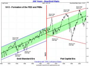
DOW to Gold Ratio 200 years
Parabolic Chuck for you from my library.
A massive 6 points consolidation/top forming and the ratio is working to get towards reversal point 6 to 1:1.
The Dow/Gold ratio appears to be making a potential awkward looking head and shoulders top pattern. We say awkward looking as the characteristics of the top pattern don’t fit the textbook definition of a head and shoulders top. The left shoulder is supposed to be higher than the right shoulder. It isn’t. The neckline is supposed to slant upward. It’s not; the neckline is sloped downward. However, we’ll accept it for what it is. If correct, then the breakdown point is around 16.50 and potentially projects down to 11.40. Based on today’s prices, that would put the DJI at 17,200 or gold at $2,270. The implication is that either the stock market is going to fall or gold prices are going to rise. The ratio peaked in August 1999 at 44.17 and most recently bottomed at 5.69 in August 2011. Previous cycle lows were in 1933 at 1.94 and January 1980 at 1.29. Peaks were seen in August 1929 at 18.36 and January 1966 at 27.85. Historically it has had some wide swings. There is a time to own stocks and there is a time to own gold. Right now, the odds are favouring gold.
Below is an interesting long-term chart of the Dow/Gold ratio. We could argue that it is huge broadening pattern forming. If that’s correct, then the ratio could fall below 1 this time. Yes, that is correct: gold prices and the DJI at the same price or even DJI lower than the gold price. Since the formation of the Fed in 1913 the Dow/Gold ratio has had some wild swings. Note that, in what appears as similar action as to what happened in the mid-1970s, the Dow/Gold ratio reached the mid-line. It was after that point that gold went on its historic bubble run from $100 to $875. Could something similar happen again?

Well, as you know, we don’t know if it’s a top… maybe it’s a continuation pattern… jk, I think!?
In Chartology term it may be bull horn pattern????
Thanks for chart! Never seen it put like this… pretty amazing.
Now THAT is a long term chart! Very interesting! Thanks!
The chart above demonstrates to me that the Central Banking (fiat money) model (pre 1913) has simply replaced business cycle volatility (which is a CB goal to suppress), with monetary value volatility (inflation isn’t as immediate and obvious). There is no free lunch, it’s just a matter of how ‘aware’ people are what is happening.
To me, the fallacy in the chart above is that the same measures that indicate the green line +/- 75% confidence band PRE-1913 is projected POST-1913. Pre-1913 Currency and Gold were tied to one another – thus, as a measure against the DOW it was a valid trend line.
Once Central banking took over and currency and gold parted ways in terms of what they could buy (the DOW) that green trendline should END and be re-drawn – i.e. it has NO basis tied to the pre-1913 gold=currency era.
Post-1913 the DOW is actually measured in currency, not GOLD which is the reason for the huge swings in what it can actually BUY. I’d argue that the green line post 1913 should actually be redrawn as the value of the DOW has NO RELATION to what can actually be bought with it – at DOW 100,000 are we all going to be rich beyond belief? really?
I’d further argue that the era after 1913 will have a relatively neutral chart trendline – the DOW value can go to the moon but odds are a decent men’s suit will cost nearly the same in terms of GOLD.
Does anyone really still believe Dow; Gold has to go to 1:1 >?
YES. DOW:gold ratio has no predictive value for gold’s price pr trend incating.
Well yes it did in our trading life time and not matter of belief but fact. In 1980 Dow: Gold was 1:1 . If happen in recent past it can happen again???
I read many post here gold charts from 1970’s for comparison, why not Dow:gold ratio chart???? Just asking.LOL
It may or may not, but the expanding nature of the swings post-1913 when the DOW ceased to be measured (in large part) in terms of a significantly gold-backed currency is something to be heeded. That continued upwardly sloped green/shaded line past 1913 is deceiving to anyone believing paper assets will continue over time to outpace what they can be exchanged for in real goods.
I’m not saying I think you disagree that the chart indicates the Dow is overvalued relative to gold and will likely mean revert – that’s fairly apparent, but to say it can’t (easily) or shouldn’t logically go to 1:1 or even lower is not appreciating the idea behind the ratio’s behavior since 1913.
One of the biggest reasons I’m bullish on gold – right here almost 2 years after joining SpockM which was after 5 years of watching the ‘solution’ to the ’08 crisis is because the slopes of that graph post 1913 are so smooth over extended periods of time – it makes total sense to me. The recovery between 2011 and today is a manufactured anomaly, not the natural trend (2001-2011).