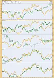
Gold Comparison Charts
I keep seeing different charts being compared to gold in a way to predict which way gold or another commodity/security is going to move and from what I can tell, although maybe interesting, just seems like noise. I see nothing that Consistently foretells what gold or another commodity/security is going to do. It seems to me that if you are going to trade something, you are best off to concentrate on the price of what you are trading, especially those with less experience who might not be so proficient at filtering out noise. Ok, I have put on my rotten tomato resistant suit 


Nice work but you forgot the YEN. Think you’ll see some similarities there…
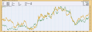
PK – I added the Yen which I had to do using FXY. FXY is an ETN that matches the Yen. As with all of these charts either in similar form or contrary to Gold, including the Yen, I see similarities but nothing that is consistently foretelling of a change in any of the other charts.
Your comment is reasonable. It is an important one. There are two or more possibilities (with variations):
1. Different markets are not useful or not very useful in predicting Au. These would include other precious metals, precious metal stocks, or currencies. Even less clearly useful would be other entities (price of Snapshot stock, or even price of commodities not used in production of metals).
2. There are correlations. Sometimes the correlations are purely coincidental. Sometimes they are not purely coincidental (platinum or GDX vs gold, for example). Even when not purely coincidental (platinum vs gold, for example, there may not be an unassailable **direct** causal relationship between the two, but rather an indirect causal relationship. Whether causal or not these correlations can be predictive, if only because investors/speculators are using them. However the degree and nature of correlation does not hold true in all epochs.
(a) Thus one entity may correlate well in one time frame but poorly in another. It may correlate positively in one time frame but negatively in another or not at all. Its degree of correlation may depend on co-correlation with one or more other entities. For example, the Yen may correlate now but may not correlate well if at all a year from now. Its correlation may have something to do with the Japanese interest rates, oil prices, Japanese tax rates, or Fukashima radioactivity yields.
(b) The time lag of correlation may vary from epoch to epoch or within an epoch. For example, the change in yen pricing might hypothetically lead the change in gold price by a day this week, by 3 hours two weeks from now, by 1 week 4 weeks from now. 3 weeks from now the change in yen price might temporarily but consistently lag the gold price change consistently by 6 hours for a few days. Simple correlation charts may not show the lag times adequately. They may particularly not show correlations well if the lag depends also on 3d or forth variables (such as changes in oil price, change in silver price, reported Japanese inflation numbers, etc). Simple correlation charts can be useful and interesting, but one goes up against propeller heads at the large institutions with fancy arrays of data and snazzy statistical software. One hopes their propellers get in the way of their vision.
Personally I clearly believe (2), that there are correlations that can be used. How useful they are I don’t know. I think it is an interesting discussion topic, conclusions not at all obvious, and a great one to have brought up. Thank you.
I clearly don’t believe (3) that one will find a correlation that consistently works adequately on its own in a predictive fashion in all epochs. Even changes in Ag or in a gold index, which correlate extremely well with changes in gold price, are not great for ***predicting*** changes in Au price, or at least any better than change in Au price is good at predicting Au price. (If you look at the auto-correlation of change in gold price to change in gold price from day to day or week to week you will see that it tends to be excellent,–but at least by itself it’s not a great trading tool.)
Thanks for responses guys
Wait don’t go…What am I supposed to do with these here tomatoes .
Sometimes a co relating chart can give a heads up , Like when the Dollar Yen Chart Broke Down…that was a big clue for us that Gold would rise….the gold chart was not breaking out at that time. Clues and Odds…Timing !
Make a big pot of tomato sauce!