Evidence demands a verdict- Stock market remains bearish.
Here are just a few charts depicting bearish evidence. Personally I am not trading the stock market as I am holding long in the PM sector and a few specialty stocks. This post goes under the category of footprints of the bear. I still see the evidence indicating we are in a broad distribution top. Until DOW theory indicates a primary trend change to bullish you can find me in the bears den with the grizzlies .
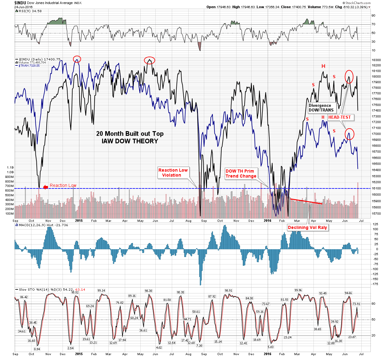
Above is my tracking of where we are at IAW DOW theory. Pretty cut & dry we remain in a primary down trend. Granted its taking a long time to develop, but that’s because so far it has taken the form of a broad distribution top. There is a lot of stock that needs to be passed on to the sucker class. Personally my investment style is to avoid bear markets and seek out bull markets. This is a somewhat new learned approach to markets for me as I did work the downside of the gold bear for its last 3 years, but frankly it wasn’t worth my energies. It was essentially a wash for me. It required way too much mental energy even though I had the trend correct from a fairly early time. Maybe when I can become a full time trader I will reenter a bear market but not for now.
This chart is a pretty comprehensive view of what Mr. Market has been up to over the last 2 years. Even though this is a simple method that is tried and true over 120 years, probably not one in a thousand market participants even know what this is saying to us. It is the graphical depiction of the language of the markets, which is showing stocks moving from strong hands to the uninformed. Spend some time with this chart as it tells the story.
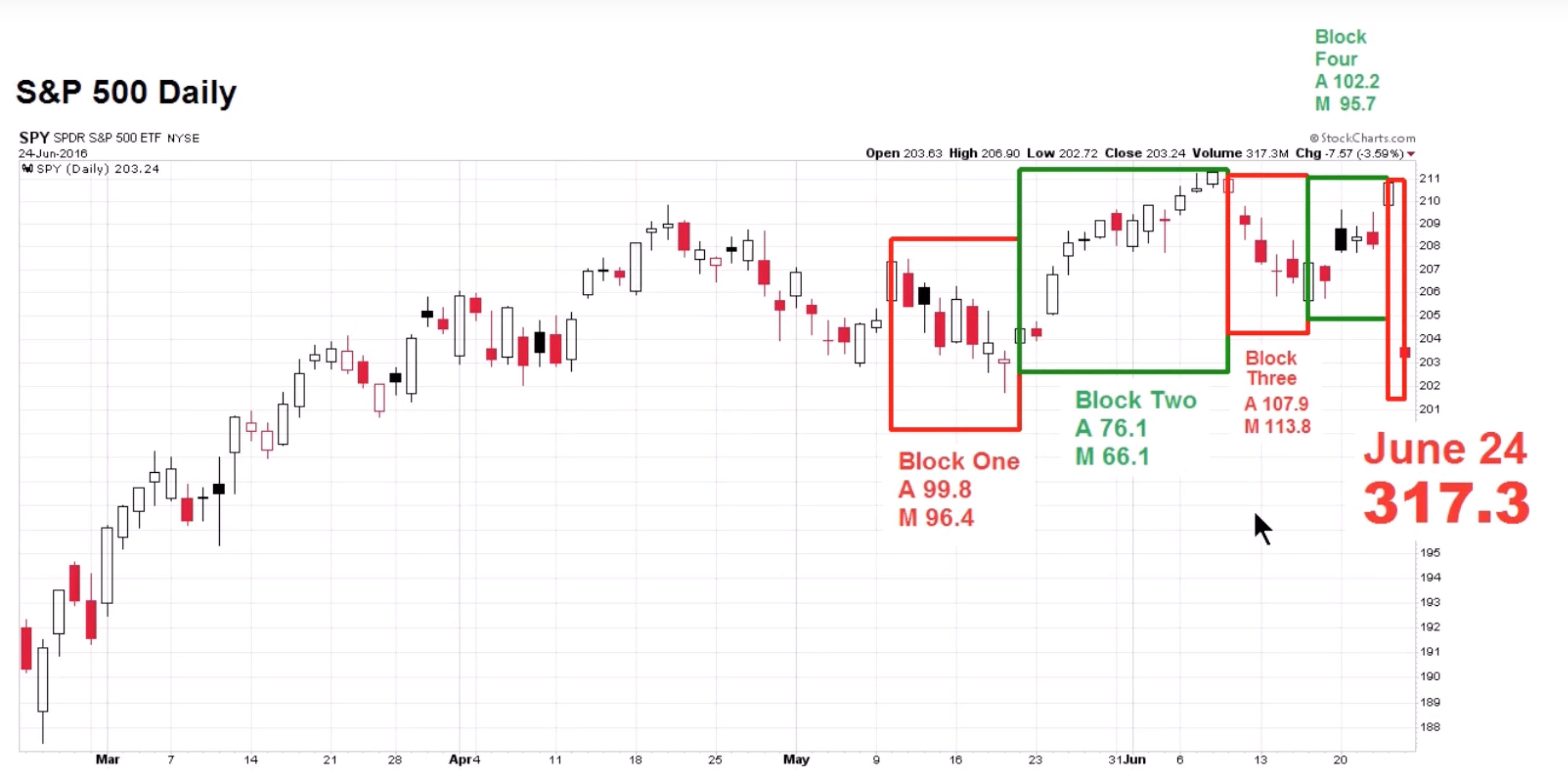
So let’s take a look at some others. I took the next few charts off of this weekends CCM video and present them as evidence. This first one is all about the volume. It analyzes the last 2 rallies and declines and compares their volume listed as both A=average, M=median. Clearly it’s showing the foot prints of Mr Grizzly. Again this is what distribution looks like. Low volume rallies higher volume declines. Can you say who’s your bag holder?
Next let’s look at the NASDAQ, it has spent the last year forming a series of lower highs. Note the two dashed lines across the chart. That shows the unfilled gap of the mid period H&S top which has served as resistance and it just gave it up again, verdict: bearish

Now a measure of risk on vs risk off which makes a statement by comparing the SPY with bonds. In the this chart note how it has broken the blue support line in this recent formation. Looks like it’s time to pull in the horns.
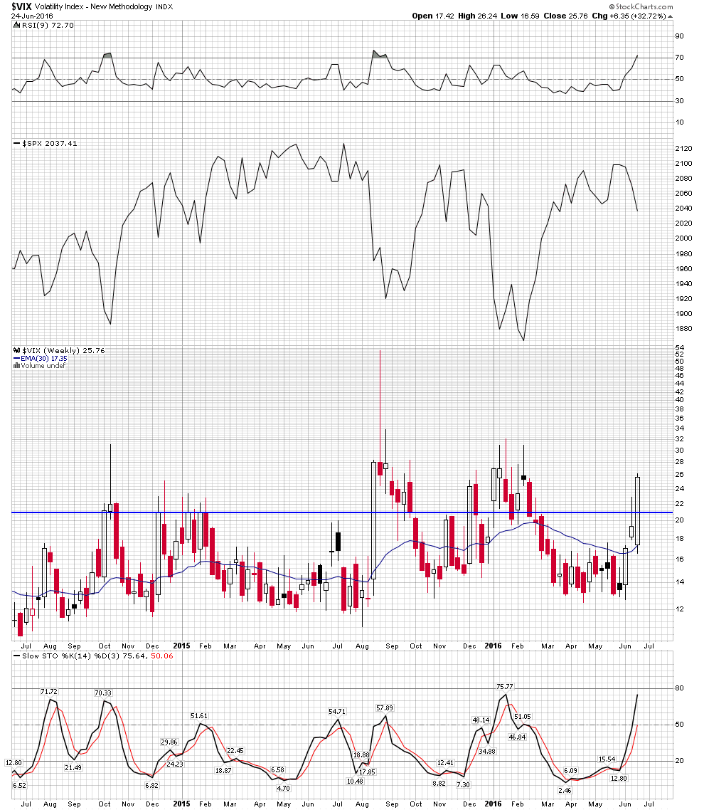
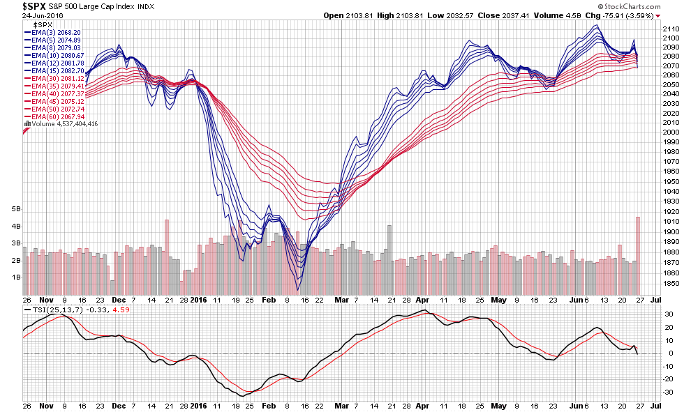
These next two charts from my collection show VIX now configured for the market to fall. Nothing says that it can’t reverse upward, but momentum is now to the downside so reversing it would require some work. And finally the moving average complex also shows the momentum of the market is now turning downward. None of these charts standing alone prove anything, but taken as a group it is compelling. Verdict: bearish
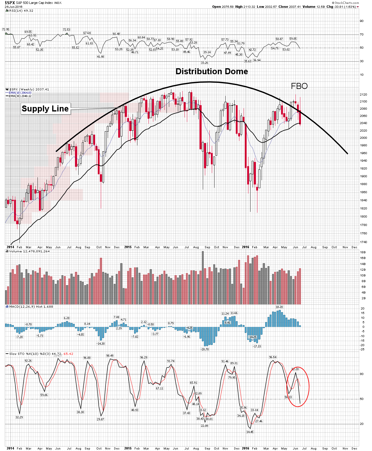
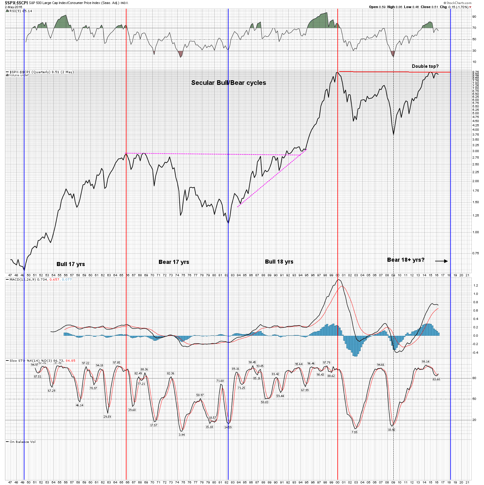
An update on two of my big picture charts. Note on the distribution dome chart the heavy supply by price now caping current price and on the SPX/CPI chart the failure to reach the top line here and poised to now fall.
Thanks Plunger
This is Compelling Work
I have had nothing but losses trying to short the damn things though
I agree with trying to find a bull and ride it