THE HISTORY OF THE CENSORSHIP INDUSTRY
JOIN THE DISCUSSION
Goldtent TA Paradise
GOLDTENT THE MOVIE
GOLDTENT STATEMENT OF NON VIOLENCE
WE ARE THE MEDIA
READ OUR DISCLAIMER
THE WIZARD OF RAMBUS
CONTACT
>GOLDTENT< WE CAME FOR THE GOLD
RAMBUS CHARTOLOGY BLOCKBUSTER CHARTS
COMPLETELY SHATTERS THE VACCINE INDUSTRIALCOMPLEX
SIX WAYS
*2020 ELECTION FRAUD ( AND MORE)
ZIONISM NEOCONSERVATISM AND AMERICAN HEGEMONY
33 Shocking Facts That Prove That The Entire U.S. Healthcare Industry
DEEP STATE STARTED THIS WAR
THE UNIPARTY UNMASKED
JEFFREY SACHS EXPLOSIVE TESTIMONY AT THE EU
O CANADOGE
THIS IS WHAT DRAINING THE SWAMP
MAJOR STUDY CONFIRMS
$CANADIAN GOLD PRICE
THE DEEP STATE AND TRUMPISM
CANADIAN GOV'T FORCED TO ADMIT
THE NAZIS NEVER WENT AWAY
2 MEDICAL BOMBSHELLS
COMPLETE COMPENDIUM
WACKOS
CATASTROPHIC BOMBSHELL
Polls
 Loading ...
THE CHOSEN ONE
EIGHT DYING PRESIDENTS
MEDIA BIAS CHART
TRUMP TRIUMPH
WARPSPEED STOPPED THE FEMA CAMPS
MASS TRUMP PSYCHOSIS
THE WOLFOWITZ DOCTRINE
WHAT'S ACTUALLY IN THE "VACCINES"
THE CULT OF MODERN MEDICINE
MASSIVE STUDY : WORLDWIDE EXCESS DEATHS
HOW MANY VACCINES ??
A REPUBLIC VS A DEMOCRACY
NUCLEAR WEAPONS ARE A FANTASY
WHEN THE FINANCIAL SYSTEM IMPLODES
NO VACCINES HAVE EVER SAVED LIVES
CANADIAN TREES CLEAN 10 MORE CARBON
THE THEORY OF EVERYTHING
THE OBLITERATION OF VIROLOGY
THE PARASITE PARADIGM
SHEDDING IS REAL
A BRIEF HISTORY OF THE ISRAELI PALESTINIAN REGION
"ORGANIZED" RELIGION
DEFINE WOKE
1000 PEER REVIEWED ARTICLES
1.600 SCIENTISTS DESTROY THE CLIMATE GHOULS
VACCINES IN GENERAL
WHERE DID THE FLU GO ?
CANADIAN TRUCKERS FREEDOM CONVOY
* THE GREAT AWAKENING
CHOLESTEROL AND STATINS
THE GERM THEORY
PSYCHOPATHS
PCR TEST WAS COMPLETE BULLSHIT
JEFF CHILDERS
THE ANTI-VAXXERS
UM...SORRY GUYS BUT
BE YOUR OWN DOCTOR
- * DMSO HANDBOOK *
- * THE RANT *
- * THE UBIQUITOUS PHARMACEUTICAL SOCIETY
- 100% CANCER REMISSION (MONOCLONAL ANTIBODY)
- 2ND SMARTES GUY CANCER PROTOCOL
- ANTI PARASITIC DRUGS SHOW STRONG ANTI CANCER EFFECTS
- ANTIPARASITIC VETERINARIAN DRUGS SHOW PROMISE FOR CANCER TREATMENT
- BLOOD PRESSURE SCAM
- BREST CANCER AND THE VAXX
- BRUSH YOUR TEETH DAMMIT
- C D S ( CHLORINE DIOXIDE SOLUTION )
- CBD GUMMIES AND TIGER WOODS
- CHLOESTEROL : A BIG PHARM BIG CON
- CHLORINE DIOXIDE DETOX
- CURCUMEN
- DISSOLUTION OF SPIKE PROTEIN ( NATTOKINASE)
- DMSO : MIRACULOUS PAIN TREATMENT
- DMSO2
- EARTHING
- FENBENDAZOLE Q AND A
- FIBROUS BLOOD CLOTS TREATMENT
- FLCCC VACCINE DETOX PROTOCOL
- HEALING POWER OF ILLNESS
- HEALTHY GUT BACTERIUM MICROBIOME
- INFLAMATION
- IT'S DEPRESSING : ANTIDEPRESSANTS KILL
- IVERMECTIN AND FENBENDAZOLE TO PREVENT CANCER
- IVERMECTIN PILLS HERE
- IVERMECTIN PROPHYLACSIS
- IVERMECTION CURES CANCER ?
- LIPITOR WARNING
- METHYLENE BLUE
- MICRODOSING LITHIUM BOOSTS YOUR BRAIN AND PREVENTS ALZHIEMERS
- MRE ON DMSO
- NATTOKINASE …SPIKE DETOX
- NATTOKINASE : THE HOLY GRAIL FOR SPIKE DETOX
- NATTOKINASE DISOLVES MICROCLOTS
- NEW STUDIES AND PROTOCOLS
- Ranking the Top 19 Terminal Cancer Repurposed Drugs
- SHEDDING IS REAL : WHAT CAN YOU DO ABOUT IT ?
- SSRI ANTI DEPRESSANTS ARE A HORROR STPRY
- TETANUS
- THE GREAT BLOOD PRESSURE SCAM
- THE VEGAN SCAM
- TOP TEN DETOX ITEMS
- TREATING COPD NATURALLY
- TREATING COPD NATURALLY
- UVBI ( ULTRAVIOLET LIGHT BLOOD IRRADIATION )
- WHY HERBS AND SUPPLIMENTS WORK ( McCULLOUGH)
- YES VIRGINIA..A CURE FOR CANCER
THE TREE OF SHARED INFORMATION
BAD BATCHES
THE SPIRITUAL REASON
17 THOUSAND PHYSICIANS AND SCIENTISTS
WHY SOME HAVE ADVERSE REACTIONS AND OTHERS DON'T
WHERE DOES ELECTRICTY
GEOGRAPHICAL WONDER
THE REAL ANTHONY FAUCI
ANTIVAXXERS
* WELCOME TO FORT DETRICK
* STATISTICAL TRICKS
* THERE IS NO CLIMATE EMERGENCY
* THE BASIC LAWS
* TOM LUONGO'S THESIS
* ADVENTURES OF GOLDBALLON
- **THE COMPLETE WORKS OF THE ADVENTURES OF GOLDBALLOON
- ARTIC SKIING IN RUSSIA
- AZERBAIJAN ROAD TRIP
- CHECHNYA
- COMPLETING THE LOOP IN TAJIKISTAN
- DIOMEDE ISLANDS : FROM USA TO USSR IN A BALLOON
- ENNEDI CHAD
- ENNEDI MALI 2
- FAIRY MEADOWS
- FROM THE ROOF OF THE WORLD
- ISTANBUL AIRPORT ART
- KALININGRAD
- KAMCHATKA
- KARELIA RUSSIA'S REMOTE NORTHWEST
- LITHUANIA LOVES UKRAINE
- MIDNIGHT AT THE OASIS
- MONGOLIA
- MOROCCO
- MOROCCO2
- MOSCOW FEB 2023
- NECTAR OF THE GODS
- NORTHERN PAKISTAN
- ON TARGET FIXATION
- PARMIR MTNS TAJIKISTAN
- SEVASTAPOL CRIMEA
- SEVESTOPOL CRIMEA
- SIBERIA 2
- SKIING IN SIBERIA
- SPRING IN mOSCOW ( ANOTHER LOOK)
- ST PETERSBURG RUSSIA 2014
- ST. PETERSBURG RUSSIA
- STONED
- TAJIKISTAN
- TAJIKISTAN 6
- TAJIKISTAN PARMIR MOUNTAINS
- TAJIKISTAND MOUNTAIN CLIMB
- THE BALKANS
- THE CRADLE OF CIVILIATION
- THE INTERVIEW
- THE LAST OF THE SIBERIAN SNOW 2024
- THE MIDDLE OF EVERYTHING
- THE STONES AND THE DOORS
- TIKSI SIBERIA
- TOP OF THE WORLD PART 2
- TREAVELS AT THE EDGE …MOROCCO
- TRUCK ART
- TURKEY 3
- TURKISH DELIGHTS
- TURKISH DELIGHTS
- UKRAINE 2015 …UNBOUNDED BEAUTY
- ULAN-UDE RUSSIA
- WINING AND DINING IN FRANCE
- YAJIKISTAN : GOING DEEPER
- YAKUTSK
- YAKUTSK SIBERIA
* MASKS HARBOUR PATHOGENIC
* WHAT IS A WOMAN
* WUHAN MILITARY GAMES
* OPTIMISM
* THE FREEDOM CONVOY
* NATURAL IMMUNITY IS KING
* 34% OF CANADIANS UNVAXXED
* COVID: ISRAEL VS PALESTINE
* THE THREE STAGES
* 100 MILLION AMERICANS
* GROUND ZERO
* COVID VACCINES CANNOT WORK
* HISPANIOLA
* PUBLIC HEALTH
* WHO ARE THE VAXX REFUSERS
NATURAL VS ARTIFICIAL IMMUNITY
THE ORIGINS OF COVID
POSTING INFORMATION
Will The pattern Repeat ?
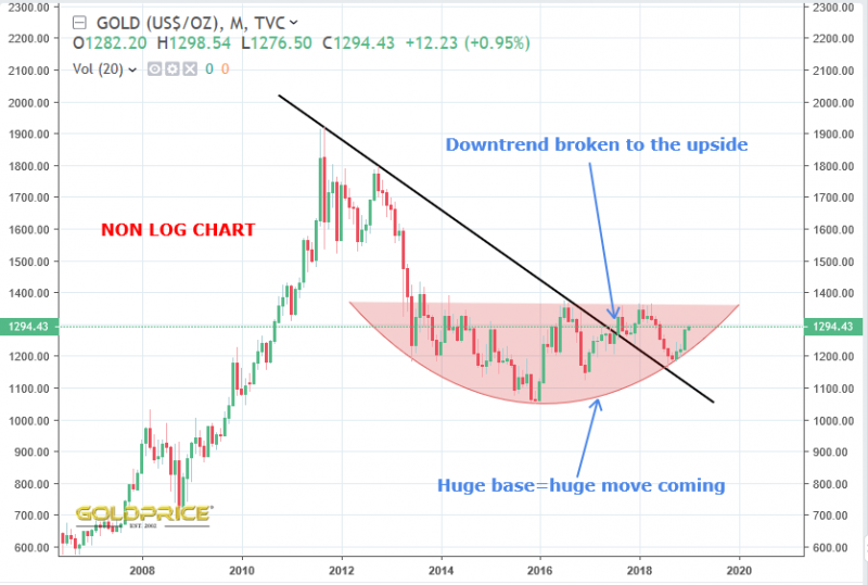
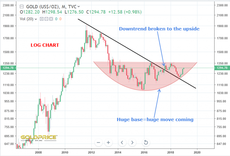
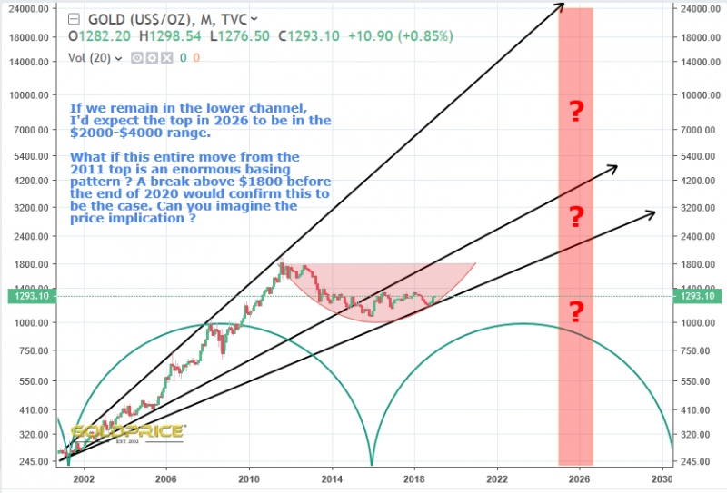
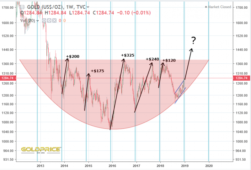
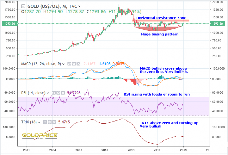
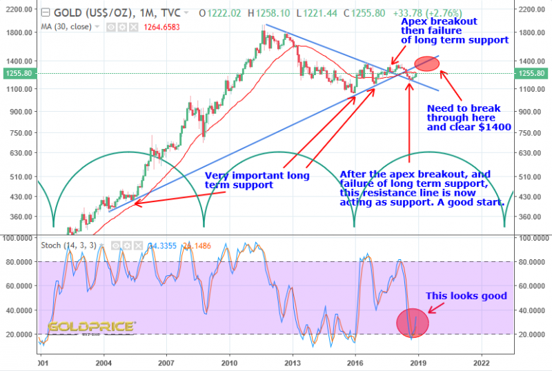
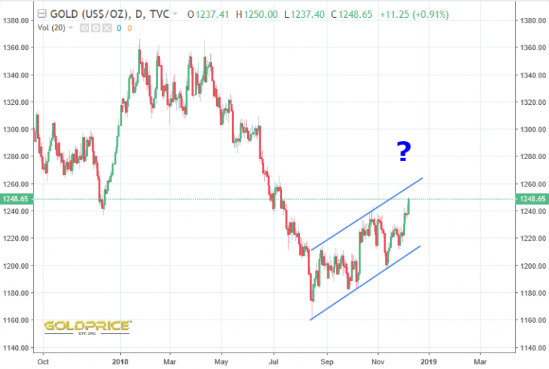
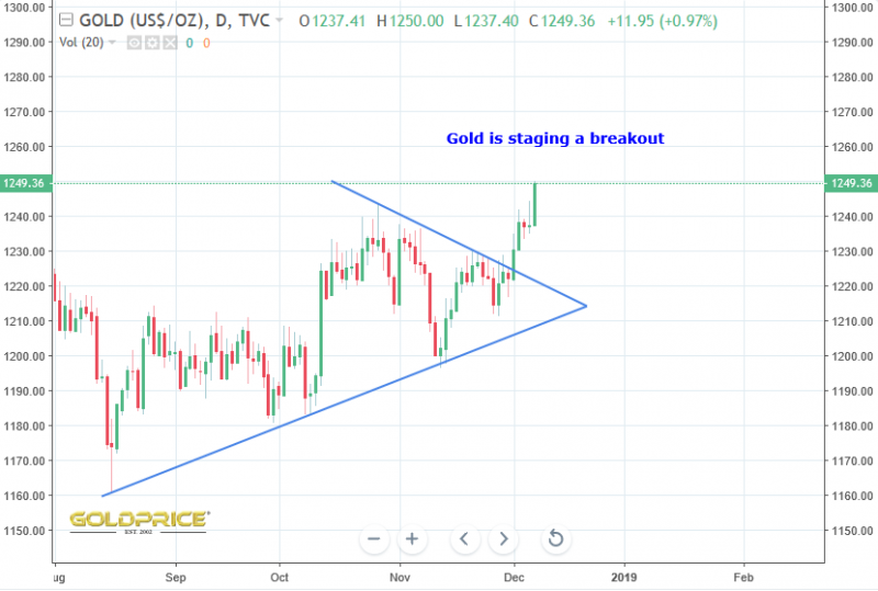
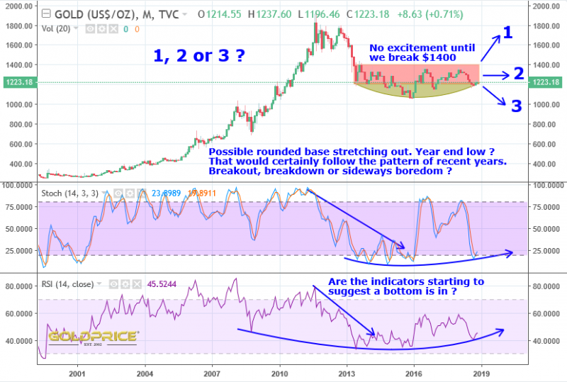
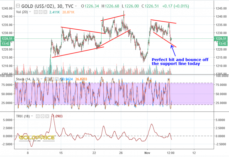
For several years now, gold has surged out of the December low to gain between $100 and $300. That would give us $1400 to $1600 gold. Coming out of a huge basing pattern, with favourable COT numbers and technical indicators, I think we could easily be towards the top end of that range within 3 to 6 months. I could be wrong, and only time will tell.
So Far, So Good
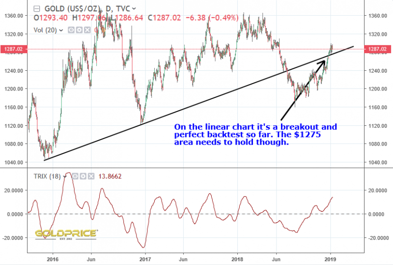
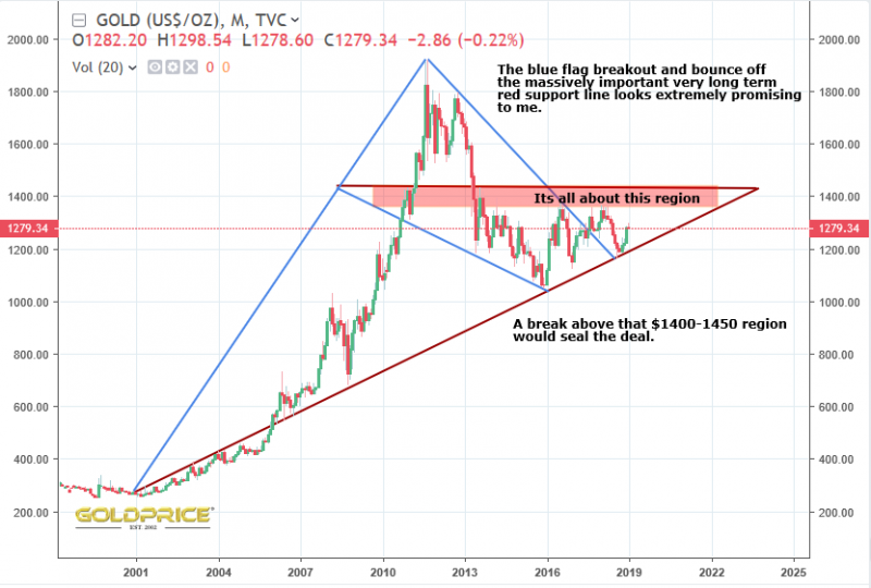
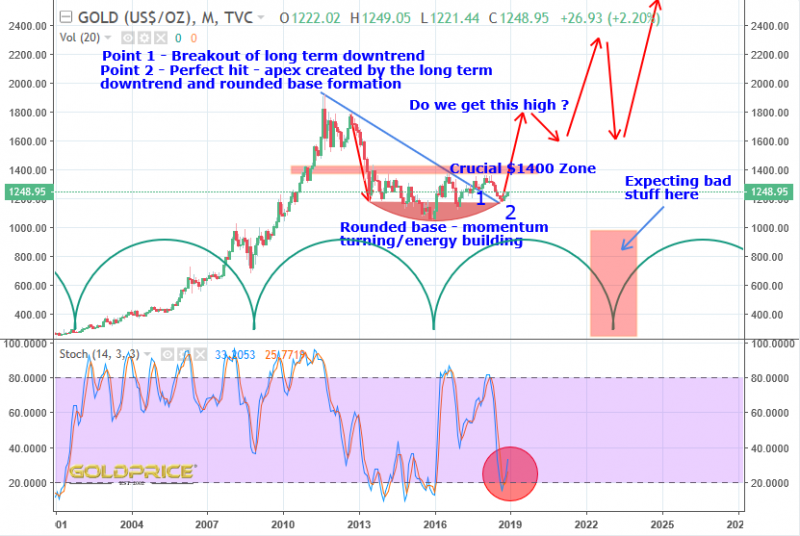
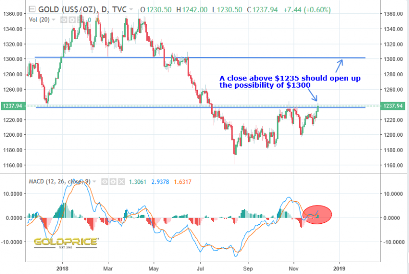
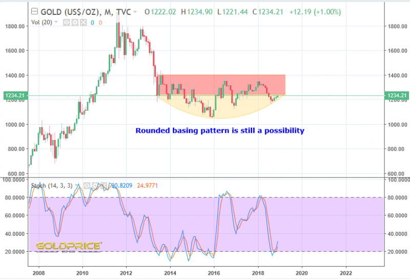
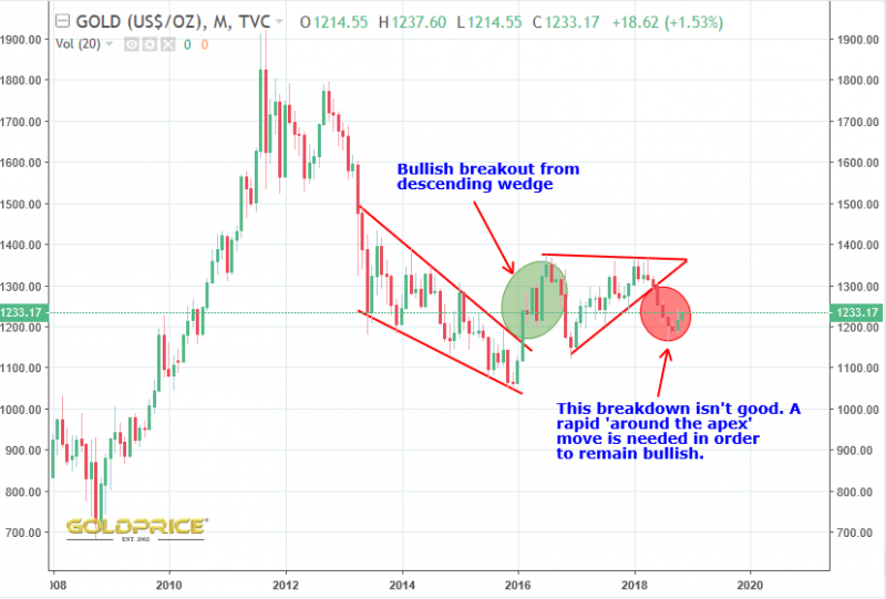
As I’ve said many times, we need to break above the $1400 horizontal resistance zone to complete the move into a clear bull market that can’t really be denied. Until then, there is still room for debate. So far, so good though, and the various indicators are looking very supportive of a sustained bullish move.
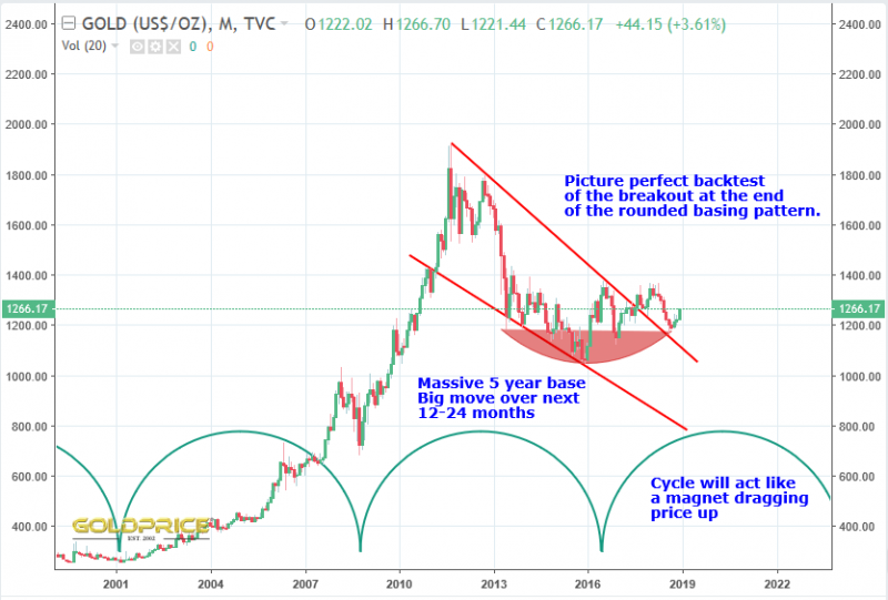
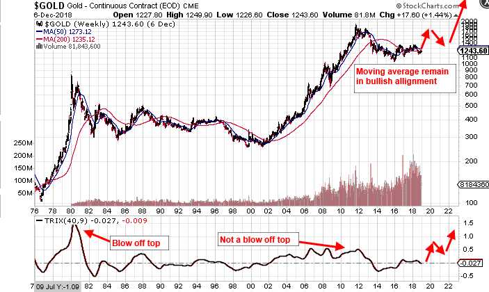
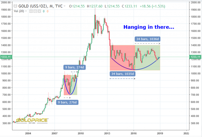
Just look at that rounded base pattern – if it’s the real deal, and we break overhead resistance in the coming weeks/months this is going to be a very exciting time. I’d expect a breather soon, but the mood music is changing. The Fed is boxed in, with rate hikes looking less and less unlikely. Gold will love it, I’m sure.
Beginnings And Endings
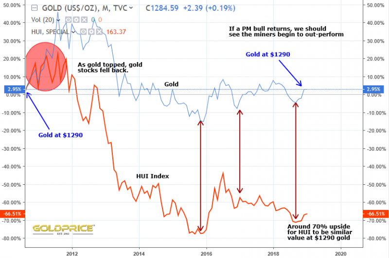
You know it, I know it, Wall Street knows it, the Fed knows it. This is the beginning of the end for rate hikes, and the end of the beginning for the PM rally to come.
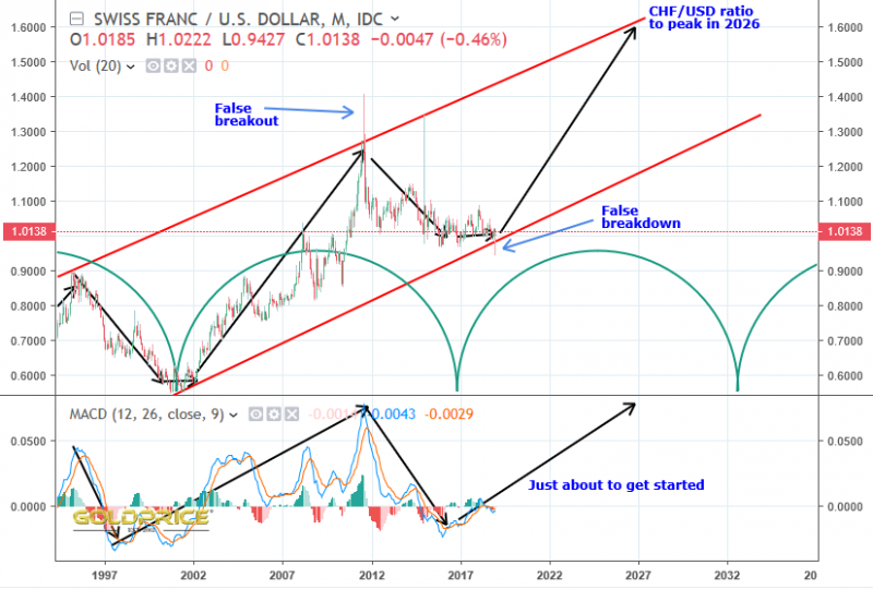
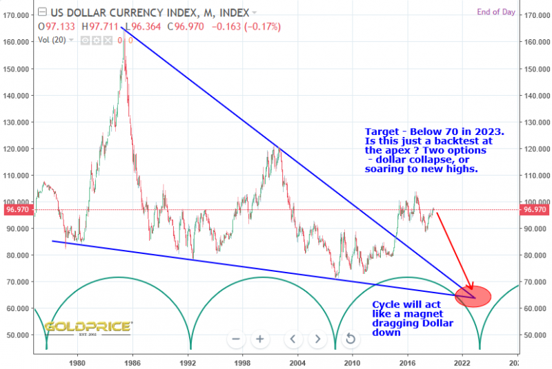
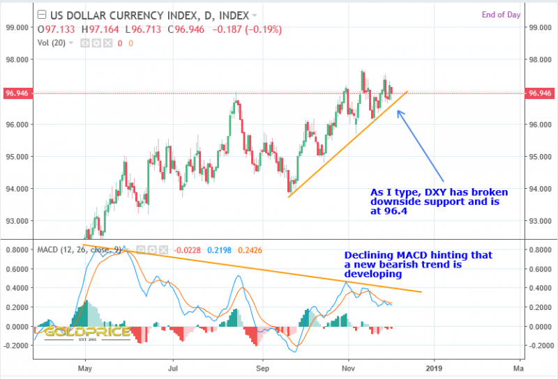
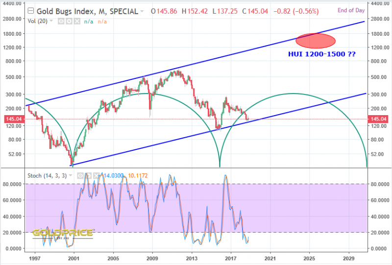
We’ve seen a huge 5 year basing pattern in PMs and the charts below are telling us in no uncertain terms – gold knows what is coming and, so does the sickly looking dollar. The fed has nowhere left to turn and markets are beginning to figure it out. 2019 is going to be fun.
Silver – Big Picture – Northstars Bullish Version
Another way of looking at the silver price action. I believe this is all part of a bottoming process at the major cyclical low, and that we will break back into that wedge formation, and ultimately up and out of it. It goes without saying though – any move below approximately $14, below the lower support would be bad. Very bad.
Those indicators look ideally poised for a big run up to me. I could be wrong though.
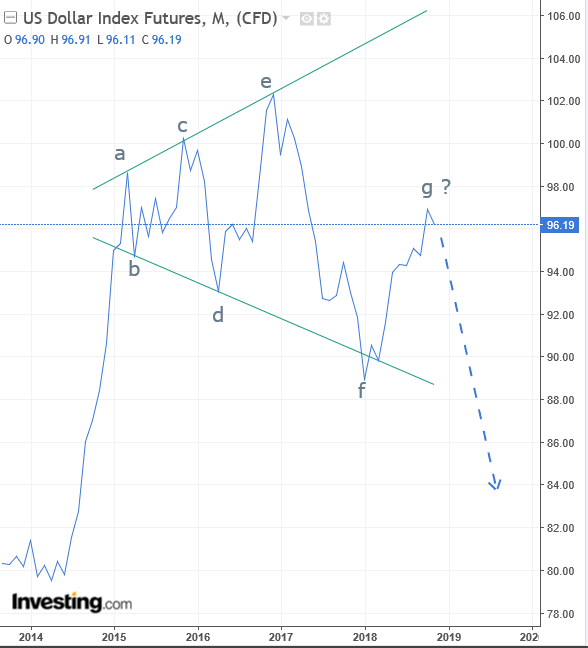
Still Toast
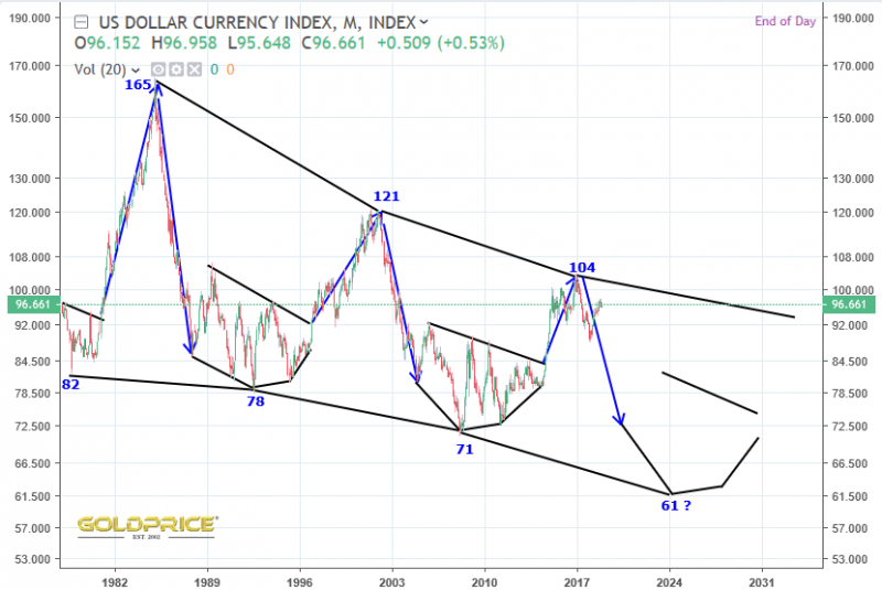
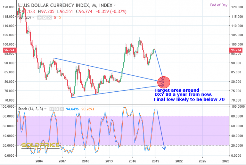
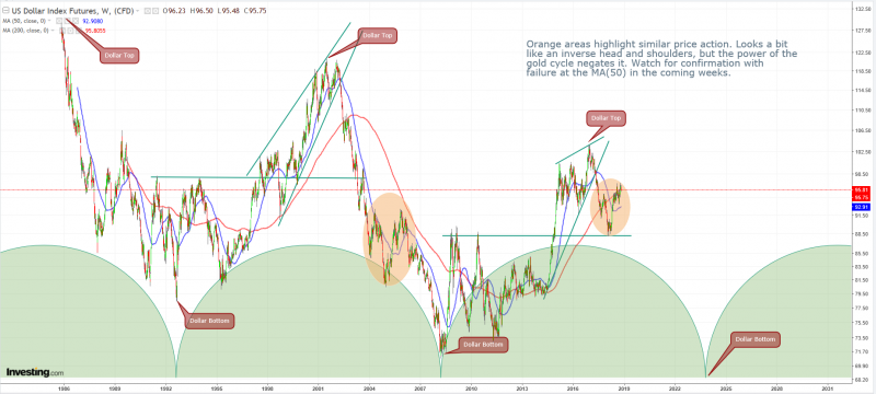
I’m on record as saying the dollar is toast https://goldtadise.com/?p=421165
I stand by that, and it’s just possible the next downturn is at hand…
Q Anon
Or whatever it is… I’m assuming that was a load of bull then ? Nothing seems to have happened.
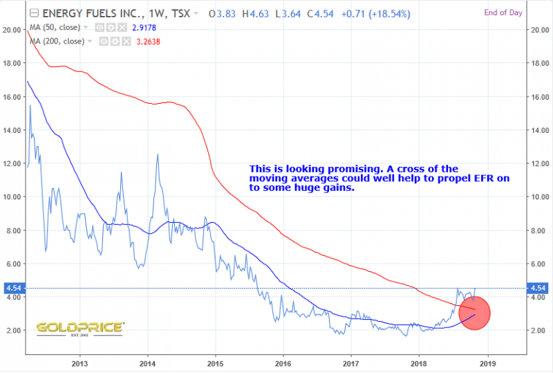
Another Look At Energy Fuels – Poised For Lift Off ?
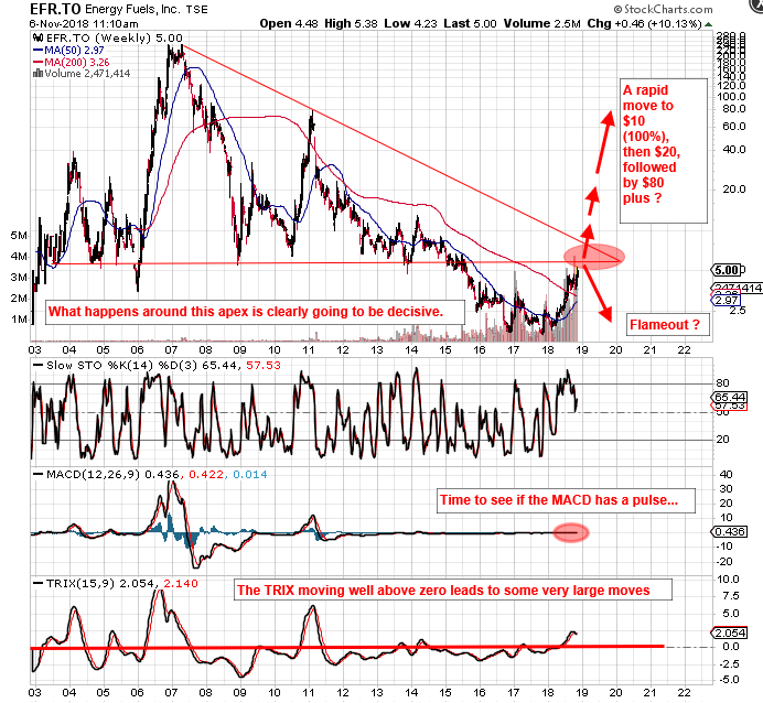
Some impressive moves in the Uranium sector recently, but I’m not going to get too excited until we see a more definite breakout, It’s possible we could get turned back down at the bottom of the triangle. Fundamentals are good and the price of Uranium itself is finally rising in response to increased global demand (and anticipated future demand) and reduced mine supply. Moves in this sector are rapid and violent – hundreds or thousands of percent in a few months, making it possible to turn $1000 into $10000, $20000 or even $50000. If this takes off again it could be quite a ride.
Energy Fuels And The Uranium Sector
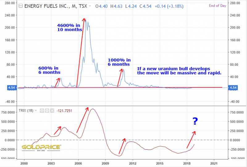
Some enormous gains now (up 16% today, at the time of writing). I managed to get into EFR at a share price of around $2 (CAD), which is around a 150% move so far. I’d expect 1000% in the next 6 months if this is the real deal Uranium bull awakening. Here’s a chart that shows how much and how fast this sector can move…
A flame out is possible I guess, but the fundamentals are looking very good. I’m holding on tight…
Edit: Mega Uranium up 21% today
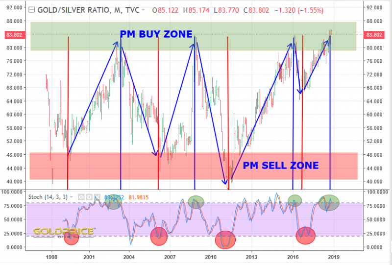
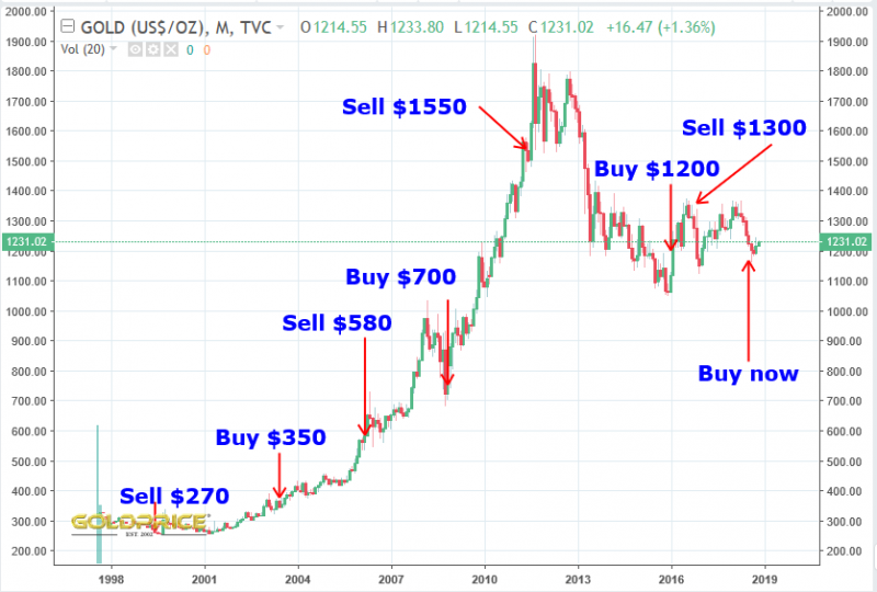
Gold Silver Ratio Buy Signal
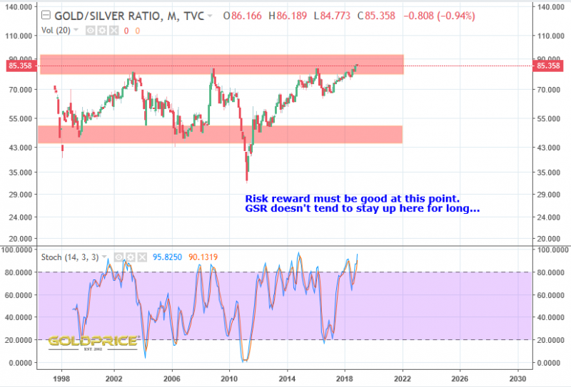
GSR is just one indicator that’s telling us this could be a favourable time to buy PM’s. Given where the ratio is, silver is great value. Could the ratio go higher ? Yes, but risk/reward is strongly in our favour here. Primarily an indicator for when to rotate from gold to silver and vice versa. The first chart shows the buy signals on the GSR chart. The second one overlays those signals onto a gold price chart. I thought it was fairly interesting, and another thing to consider.
