Yearly Chart of Gold says Multi-year Pullback Lies Ahead.
I don’t want to scare the bugs but this chart is “Yearly” gold meaning each candle represents a years time. Its pretty clear we are near a top if not all the way there and a multi year pullback is now expected. I don’t need to add much more. You know the drill.
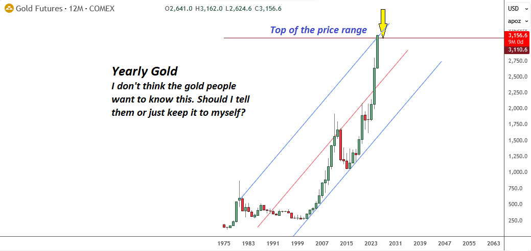
I may be wrong but after a healthy pullback the world is still facing exploding sovereign debt loads and Central Banks are flocking to Gold as they know the end of the debt based system is nigh.
Yes its all true. But where the problem develops for investors is they cannot seem to understand the element of time and how nothing happens on their perceived schedules. Charts help us keep it all in focus and remind us not to get ahead of our skis.
Long term charts should be logarithmic and inflation adjusted – which takes the (fear) message out of this chart.
Also, this simply reflects the devaluation of what the USD can buy (or any currency for that matter), and for which there are hundreds of examples of them (fiat) going to ZERO (or effectively such – aka the Pound). When is gold going to be worthless – ie not a store of value? I’m still going to give you paper in exchange for your gold.
“Long term charts should be logarithmic”
Absolutely. Was about to post the same.
And yes, fiat disease is getting worse.
But Risk Off is likely causing margin calls, and so — sell what you can not what you wish.
Reasoning? Why should long term charts be logarithmic? Because they make you feel differently? In this case a log chart would not improve anything at all. The net effect is the same either way. A top has been hit and there will be a pullback in 26, 27 and likely 28. Unless you just like holding non performing assets. Then log away to happiness.
A Log chart is best for long term because it shows % moves . Linear Moves work for short term
Again IMHO
https://schrts.co/FemTnJGs
Well my chart shows a car accident and it has real blood and broken teeth. It warns me to remain seated on my bus and not get out and be looking around for more photos. I like my chart better becaause its quick, concise and easy to read. Your percentage chart does not tell me anything at all.
Agree with YYZ here
A Pause will be healthy….gone parabolic
But no where near done yet IMO
Your percentage chart does not tell me anything at all.
It says 2 years sideways then up….so hold
Avi Gilburt thinks the decade long bull in Gold is over. You know the old saying. Bull markets peak on good news at least for the asset and bottom on bad news. I know most of you guys have lived through a few of these cycles. None of this ever has to make any sense.
I am with Avi. He is an Elliott Wave guy and my chart by years shows a perfect 5 Wave Elliot move to be followed by a three wave decline. So gold will go cold until at least 2028 and possibly 2029. What we want between now and then are dollars. 99% of all USD is electronic. But that 1% paper is the same as gold if you are a self custodian and keep it at home.