Proof that Gold is Entering a Bull Market
This is a republish of post I wrote and printed on March 13th 2023. I brought forward the original comments from back then. There were enough objections that I had decided to withdraw and just forget it for awhile. So it has been sitting getting moldy after having lasted just one single day in print. But I am thinking it had merit after all.
Not surprisingly (at least not to me), the post has aged well. What I was identifying on March 13th was what I believed was a key reversal point that should have been turning us all into bulls. To be precise, it was the second of two touches on the rising diagonal green line. A kind of a double-bottom in a sense but one that takes place on an angled line.
There is no technical term for this kind of double-bottom, but we see them all the time. They are valid. So here is my post again. But this time I have added the words “inflation adjusted” with a little extra commentary in italics to make it very clear this is not a typical gold chart. Hope it ages better this time. Especially as gold has shot up more than 160 dollars since I first wrote the post.
————————————————————————————–. .
Sometimes we need to look at very long term charts to separate the forest from the trees. Gold can be confusing at the best of times as it gives what appear to be conflicting signals disorienting just about everyone. But if we look at very long term charts it helps clear the air. And that is what todays chart is about.
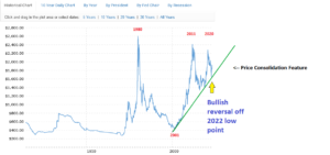
Below is the 100 year “inflation adjusted” gold chart presented by MacroTrends. You can quickly scan it and see what appears to be a very negative pattern subsequent from the 1980 peak. The two high points of 2011 and 2020 came in lower than the 1980 top. Gold looks doomed from that perspective. Some may argue it even looks like a bubble top with twin peaks of Lower-Highs. A price collapse is inevitable in that case.
(Please keep in mind the chart has been adjusted for inflation back to 1913. So the prices and peaks will not immediately compute with you if you are comparing it to a standard gold price chart. It is believed that Macrotrends is using the CPI for its adjustments. So we won’t be debating their methods here today….just presenting the chart exactly as they have offered it.)
Looking a little deeper in the chart we can see that it has bounced sharply off the diagonal green line where 2022 put in a low point. That diagonal green line is acting as a very solid support. So our view now changes and it becomes obvious that the negative pattern of peaks is actually a halfway consolidation feature. From that standpoint the measured move should take gold up above 2700 dollars as the breakout persists. I really like this chart. It is informative from the big picture viewpoint and helps us bulls keep our eye on the ball and not get distracted by what looks gloomy to others.

Please explain what that chart is supposed to represent? It certainly isn’t the actual price of gold which never reached those price levels and certainly, unlike silver, has made higher highs in both 2000 and again twenty years later. What type of comparison is it meant to reflect? Gold compared to what? Rate of increase or something else? Thanks.
Link posted below. Thanks for the reminder Chartsmaster. If you are still not getting it though I will delete and then rewrite the post from scratch since I neglected some key details in the first round.
PS, I agree that long term charts provide a better perspective and agree with you that gold is in (or entering a bullmarket). Just don’t understand what the chart is depicting?
Corrected by govt CPI or what?
Sorry, sorry, sorry……getting lost in charts and forgetting to explain all the details to everyone. Ha ha ha ha ha!!!
Yes the chart is inflation adjusted back to 1915. The easiest way to explain it is to let you use the interactive chart yourself
as its self explanatory. Here is the link to the original:
Gold Prices – 100 Year Historical Chart – Interactive, inflation adjusted, log scale
https://www.macrotrends.net/1333/historical-gold-prices-100-year-chart
Here is a new comment..Your chart nailed it …I was a skeptic …
You Go Farmer
OK thanks man. Hope the chart makes more sense this time. I was at fault for the poor explanation first time around. But I agree. Gold is going to be a big winner. My target is 2700 dollars for this current cycle. The final C-D leg is just getting started but should see gold rise relentlessly for the next couple years if the A-B leg is any indication.