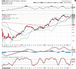
$TNX
It’s the only chart that matters. The weekly chart looks like it is primed to explode higher. That is probably going to destroy the mining stocks.
Talk about an absolutely beautiful, bull market chart! Very measured, and it is respecting all the key moving averages like a true bull should! This is what I fantasized my mining stocks would look like. The move on a log chart has been up for 3 years in essentially a very steep, straight line. Maybe that means it is ready to cool off, but my guess the run ends with an explosive yearly top that is just getting started.

Good Chart Sir Naut.
I agree $TNX is the key
Here is the weekly
https://schrts.co/fYnSZKIq