A Reversal of Fortunes
There is an old expresssion that states “what goes up must come down” 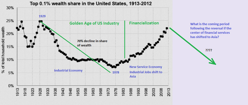 and in the world of charting it is often appropriate to use that term as we know very well there is a cycle to everything in motion. And so it is the case with todays chart showing the wealth share of the zero point one percent (0.1%) of the US population. This is the wealth share of the billionaires in other words and is distinct from other charts that typically show the wealth of the upper one percent (1.0).
My chart ends in 2012. Unfortunately I was unable to locate a current version that included 2021 that also contained data back to 1913 when the Fed was formed. But we can work with this anyway as the .1% wealth share has more or less stalled below the 25% share level shown here.
What I wanted to point out here is that the last time this group saw a major reversal in their fortunes was after the crash of 1929 which led to the Great Depression. The decline was dramatic as you can see. We all know how hard life was for the average person for the decade of the 1930’s that followed the great crash but nobody ever notices that the wealth share of the billionaires crashed by about 70% over the half century that followed. What this means in other words was that a larger share of wealth accrued to working people as the economy started to rebuild when the Second World War ended. It was a golden age in America for its industrial capacity but also for the average workers and their wealth accumulation. They were after all buying housing from the very bottom of the depression market.
But the impact was also democratizing for the country from a financial perspective as some of the big monopolies of the day were broken up. And that was necessary in order for there to be enough oxygen for the process of rebuilding to get underway again. But how would you feel about such a chart if you were one of todays billionaires staring down a chart that warned the next major reversal was about to get underway? Remember, what goes up must come down. What if you were a Turner or Soros or Gates or Munger? Would the prospect of seeing 70% of your share of the wealth pie vanish over the next half century be all that appealing?
What might you do?
I think this chart helps explain a question in the minds of many people who are scratching their heads and wondering why the wealthiest people in our society seem to be attacking the man on the street with bizzarre vaccination policies, transhumanist goals and depopulation agendas. I suspect the wealthy are not prepared to give up their gains since the early 1980’s when the economy was financialized. Instead they are looking to consolidate what they already have and increase it further yet by bankrupting the rest. That is why you will own nothing and be happy. Because someone else will own everything and be even happier….
The chart is just a thought experiment though. You will have to draw your own conclusions about what comes next. The fourth turning or the fourth industrial revolution. Something big will happen though because this chart is nearing its terminus and if it does not fall then it probably means you are going to be a poor, landless serf eating bugs.
In an earlier post discussing the bond bubble bursting I was alluding to to the fact I believe what is taking place today is fundamentally about money. I mentioned that Africa was not heavily vaccinated as one of the proofs since Africa is utterly poor in relation to the rest of the world. Why bother with them when they are not the target of wealth aquisition. The wealth of Westerners on the other hand is a big fat easy target if you can come up with a method to strip it from their grip.
Remember how small business all had to shut down during the pandemic while the largest corporations all stayed open? You could go to Walmart but could not shop in the local shoe store. Some bullshit about germ theory and how it only circulates in places that the globalist want to bankrupt.
Well bankrupting small business was just the start. We know that now. Shifting wealth around by manipulated inflation was another. We have all been told how prices are quick to rise but they are sticky going down. Yeah, why is that exactly. You are not wrong to wonder why the benefits of inflationary price hikes always accrue to the same monopolies. Lately we are seeing that process in action but there is very little that can be done to stop it. This kind of inflation victimizes everyone to the benefit of the most dominant companies. And that is the intention since it really amounts to a wealth transfer from you to them. Taken to an extreme, inflation can eat the entire economy and all discretionary income.
The destruction of the food supply is another example of how prices have been manipulated upwards. The shortages of containers for shipping was another. The stranding of that container ship in the Suez a third. On and on it goes. And in the interim you were handed free money to spend which went straight into the pockets of those same dominant companies.
The same ones run by the people who do not like the looks of the chart up above. If they are going to succeed at growing their wealth and putting the breaks on what is an obvious reversal point then they need to break resistance levels. And that is exactly what this is all about. Yes its technical and yes you all know what I mean. The globalists are trying to break the chart up which will send the trend soaring rather than crashing back to Earth.
If they succeed, we will be going back to serfdom.
Unleash the masses! Ted Turner shouldn’t be included in the group as he already had his wealth pile shrunk by 90% or so. Holding onto all of that AOL stock did a number on TED. He turned out to be a great company builder but a not so good investor. I recall reading he was on a form of suicide watch by his family at one point when he got down to his last $billion…
I did not know that Plunger. Wow! Glad you are here to correct me! He is one of the 300. Still causing trouble no doubt.
“If they succeed, we will be going back to serfdom”
Serfdom, tax donkeys, what’s the difference?
About 40% or more, actually.
Back in the day, serfs had to pay 10% of their production to the King.
These days, for the working class, its 50%. With no winters off.
LOL, well no disagreement from me on those points Pedro. And it looks as though taxation will get even worse as time passes. Now they are talking about taxing inheritance and estates just to make sure less gets passed on to the next generation. We are indeed tax donkeys. There are no good solutions either except moving away to other jurisdictions or other countries. I mean, voting is pointless at this stage so leaving is the only thing we can easily do.