Week 42 – October 21 – UK Government COVID Stats – not looking good for vaxx
I hardly post (hence the shitty table screenshot below), but I read this website almost every day (more for COVID related stuff than gold now lol).
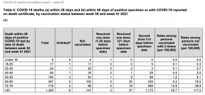
Someone help me interpret this chart on pg 15. To me, it seems like those with vaxx in the upper age groups are dying in a ridiculous proportion to non-vaxx. I’m just looking at the nominal deaths with second dose > 14 days compared to Not Vaccinated deaths.
I haven’t even factored the implications of the “rates among vaxx” and non vaxx columns on the right.. seems important.
https://assets.publishing.service.gov.uk/government/uploads/system/uploads/attachment_data/file/1027511/Vaccine-surveillance-report-week-42.pdf
VERY interesting! Thanks for posting. Please post the original website where this report came from.
Guys you missed Spock’s post this morning ..here is a much more clear picture and the website is Public Health England
https://goldtadise.com/?p=514207
I posted same data several days ago — way to read the table — lets look at over 80 year olds — says there have been 1365 total deaths — go over 5 columns “more than 14 days after second dose = fully vaccinated” is 1175 deaths –> therefore vaccinated death rate in over 80’s is 1175 / 1365 = 86%.
So in the over 80 category – 86% of the deaths are fully vaccinated individuals.
Repeat mathematical calculation by group to get the overall breakdown.
OVERALL SUMMARY = 2,745 deaths and 2,136 fully vaccinated = therefore 2,136/2745 = 78% for the period between week 38 and week 41 within the guidelines set out in the table heading!
So for the entire graph – 78% of the deaths are fully vaccinated individuals
Thanks for the detailed explanation. Any idea on how to interpret the 2 “Rates among XXXX) columns on the right or is it not worth looking into.
78% of deaths are fully vaccinated, such a scary stat. I can’t even convince my dad even with stats like these. totally brainwashed.
The two right hand columns show the rates per 100,000 of their class within the population. These columns appear contradictory to the other columns.
The percentage of the English population fully jabbed is 79.2% If they were giving saline jabs with no added Covid protection, I would assume that we should see 79.2% of the saline group to die from Covid. In the real world if the percentage of jabbed who die is over 79.2% then the jab does not work. As the weeks pass by we should see a higher percentage of the jabbed die. (higher than their Group %)
The bottom line is that the jabbed “do comprise most of the deaths” as they are the largest group by %. So not a pandemic of the unjabbed. Basically the Jab offers no additional protection. The Jabbed who are dying are tying up the hospital beds. Not the unjabbed.
We were originally told : take the jab and you will not get Covid and will not die from Covid. Wow the narrative has certainly changed!