Question Everything
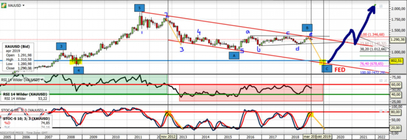
Here’s an example of why it’s so important to question everything you read. The only way to build up confidence in your forecast is to look at multiple scenarios and gather the evidence on both sides of the argument. Following a post I put on Twitter someone stated that gold was ‘going sub $900’. I genuinely want to consider all sides of the discussion, so asked why he thought that. He gave me a link to a chart someone had posted. Here it is…
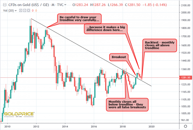
I noticed it’s a log scale, and immediately thought it odd. My log chart for gold doesn’t look like that. This is a case of someone drawing a chart with thick lines to fit their bearish narrative. Notice how they’ve scribbled the number ‘2’ right on top of the candle. It hides the fact that their line doesn’t touch the top of the candle. It’s so important to look at your chart on an appropriate level of ‘zoom’ and use a thinner line to get it right. Here’s my version…
The implications are very, very different, I’m sure you’ll agree. If the 8 and 16 year cycle low is behind us (which it is), it makes little sense to make a new low in a years time. Sub $900 gold is fundamentally hard to imagine. Mining shares already lost an average of 80% or more. They would be almost worthless if gold fell another $400 or more, with many mines likely to close. I’m not saying that would be impossible, but it is a very, very low likelihood, with the cyclical lows behind us. The stocharstic indicator on this scale has turned down, but as you can see in early 2009 and early 2010, it means very little in isolation. The chart ‘evidence’ he posted is plain wrong, and it goes to show how people are misled on a regular basis.


THANK YOU NS
This is my pet peeve.
Thick lines drawn with an agenda
Your point is 100% right
Thin crisp accurate lines are imperative…especially in the type of example you are showing…where a 1% deviation on the left side can mean multiples of that on the right …the farther out we get.
Messy charts with thick random lines = garbage in garbage out !
Spot on Fully. You have to be so careful. I sometimes use thicker lines in a bright colour to make them stand out, But not before checking the placement is correct with a thinner line first. We can all make a mistake, but I just thought this was pretty poor and misleading.
Would like your twitter feed name if you care to divulge.
Of course Take a look at Northstar (@Northst18363337): https://twitter.com/Northst18363337?s=09
LOL, Henrekt is a clown and I hope you tweet at him a link to this post. He blocked me for obvious reasons.
I don’t know much about the guy. I don’t want to start arguments on Twitter – “people get very defensive and angry. As Fully said, ‘garbage in garbage out’ Your conclusions are worthless if the input was flawed.
Yes this guy has extremely radical views on deflation coming up. Probably about a 1% change of occurring if we think of the full distribution of possible outcomes.
Channeling is important for EW counts in an impulse.
In a correction, not so much.
This is a correction, from 2011 to whenever.
Trendline or channeling touches matter not a twit. Again, in EW corrections. YMMV.
I don’t think HZJ is correct in his count. But its not impossible either.
It all depends, probably, on whether rates cut free.
Jeffrey Snider is ALL OVER THAT potential RIGHT NOW. (EFF vs IOER. Have fun!)
There are multiple problems with this analysis.
First, the problem with EW and other cycles analysis is it tries to map something to the market itself rather than just focusing on the market. There’s a reason so few professionals use this kind of analysis. Its subjective.
Second, the banks are healthier now and consumer debt has come off. Its the government who has the debt problem now. Thats inflationary not deflationary.
Third, if the stock market rolls over, you would see massive rate cuts and stimulus and Gold would rocket higher. This isn’t 2008 where stocks and Gold trended up together for several years. One has been going up for 10 years while one has been going sideways to lower.