THE MOST BULLISH GOLD CHARTS ON THE PLANET
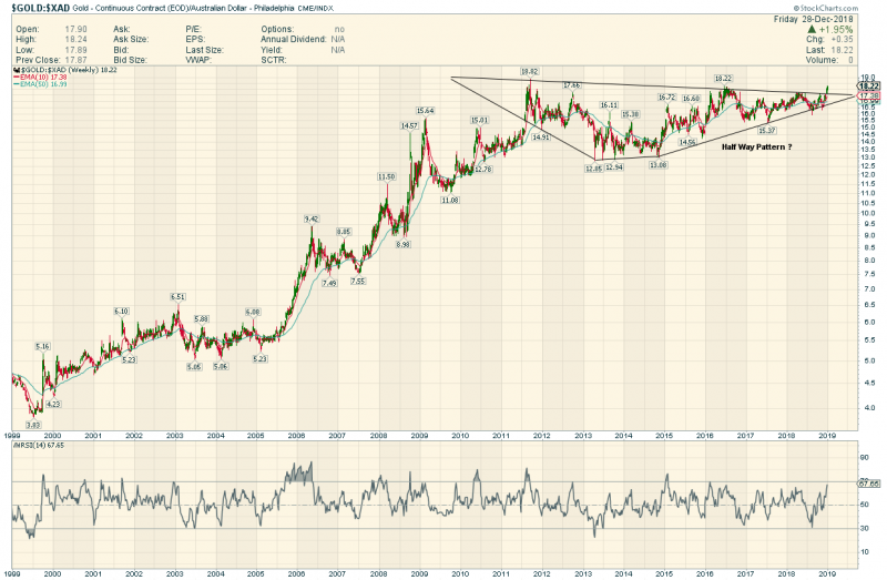
Gold in Australian Dollars
Wow…Looks like a Diamond Half way Pattern Breakout
Price Objective ( rough Calculation ) $7,200 Auzzie
You are welcome Sir Norvast and Countrymen
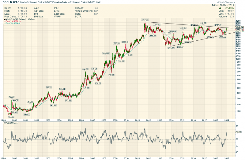
Gold In Canadian Dollars
PO $8,500 Loonies.
You are welcome Canucks .
There has been NO bear market in Oz nor in Loonies
Just a High level Consolidation
In Rudimentary E Wave Lingo I would say we just finished wave 2…Wave 3 could be a doozy !
ONE MORE
Gold in Rand !
Holey Molars :If you bought Gold in Y2K in South Africa You had a plus 10 bagger on your Phys in 10 years
20,000 Rand per ounce in 2011. If this is a HWP you could see more than $200,000 before the wave 3 ends.
Got Gold ?
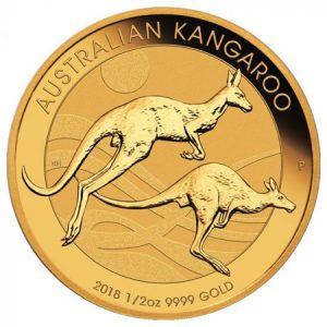
Maples and Kangas and Rands Woo Hoo !

I know it is difficult for some members to trade or invest in countries outside their own but I have grown a little weary of singing the praises of the AUS mid tier producers, while listening to the continual share losses from investment in their US counterparts.
Pull down some 5 year charts of NST.AX, EVN.AX, SAR.AX and KL.TO for example.
These are well managed, low cost profitable companies, mostly debt free, pay dividends, have expansive exploration programmes with a growing resource base and most looking to purchase cheap assets abroad.
I have been on these companies since early-late 2014 when oil prices dropped, labour & earth-moving costs reduced as a result of the commodity downturn, and the price of gold in AUD was AU$500 above production costs.
These companies were making good money AND it was NOT reflected in their price.
The rest is history now!
As the price of gold increases over the next few years the share price of these companies will continue to rise.
I am holding for now!
It’s interesting on those log charts that the early 2006 move was probaly the strongest move in the entire bull market.