Gold – At A Crossroads
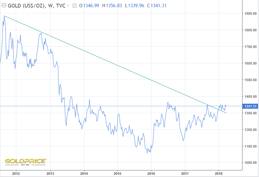
So it’s game on – gold has broken out on the weekly chart below, with the descending green line support at around $1300.
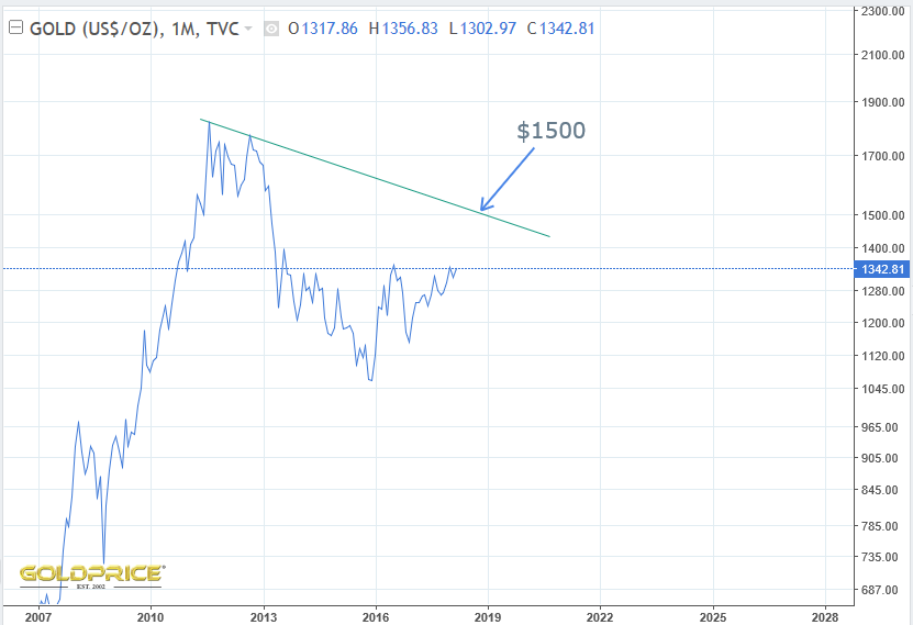
However, the monthly chart below is very different, and we’re a long way from breaking out of that one. This is primarily due to the lower starting point at the 2011 top resulting in a much shallower slope.
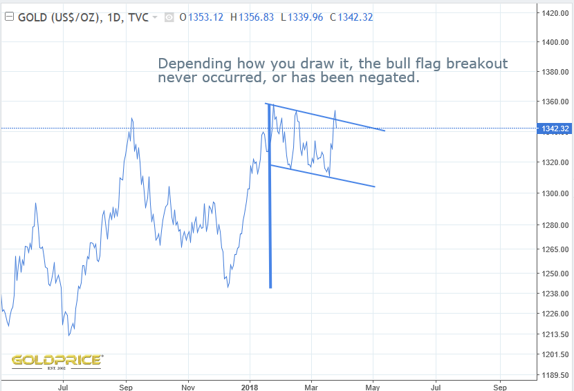
The bull flag I posted previously (as Fully has just shown), either didn’t occur, or has been aborted – depending on your charting software and how you place your lines. Either way, it’s concerning.
In contrast to the bullish case, here’s a look at a bearish possibility…
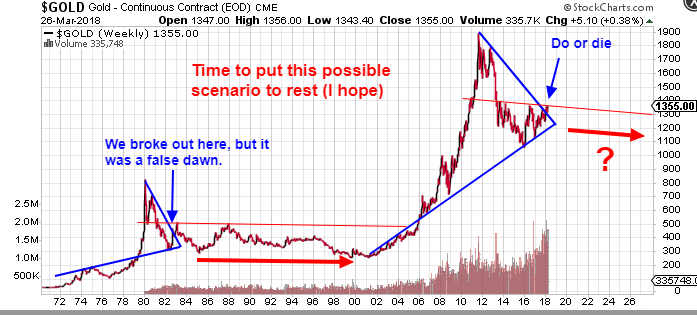
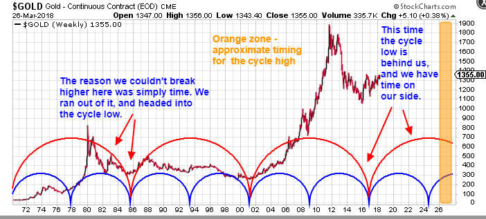
On the face of it, we could be looking at a sideways grind for at least 15 years. I’ve posted many, many times explaining why I don’t think that’ll happen, but here’s one of the biggest reasons. Time.
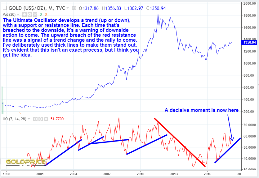
And finally, another look at my new favourite indicator, the one, the only, the Ultimate Oscillator 
Come on now gold, don’t let us all down 
Edit: ‘2016 top’ corrected to ‘2011 top’. Oops.
Northstar, I like the way you look both ways before crossing the street. Great charts. Thanks.
Ha ha, good way of putting it SF. All the possibilities have to be kept in mind at all times.
I’ll second that. NS is reconsidering the bull case, just as I have to reconsider the bear case (as this correction is only a correction and we’ll have a fifth wave up soon to complete a messy impulse). No question, the intermediate term isn’t exactly cut and dried.
I think it would be wrong not to look at all angles. I strongly favour the bull case for PMs into 2026, but the detail of how it pans out can be tricky. Thats what makes it so challenging and interesting.
Thank you Northstar. Been learning more about the ULT. Using it in conjunction with ADX Line (w/+DI and -DI).
Cheers Chap some indicators are easier to interpret than others, and it really pays to go back through several economic cycles to see how they behave.
To Breakout, Gold must overcome significant 4 year resistance at 1365-1367.
Agreed. We’re close, with the end of the month fast approaching. This is a very interesting week.
Also – the cycles on my chart above could be shifted 6 to 12 months to the left – I still can’t quite decide on the best fit. I bow to your expertise in that area.