We get to do it all over again.
Thanks to Rambus, there is now a correlation between the commodity cycle of the 1920’s and today.
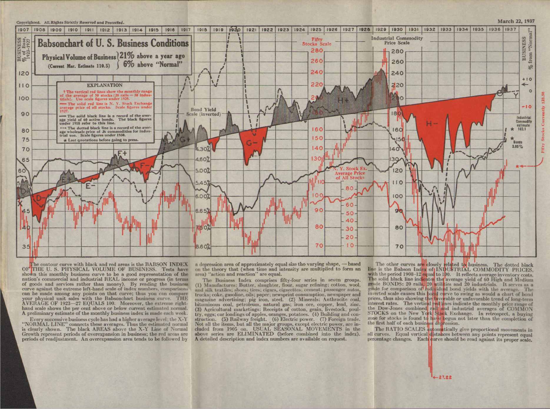
Babson chart from 1937. Notice the dashed line —-
Rambus chart from a few days ago of the CRB, with approximate dates from the Babson chart:
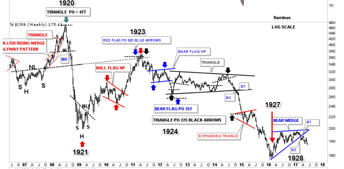
Eerily similar. Completely different economy, yet the cycle tracks the same. Does anyone want to guess where we are headed next, in a year or two?
Remember Hoover?
Wow Avacado
Roger Babson Chart from 1937
Fantastic
I have a calling card found in a Book about the Great Depression that a lurker here sent me from Florida ( where Babson Lived)
It simply says ” Complements of Roger A Babson.”
cool
Wow again…what are the dates on the Babson Chart ?
OH I see they are on the top…..Wow X3
So we are heading to 1929 ….!
Across the top. 1907-1937. The book is Business Barometers for Anticipating Conditions. I bought it in Framingham, MA in 1970, at a library sale. Best purchase I ever made!
Plunger…what do you think of this find from Avacado Pit ?
Yes, this is a historical nugget. For the Rambus subscribers out there this fits perfectly into my article of last weekend. 9 years after the commodity peak the market peaks. The FED looking backward throughout the 1920s was concerned about commodity prices so they juiced the money supply. This QE flowed to where the public wanted to speculate which was the financial markets so we had the great bull market of the 1920’s. So the crash in commodities after 1929 is what we have to look forward to, just like this chart shows.
9 years in the 20’s. I’m thinking 11 years this time around. We have not yet had the parabolic rise one gets when its all in and damn the consequences. So I’m thinking another year or two.
Note on the CRB chart that we are in 1927, not 1929. We can have falling commodity prices with a rising stock market, it isn’t until commodities really start to fall that the market wakes up to the fact that something isn’t quite right.
If you could read Plungers Epic it shows 6 different 50 to 70 year K cycles and in each case it was 9 years after the Commodity Burst that the SM and Economy simultaneously imploded.
350 years of history repeating !
Thanks Again Avacado Pit…this post is going into its own category on the sidebar
“Note on the CRB chart that we are in 1927, not 1929.”
I don’t agree.
We had the CRB dump into Jan 2016. That echoed the dashed line drop in Babson seen in early summer 1927. We’ve since had a bounce that is rolling over. As it did in mid 1928 in Babson and per the Rambus chart. We’re ~17 months beyond those lows, which puts us in early 1929. As to whether we need 11yrs or an equities blowoff first before the capitulation lows, I can’t say. I’m just commenting on the tracking here.
“So the crash in commodities after 1929 is what we have to look forward to”
Well, I would say its the equities crash that we have coming. The commodities crash was in 1920-21 and again post 2008, and resuming since 2011. We do have a final capitulation leg down ahead. Just as my EW chart for gold depicts. Although that would also support one final rally to complete B of 4 to $1500 gold that we should still see ahead. Perhaps with the equities blowoff.
Pedro you are right on on all accounts. We are set-up according to 1929 since we are 9 years past the commodity bubble peak. Plus you are tight we are finishing up the commodity dead cat bounce just like 1928-29. You are also right the stock market bubble sell off is the main show. The coming commodity swoon is a capitulation move. I just didn’t develop the story enough here.
B of 4 lunch on the way. Many ways have I looked, it’s still B of 4. After this we shall worry about our C of 4 supper.
You are all forgetting what is obvious. The Internet. What allows us to transmit information instantaneously, something never before possible. And something else. I make my living almost 100% off the Internet. I could not do that 30 years ago when I got into the used and rare bookselling business. I’ve gone from 100% open shop to almost 100% online. (I also do software as a service, something else not really available 30 years ago)
This time is DIFFERENT, and for that reason it will take a little longer to play out.
Avocado
Avocado, You are going to have to take that up with King Solomon who said this time is not different. But yea I kind of understand. If the FED started buying commodities I am sure they would go up for a while. The question is how long?
Plunger, Pedro, I agree with possibility of market weakness but we can not dismiss that the 75/80 year cycle already made a very important bottom in March 2009. (bottom in 1857-1932-2009) The economy was in terrible state then as most companies did not receive orders for weeks/months. They only rescued economy by printing trillions. I guess this was a once in a life time event.
The questions is will we have a repeat of that only 12 years after previous bottom, I doubt it, but it is possible if the 2009 bottom, was not the ultimate bottom and we have a larger cycle like the 90 year cycle due (1837 panic, 1929, 2019??), if not we will only have normal correction in stock market.
I think this time around China is going to pull the trigger on the next great depression, and I’m guessing it gets going 2018/2019. Falling commodity prices plus rising short term interest rates coupled with massive debt. Their debt is far higher than ours and much of it went into phantom cities and similar development.
I think yuz right on that one. EW’s principle of alternation. Baton handoff, just like Britain to US but a nasty one first (GD1). USA’s turn to hand it off, this go around.
What about China?
https://secure.stansberrychurchouse.com/chain?cid=MKT336299&eid=MKT336493&snaid=&step=start#AST67937
UBS’ take on China, just out ….
https://t.co/9eeumLtyrb (ZH)
The whole ramp since Feb ’16 appears to have been China led.