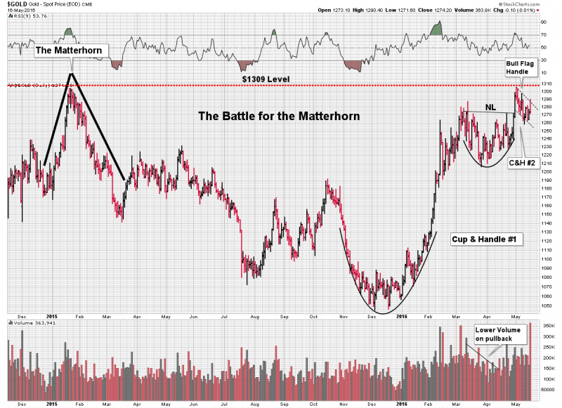
The Battle for the Matterhorn-Skirmish Lines Drawn
We are presently engaged in an epic battle involving the gold price. So what is it all about? What is so epic? You should know that gold bottomed back in December and the precious metal (PM) stocks bottomed in January. Since this bottom the stocks have simply been on fire. I have classified this as a Phase I advance where stocks return to “Known Values” after having been left on the bargain table throughout the fall of 2015. The Phase III of the previous bear market had so compressed these stocks that they resembled a beach ball held under water. Well, on January 20th 2016 Mr. Market lost his grip on the ball and it has been in an upward impulse seeking known values ever since. In this period we have witnessed a rare phenomenon, one that occurs but a few times in ones operative investing years. That is a phase shift in market dynamics. The old model permitted the market circling back after an advance, thus allowing latecomers a place on the train. This bull, however is operating under different rules. The result has been a multitude of sold out bulls sitting on the sidelines, developing bullcers, waiting for a pullback to get in. Sorry gang, this bull doesn’t grant “gentleman entries” to people who don’t get it. Gold is NOT doing what it has done for NO reason! There is an unseen fire burning in the world’s monetary system and we are now set-up for a BACKDRAFT erupting into a conflagration with gold acting as your protector. That’s the message gold sees and the Battle for the Matterhorn is set to “blow the roof off” and expose the inferno underneath.

The Battle for the Matterhorn is now upon us. The Matterhorn of course is the spike top in gold back in January of 2015. It was the footprint of the last bear market rally of the previous bear market. Back then the gold paper market held sway over the physical market. So as massive short selling was applied to put out the fire it stopped gold’s advance in its tracks. Commercial interests were able to collude and smack the gold price back down in quick order. What the Battle of the Matterhorn today is all about is the reality that the tables have now been turned. In the intervening period the physical market has been competing for dominance to the paper market. If the physical market can assert this newly dominant role then it will scale this peak and announce to the world gold’s preeminence to paper. Yes, folks this is EPIC.
Sometimes a chart simply jumps off the page and communicates its message. That’s what we have here in this stunning textbook example of a cup and a handle. Not just one, but a double C&H fractal. Its almost like gold is snubbing its nose at the paper shorts in arrogant fashion. It’s as if Clint was saying go ahead….make my day! Its all in the chart folks. If the paper shorts can’t hold the line, what kind of explosive upside is in store?
1550 … after gold blows the roof off. Imagine what the miners will do, especially those with low cash costs. cash costs margins go to +100%.
This is the key… the cost reduction has been amazing. At 1550, Newmont’s cash cost profits are 900$ an ounce. Their free cash flow is 2 billion. 25 times 2 billion = 50 billion mkt cap = 95$ stock. That’s what is going to happen.
Excellent piece! We are on the precipice of a commercial signal failure. Record shorts in the silver market and still they cannot knock the price down. What will happen next?? A repeat of the 70s is upon us. This summer is going to be interesting indeed.
Powerful post. Love the vivid imagery.
Yes and the Shanghai “physical only” Gold Exchange now appears to be providing a Floor on the Gold price.
A new category is born:
BABY BULLCERS
Bullcers…LOL mamare….perfect
Great post, Plunger!
Agreed on the chart pattern Plunger. here’s my 5/4 chart posted previously, untouched and behaving like a champ.
http://schrts.co/Tf6S8p
Ah yes, very nice. How did you assign the target level. Is it a measured move or just a resistance level?
It’s actually both. The measured move on the c & h is shown; red and green vertical segments are same length on my chart. Also $1,550 is the 2011-2012 support level that was broken in 2013. Here’s a chart link that explains the S/R level and how it matches a 62% fib and a VERY thin trading zone which could fill in a nanosecond on the way back up.
http://schrts.co/Xqf66F