Misreading CoTs, Again
My latest piece:
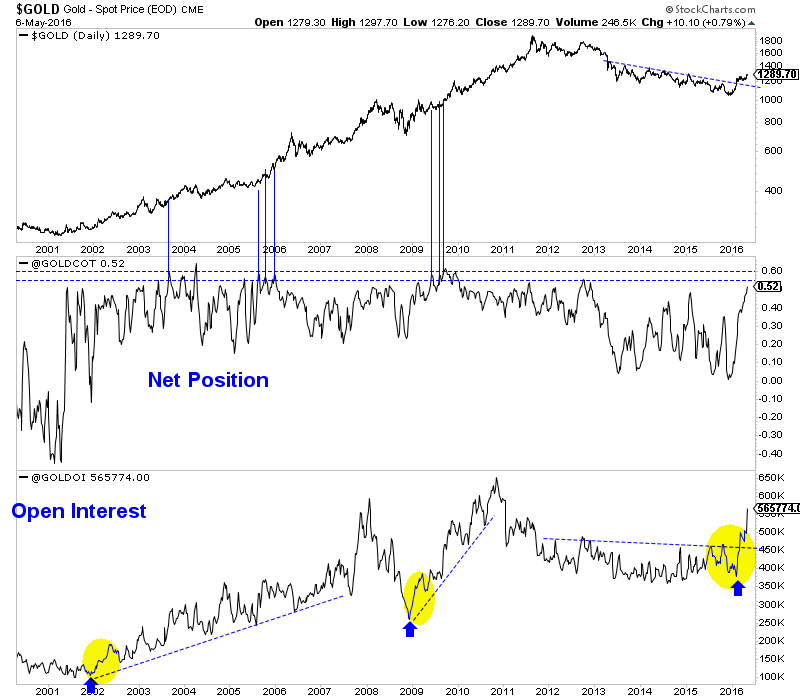
The Gold CoT is flashing a warning even as a percentage of open interest. However, note the very high readings in 2003, 2005 and 2009. As the chart shows, those were some of the highest readings yet Gold surged higher.

Thanks for the historical perspective! This is an analysis I was curious about.
Plus 1
That Chart is worth more than the Tens of thousands of words from Cotophobics
🙂
COT-phobics…good one Fully!
Excellent analysis. Thanks!
Stunning chart. Thanks for posting.
Hi Jordan excellent analysis. Let’s not forget years of easy money policies had also created an abundance of liquidity which are probably sitting on the sidelines right now. The moment stock markets start rolling over all that money will have to go somewhere Hopefully that will translate to higher prices for PMs and miners