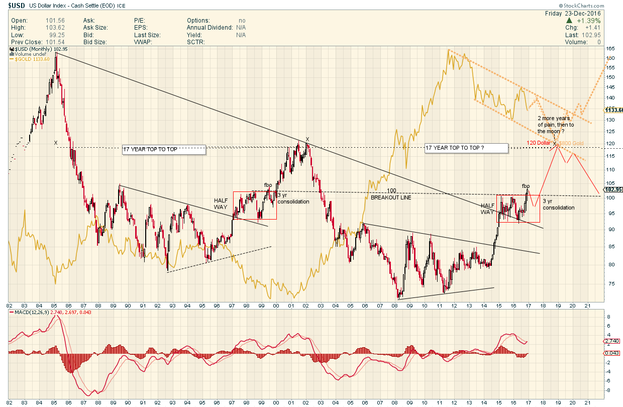
Symmetry in Motion
If you are a fan of symmetry , this is quite the potential fractal
Dollar down a little for 6 months = GoldBounce
then Dollar Runs away up to 120 = GoldTrounce ?
Merry Christmas
The Grinch
……………………………….
PS
This Chart is Based on and Inspired by Rambus Long Term View of the Dollar originally posted March 10 2013 in his “Epiphany” Post
Snip
“This next chart for the US dollar is a very long term monthly chart that goes all the way back to 1980. Sometimes in charting one can have an Epiphany or an eureka moment where all of a sudden there is clarity beyond what you were initially looking for. I had such a moment with this next chart that has a lot of information on it. First you will see two bases labeled Big Base #1 and Big Base #2. These two bases are uncanny in their similarities. Some might call them fractals. The two bases are almost exactly the same height as well as time. The only real difference between the two bases is at point #3 which was a tad higher on Base #2 whereas in Base #1 it was a little longer. Other than that they are amazingly similar. Note the breakout and backtest from Base #1. If you look real close you can even see a small gap that was made right at the breakout point. The support and resistance rail held on two backtests which told us the S&R rail was hot. Note the blue bullish rising wedge that worked out as a beautiful halfway pattern. The height of Base #1 also measured out real close to the high where you can see the H&S top. As I said there is a lot of information on this chart so I’ll post it right here and carry on with the same chart again a little further down.

Carrying on with the same chart there is another important observation I would like to share with you. Note the H&S top that formed back in 2000. If you look at a gold chart you will see a big inverse H&S bottom that launched its bull market. A dollar top and a gold bottom. Now I want to draw your attention to the bottom right hand side of chart that shows point #4. That low at point #4 marked the absolute high for gold back in the fall of 2011. So what is this chart telling us? Strictly from a Chartology perspective I think it’s talking loud and clear to us. If that S&R rail on big base #2 gives way we are looking at a multi year rally for the US dollar and most likely a decline in the precious metals complex.”
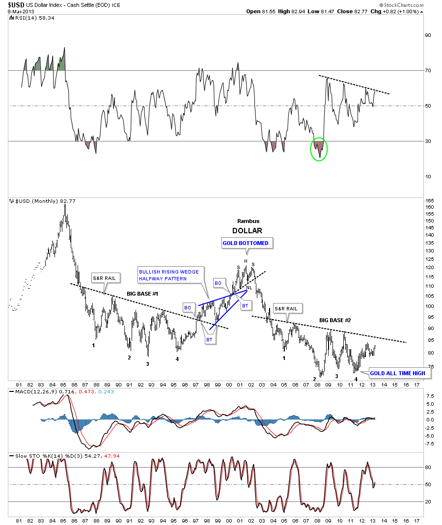
https://rambus1.com/2013/03/10/dollar-bears-about-to-go-into-hibernation/
……………………………………
PPS : Rambus has had another Epiphany and will be posting it soon. Hint : it pertains to the Gold Chart
………………………………….
PPPS Even if this fractal plays there is something very different this time on this chart regarding the US Dollar and Gold
IF This chart played out ( big IF ) Gold at 800 with the Dollar at 120 is 220% higher than it was
last time the Dollar was 120 when gold was $250, SO there’s your inflation I guess .
17 years later US Dollar is 120 again and Gold goes from $250 to $800 ( again of course this is an exercise )
17 years 220% gain = 12.5% gain per year . Yes its a potential snapshot in time but looking at it this way
Gold is doing OK vs the Dollar.
Santa
I have recreated this chart for charting practice and will be watching it with great interest as we move forward. Thanks for posting.
Fully, the analysis ignores the USD 30,15, 7.5 year and 45 month cycles. They are all peaking here.
On that basis, the chart forecast analysis is highly questionable.
Agree .
I am just exploring the Fractal Symmetry here . I know nothing of Cycles
I have added a postulated 17 year USD cycle top callout here for consideration however
1985 2002 2019 ?
Ah …its an Armstromg Number…BUGS…LOTS of BUGS !
https://www.armstrongeconomics.com/armstrongeconomics101/understanding-cycles/17-year-cycle-of-the-cicadas/