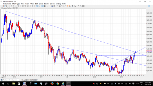
Gold Weekly
Mark…This looks like a breakout to me
This is Netdania 24 hour Gold
Your Chart is Investing.com and it shows we are AT resistance
I have seen these kinds of differences before.
There should be NO differences in the resistance points but obviously there are .
I see this as a breakout of 3 important resistance lines
Irreconcilable Differences ?
🙂

under the hood, the rocks are just fine, no sign of breaking down. in fact, many are getting legs here.
It is interesting the discrepancies between charts. In my view, these are often because of use of linear versus log charts but sometimes maybe due to difference between weekly / daily charts and how highs and lows are delineated and whether people draw lines from price closes or intraday highs and lows. Also it depends on how accurately people draw their lines!
I am looking at my English rock Fresnillo (I know majors are ‘boring’) but it’s up another 6.7% this morning, again. Gold in sterling is now at 1060 GBP. That is more than it was denominated in US dollars at the low last December at $1045! I thought it would be years before gold went over 1000 GBP again and here it is. Pound sterling is also slightly under $1.30 at $1.29 and change.
The performance of FRES.L seemed to me to forecast the Brexit and also this recent upmove in gold and silver when so many expected weakness. I read some bearish forecasts in the past couple of weeks, looked at the Fresnillo chart and current daily price move and thought, “Nah.”
Netdania tracks the spot price, Investing.com tracks the price of one of the futures contracts (not sure which one). The two prices are different and will give slightly different chart structures.
Thanks Neil