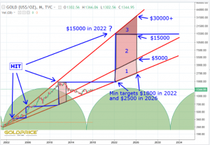
Where Is Gold Going ?
If we assume the bottom red line is going to provide support through to 2026, and use some simple trigonometry, this is what we get…
Zone 1 is a dead cert in my view. If we return to the upper red line the numbers seem ridiculous. This is a log chart, so a straight line from bottom left to top right represents an exponential, parabolic move. You can see that in the price action leading to the 2011 top. All speculation of course, but a bit of fun. Alternatively, the dollar moves to new highs and gold plummets to $800.

“You need to be able to walk before you can run.”
Agreed. As I say – just a bit of fun.
If AU is only up a third by 2022 (not counting any retracement)…. well, let’s just say I won’t go as far as John McAfee in placing a bet.