RAMBUS HIGHLIGHTS
FOR THOSE OF YOU WHO ARE NOT CHART READERS AND WHO MAY HAVE GOT LOST IN THE WEEDS IN THAT RAMBUS POST HERE ARE A FEW HIGHLIGHT CHARTS . THEY ARE ASTOUNDING …CLICK ON CHARTS TO ENLARGE
……………………….SILVER………………..
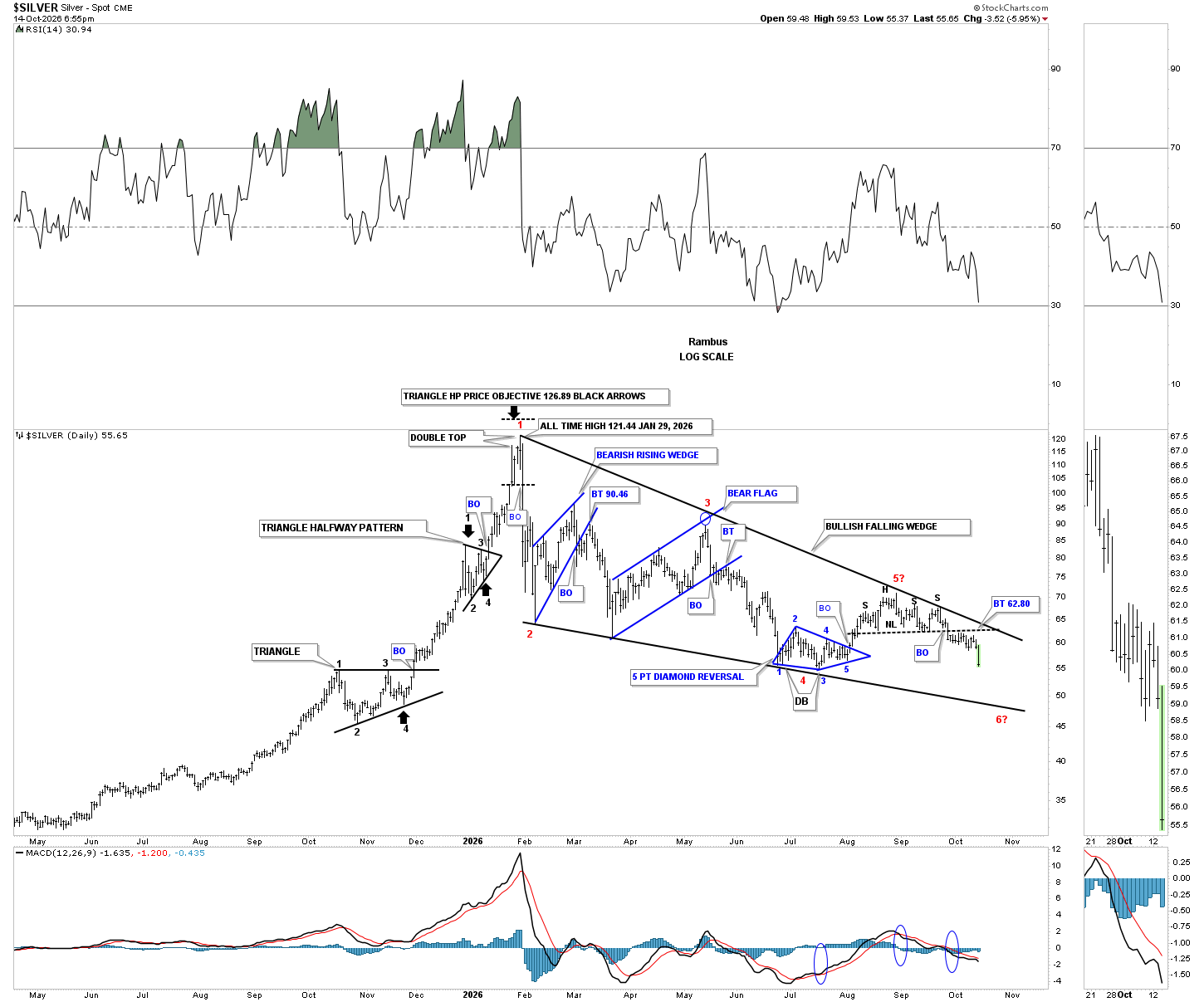
SILVER SHORT TERM ( 18 MONTHS ) TRIANGLE WITH RECENT HEAD AND SHOULDERS BREAKDOWN TARGETING THE LOWER LINE AT BELOW $50
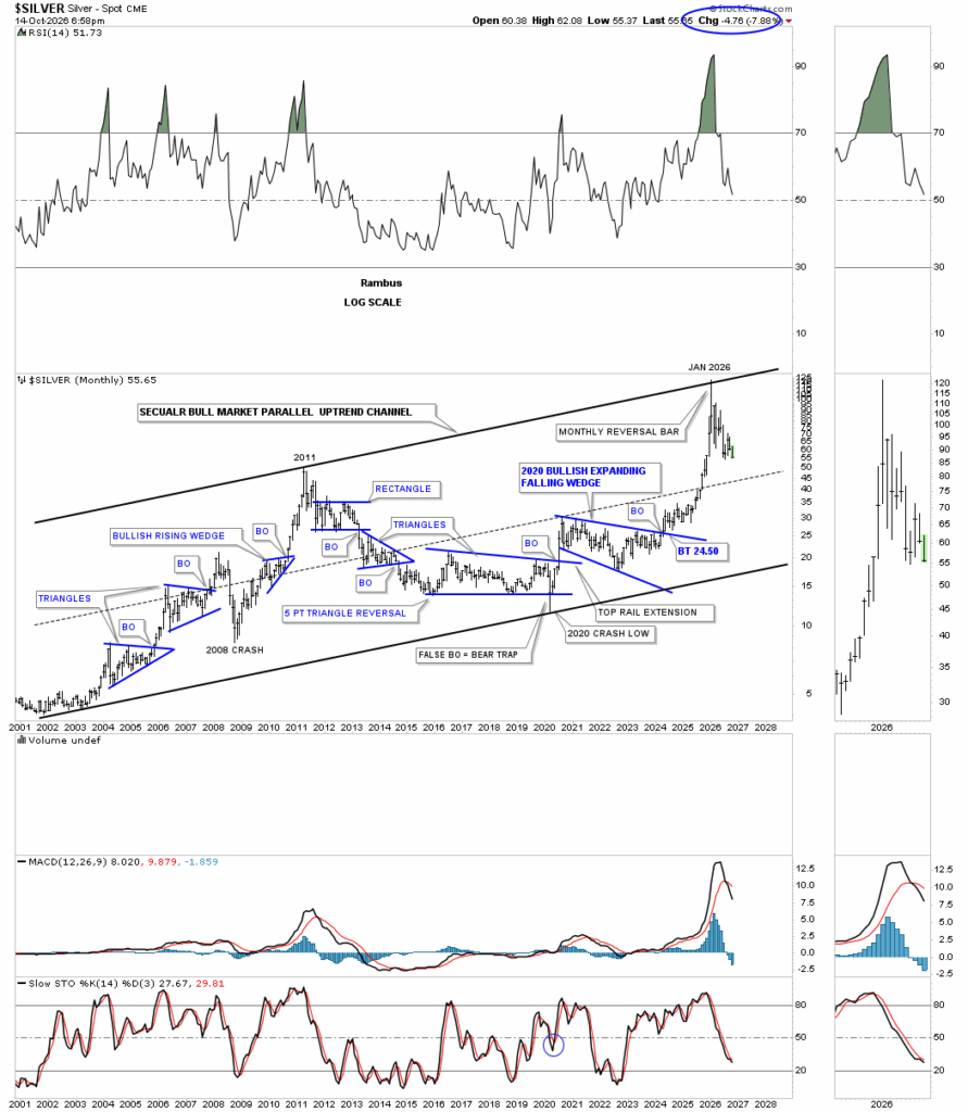
SILVER LONG TERM ( 25 YEAR ) CHANNEL …TOP WAS HIT EARLY THIS YEAR MIDPOINT LINE TARGET AT ~ $50
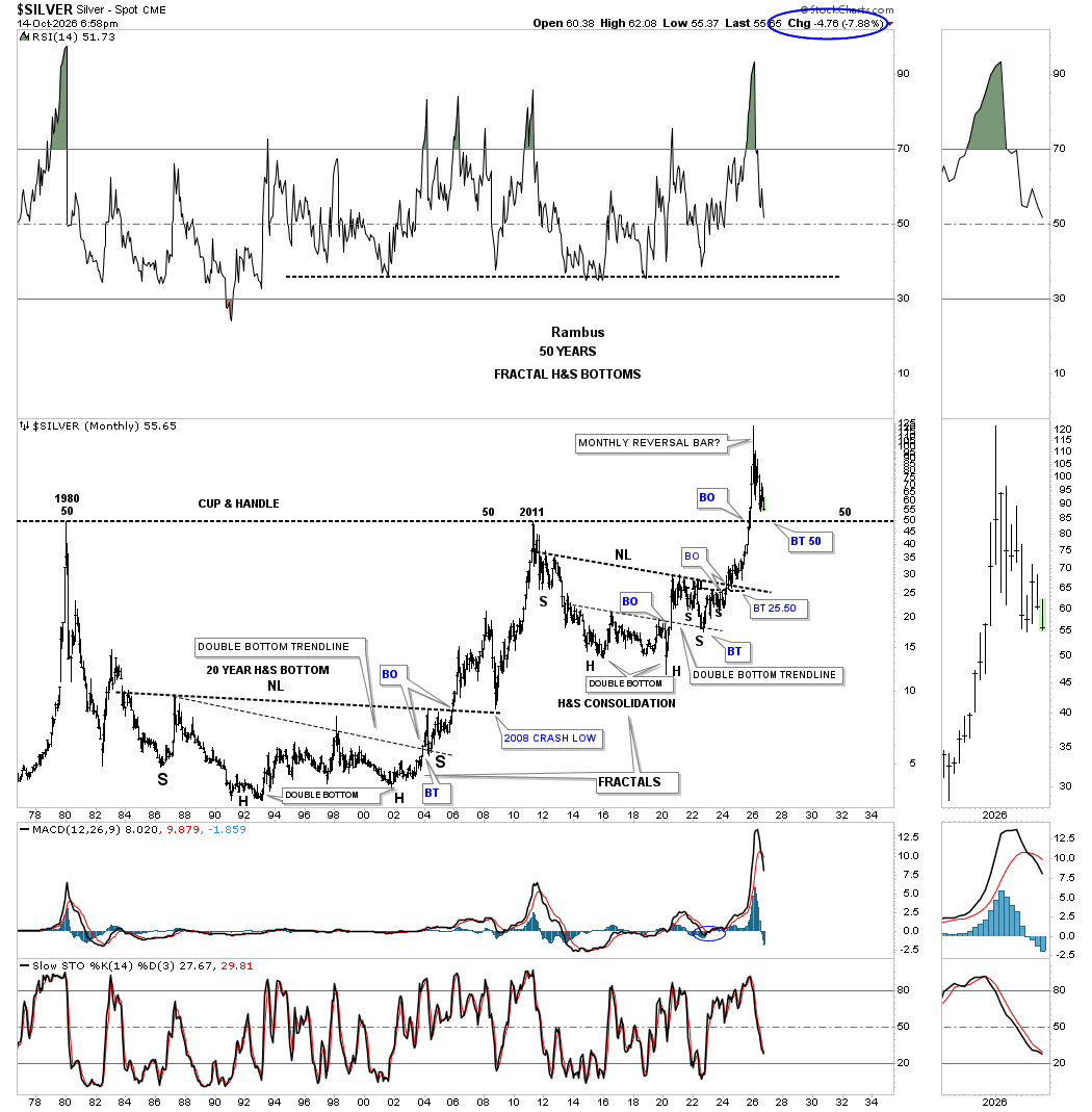
SILVER VERY LONG TERM ( 50 YEAR ) …TARGETS $50 …THIS ONE LOOKS INEVITABLE
………………………………
………………….DOLLAR INDEX……………
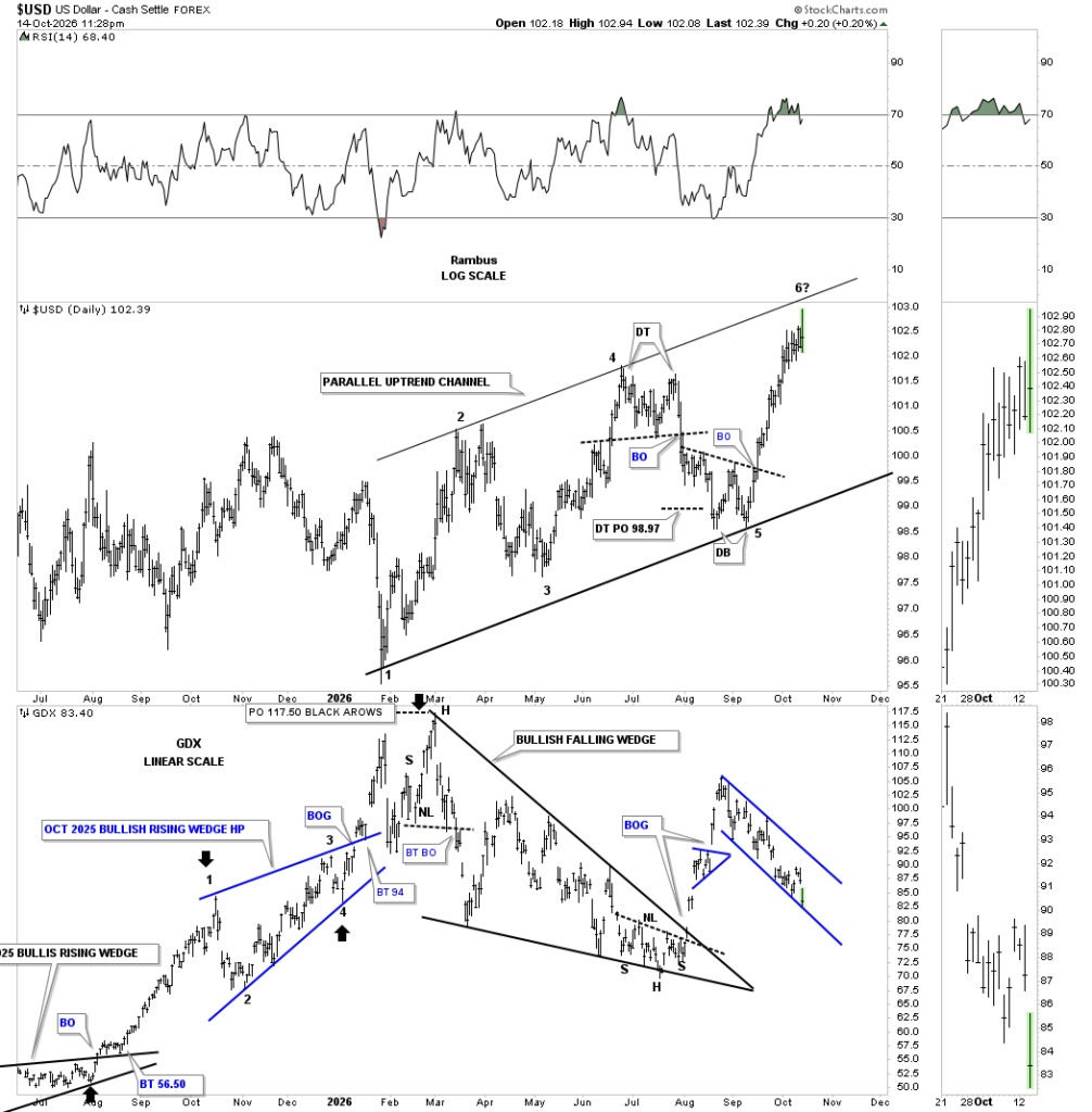
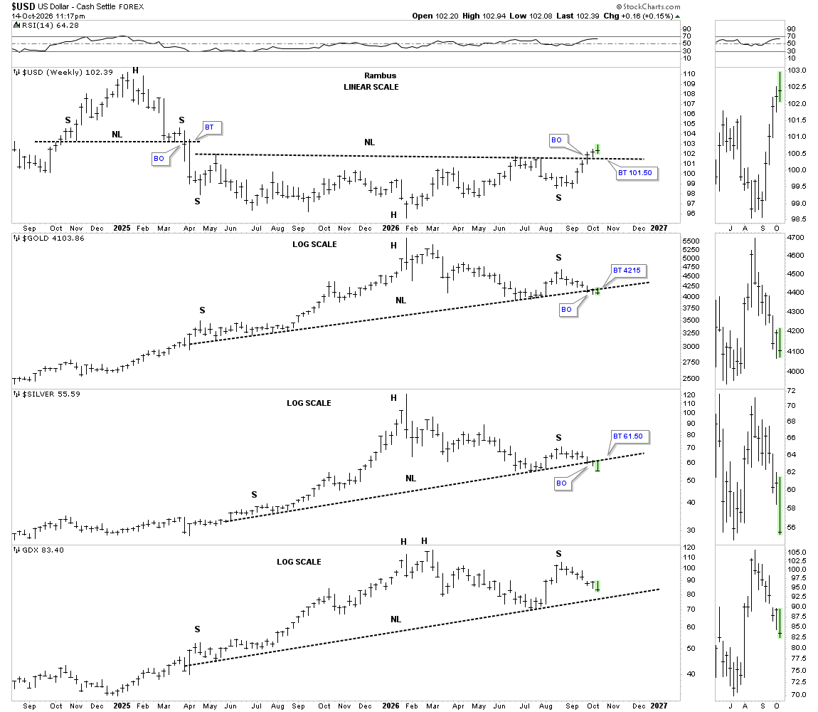
18 MONTH DOLLAR CHART…DOLLAR ABOUT TO HIT TOP LINE OF ITS CHANNEL AND GETTING OVERBOUGHT ..PAIRED WITH THE GDX ON THE BOTTOM SHOWING THE INVERSE CORELATION …LOOKS LIKE A SHORT TERM TOP PROBABILITY IN THE DX AND REPRIVE IN GDX ?
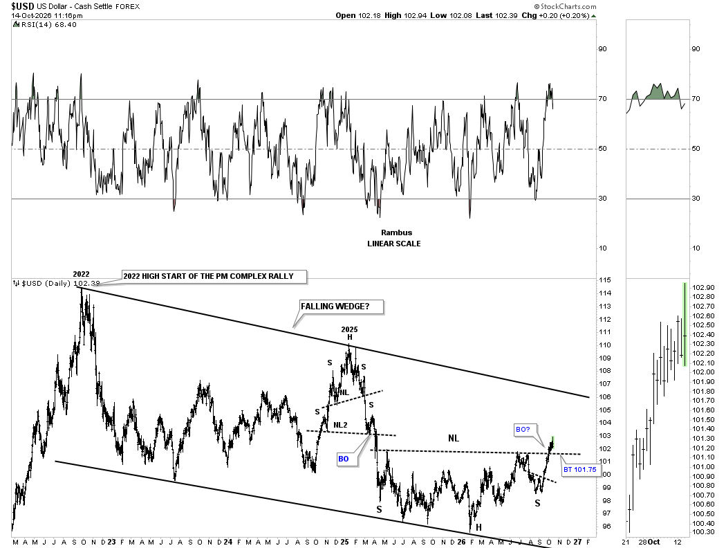
5 YEAR US DOLLAR CHANNEL (FALLING WEDGE )…DX JUST BROKE OUT AND APPEARS TO BE ON IT’S WAY TO THE TOP LINE ….HOWEVER A BACKTEST IS NOW SPECUATED …IE..SHORT TERM REPRIVE FOR PMs
…………………..
…………….US DOLLAR / PRECIOUS METALS COMBO CHART……..
PUTTING IT IN PERSPECTIVE WITH RAMBUS COMMENTS …THIS IS THE MOMENT
This weekly combo chart has the US dollar on top, followed by gold, silver, with the GDX on the bottom. The US dollar is now in its 3rd week of breaking out above its neckline, with gold and silver closing below their neckline this week, with the GDX not too far behind. This is the moment of truth we’ve been waiting for. Are the backtests going to hold?
………………………..
……………..CANADIAN MICRO MINERS INDEX ……..
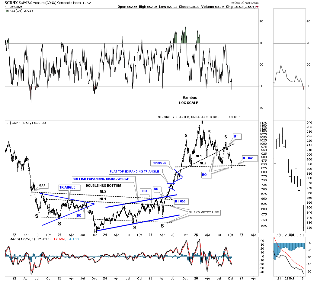
RAMBUS STILL CHARTS THE CDNX WHICH IS A NOW OBSCURE INDEX TRACKING CANADIAN MOSTLY PENNY STOCKS
THIS ONE IS BY FAR THE SCARRIEST CHART IN THE PM COMPLEX ..
………………………
………………..WHAT ABOUT GOLD ?…………….
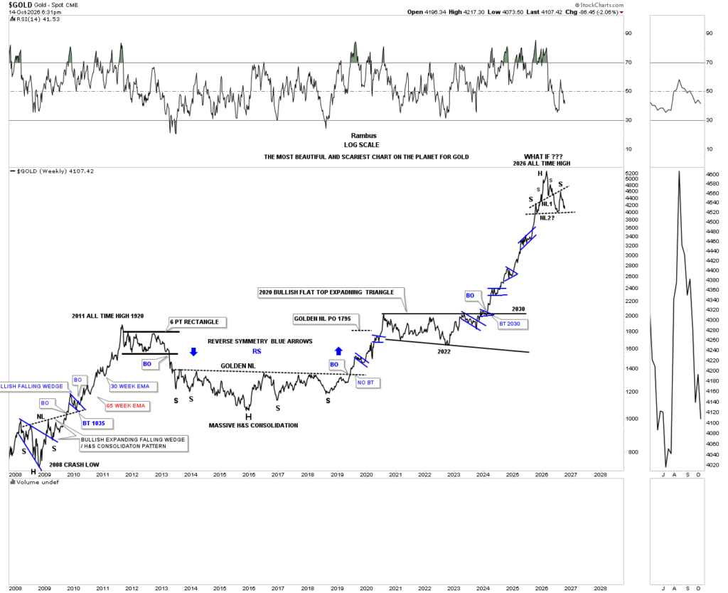
What’s difficult when you spot an H&S top early on is you have to wait for confirmation when the neckline breaks, which can feel like an eternity. The wait continues.
… ……..AND FINALLY….BONDS…$TNX ( 10 YEAR YIELD )….
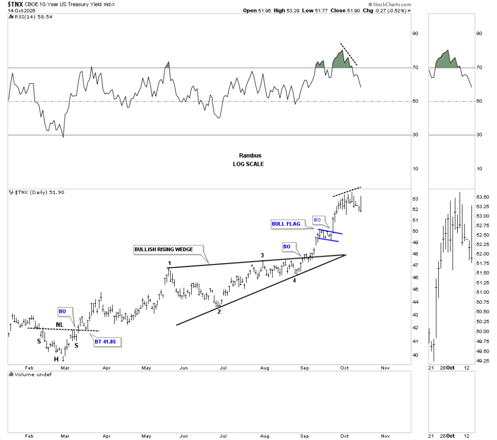
THIS ONE IS A HUGE SURPRISE …RAMBUS IS SEEING A REVERSAL DEVELOPING HERE …MEANING LOWER RATES IN SPITE OF THE INFLATION NEWS AND THE 40 TRILLION DEBT
A quick update on the TNX. In the Weekend Report, we looked at the divergence taking place on this daily chart with the RSI, with today’s price action showing a possible outside reversal bar.
NOTE : SINCE THE $TNX IS PERHAPS THE MOST IMPORTANT CHART ON THE PLANET….I PULLED RAMBUS WEEKEND REPORT CHARTS AND COMMENTARY AND WILL POST THEM IN THE COMMENTS SECTION
…………
IN SUMMARY….RAMBUS HAS HAD 2 HISTORICAL CALLS ( 2008 AND 2011) FOR PRECIOUS METALS APOCALYPTIC HEAD AND SHOULDERS TOPS …which he called to a “T”
THESE DEFINED HIS CHARTOLOGY SITE AND DEFINED THIS SISTER SITE… GOLDTENT TA PARADISE. HE IS SEEING THE “POTENTIAL” FOR ANOTHER HORRIFYING TOP . THESE ARE SOME OF THE CHARTS TAKEN FROM HIS POST FOR CLARIFICATION . HE STILL HOLDS OUT HOPE FOR A REVERSAL OF THE BIG PICTURE WE ARE AT AN INFLECTION POINT
HE SEES A POTENTIAL SHORT TERM RALLY HERE IN PMs AS THE DX BACKTESTS ITS BREAKOUT …BUT HE REMAINS ON THE SIDELINES AND LIKELY WILL BE TAKING INVERSE ETFs TO SHORT THE COMPLEX IF THERE IS A DEFINITIVE BREAKDOWN
………………
TO FOLLOW RAMBUS IN REAL TIME TAKE A SUBSCRIPTION HERE
https://rambus1.com/membership-subscription-service-via-paypal/
OR IF YOU ARE PAYPAL AVERSE email gmag@live.ca for a Credit Card Option
THIS HAS BEEN A GOLDBUG PUBLIC SERVICE
There is a possible important development last week in the TNX, 10-year yield. Last Wednesday, the day the PM complex bottomed, the TNX put in a possible daily reversal bar with a negative divergence taking place on the RSI. If you want to know what a standalone consolidation pattern is, the bullish rising wedge is a good example. I’m also referring back to the 2-hour chart for the HUI and that August 25th blue falling flag as a possible stand alone.
The same thing also took place on this weekly chart for the TNX, which may have put in a weekly reversal bar. If the daily and weekly reversal bars play out, we could see some positive price action in the PM complex.
If the daily and weekly reversal bars play out, this long-term monthly chart for the TNX shows a backtest to the top rail of the 2023 triangle would come in around the 4.50 area, which could give the PM complex a big lift.
Keep in mind the much larger picture shows the 1981 downtrend channel coming to an end during the 2020 capitulation low. If we see a complete backtest to the top rail of the blue triangle, interest rates will be ready for another leg higher, and how will that affect the PM complex and, for that matter, the US stock markets, which so far haven’t paid any attention to higher interest rates?
Over the last two years, the JPT10Y, Japan 10-year yield, has had a massive rally, forming two bullish rising wedge consolidation patterns, with the middle rising wedge being a halfway pattern. The black arrows show the measured-move price objective, which was recently met, as shown by the black arrows. It now looks possible that the current rising wedge could be a bearish rising wedge to the downside if the bottom trendline gives way.
How many times did we hear that the rise in interest rates in Japan, carry trade, was going to crash the US stock markets? So far, the US stock markets have held up very well, with the SPX and QQQ just making a new all-time high. This reminds me of an old adage I like to say from time to time: “The only rule when it comes to the markets is there are no rules.” Every rule that is written in stone can be broken on occasion, especially in a secular bull market, which the US stock markets are in right now.
This monthly history chart for the JPT10Y clearly shows the ten year yield should have been bad for the Japanese stock markets but they haven’t collapsed yet either.