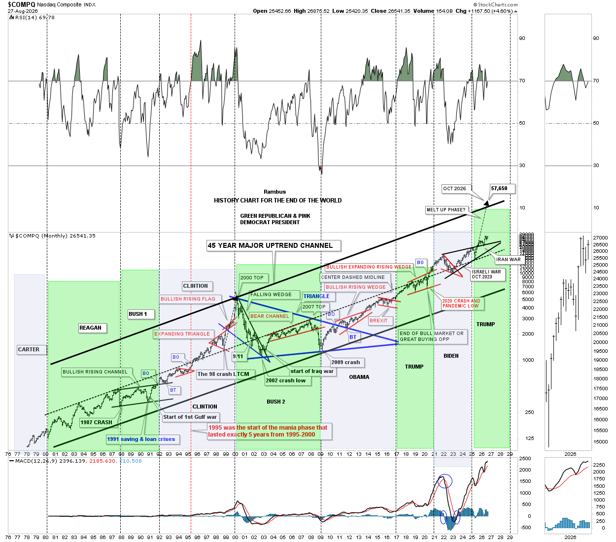
HISTORY CHART FOR THE END OF THE WORLD
RAMBUS HAS UPDATED THIS NASDAQ CHART HE CREATED YEARS AGO…IT’S HIS TONGUE IN CHEEK COMMENT ON THE DOOMERS THROUGH THE YEARS
VERY INTERESTING ADDITION OF THE PRESIDENTS ….ONE PRESIDENT STANDS OUT AS THE GUY WHO PRESIDED OFVER THE WORS STOCK MARKET PERFORMENCE IN THE LAST 5 DECADES…CAN YOU SPOT HIM ?
CLICK ON THE CHART 2 x TO SEE THE DETAILS.. A REMINDER OF ALL THE “TURMOIL” WE HAVE LIVED THROUGH …AND SURVIVED…AS THE NASDAQ MARCHES EVER AND EVER HIGHER
ALAS
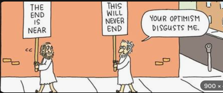
Hard to imagine……without Rambus
I’m definitely the LAST person who should critique Rambus but this doomer’s observation is:
1) the upward slope is a simple Function of currency debasement (‘value’ is not what it seems) – inflation adjusted is preferred. Still upward sloping but less so.
2) Except for ’00 and ’09, the normalized channel is much narrower – indicating that where we are at this moment is STRETCHED – barring something akin to the .com euphoria (Total AI success?) or GFC scenario (my expectation) were to repeat.
3) Definately in BUBBLE territory as it is (above the dashed line only for the 3rd time – low oxygen).
4) The MACD is looking tired.
Nothing about that chart warrants regret about my positioning since the ‘solutions’ put forward during the GFC.
Thanks for sharing FGC !