WTI Crude vs SPX 100 years.
How cheap is oil when not measured against the USD? (EDIT) added nominal price behavior of Gold and Oil charts underneath for periods 1946-1971, 1972-1999, and 2000 to current (coordinated with main chart). Over long timespans, gold price scale went up drastically which obscures what is really happening between competing asset classes. Yellow line is OIL in USD, Blue line is Gold in USD (hard to see $ figures is gold/USD, FGC I posted as ‘large’ so it was a bit more legible).
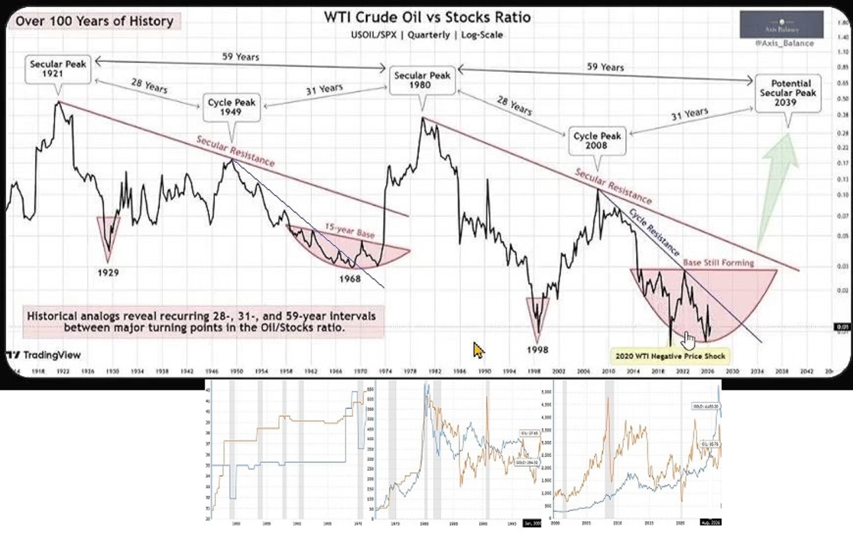
Credit to Axis Balance. Finding Value Finance brought this to my attn.
THATS A STRETCH ….SPECULATIVE IS TOO GENERAL A WORD FOR THAT OUTCOME
ANYTHING’S POSSIBLE ON A 100 YEAR CHART ….BUT WHEN THE IRAN THING GETS DONE AND WITH OPEC DESTROYED AND WITH USA TAKING CONTROL OF THE LARGEST OIL RESERVES ON THE PLANET….HOW DO THE FUNDAMENTALS ACTUALLY LOOK TO YOU YYZ ?
MY BAD ..I SEE THATS A RATIO CHART SO IF STOCKS CRASH IT’S A POTENTIAL OUTCOME …GOOD CHART TO WATCH
I’m updating the chart to show the underlying nominal prices of Gold (blue) and oil (yellow) during the same time periods.
The $ prices are NOT to scale but the price behavior is what to focus on.