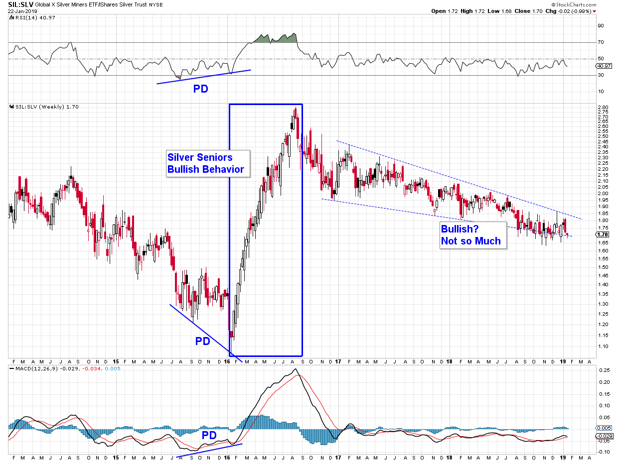
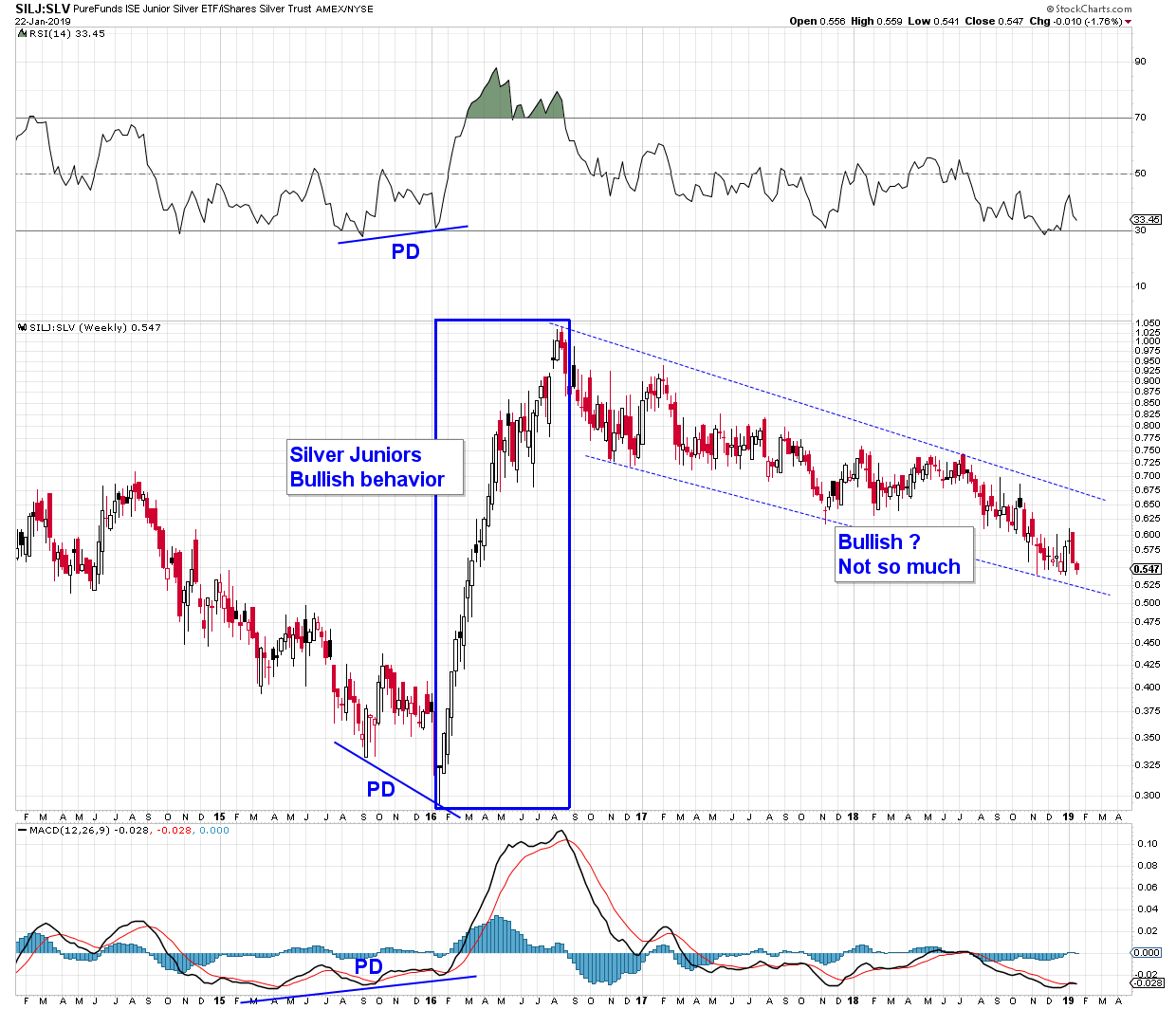
Silver Miners – January 2016 vs January 2019
In a PM bull market we want to see the miners out perform the metal. Maybe that’s in the cards for “tomorrow,” but not seeing it yet.
SIL:SLV
SILJ:SLV
In a PM bull market we want to see the miners out perform the metal. Maybe that’s in the cards for “tomorrow,” but not seeing it yet.
SIL:SLV
SILJ:SLV
Self-similarity in gold action between now and January 2016?
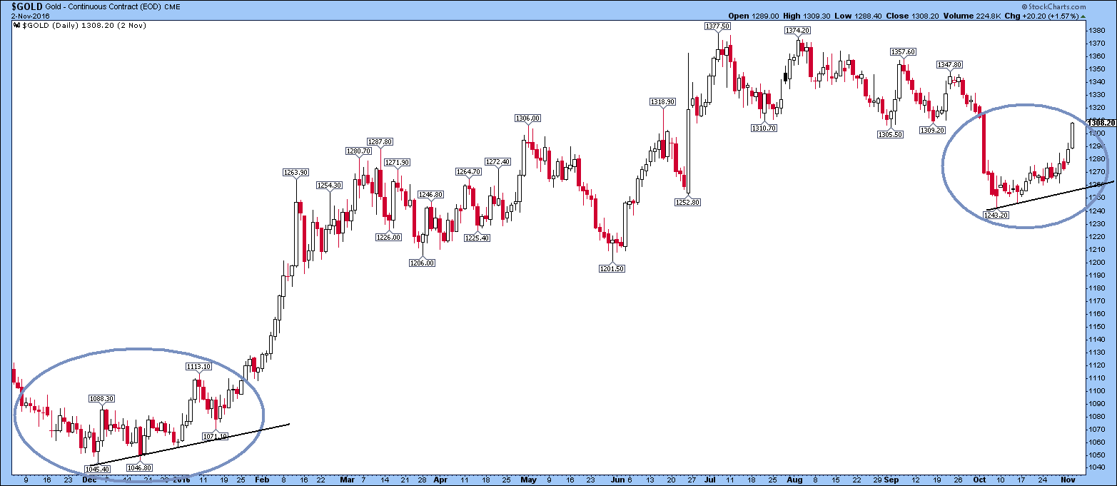
No analysis here – just an intuitive observation. I am putting it in here and waiting to see how it turns out.
Of course, what I didn’t mark on this chart above was the major resistance level around $1307-1310. Gold has just topped out at $1306 today as I write (Friday 4th November 2016, 1400 GMT) after reaching around $1308 on Wednesday:
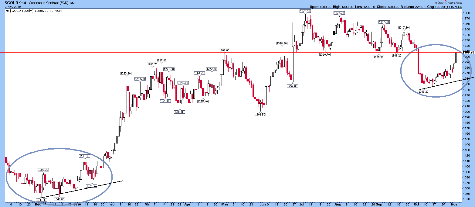
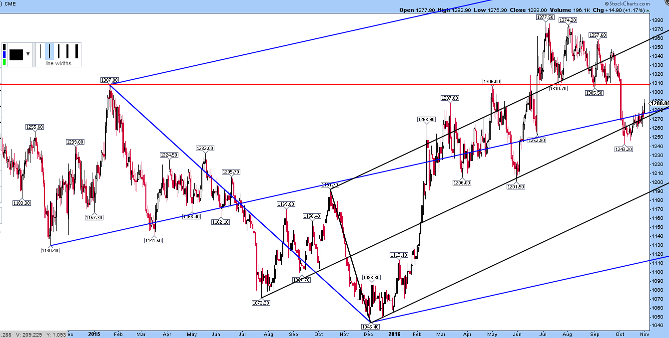
Bigger picture (slightly older chart not including move above $1300). If $1310 is breached, then bullish target might be the top line of the black pitchfork at near $1360. Crucial support is at centre lines of pitchforks coincident at near $1280:
Well Well Well
What a difference the last week of the year makes !
This sector is Not often dull , but it was for the last few weeks and looked like it would remain in a coma
until year’s end ( tomorrow) . But a funny thing happened on the way to sleep.
A Huge rally out of nowhere with large volume considering this is the lowest volume time of year.
Now this could be :
A…a short covering rally / book squaring rally as shorts book profits . It cannot be ruled out. Short Cover rallies are ferocious beasts lasting usually a short time ( days to a week)…especially from such a severe oversold and sentiment extreme. There is good reason to believe this is the case ….Caution !!
Jordan , Rambus , Myself and others here are in this camp. But willing to declare the Bull is alive , if certain parameters are met.
OR
B…The Bottom of this first correction in a new Bull which began in January 2016.
….The Fearless Vulcan Spock is in this camp . He shows some dynamic cycles showing a bottom of significance here
…(The Spock Rocks are up 10 to 25% this week)
…Norvast has his own Gann and Triangulation cycles confirming,
….Surf the Cycles Master also sees great potential this is a yearly cycle Low .
….Graddy has been steadfast .
Which side are you on ?
1…Getting excited about another great short
2…Patiently watching the wild beasts
3…Putting the spare powder to work now
……………………………….
For PM Stock Affectionados (The vast majority of readers and posters here are in this Group)
This is what your year looked like .

…In a nut shell …
First half of the year was a shocking powerful relentless rally from THE most oversold sector maybe in History
After a Brief Mid Summer Pause…this was followed by a shockingly powerful crash for the last half of the year
Finishing now in week 52 with a powerful rally of some note !
Your yearly results depended entirely on where you bought and where you sold / or didn’t on this chart .
This IS addicting !
One of dozens of charts…
I can see a washout to $22-24 to purge the bulls before continuing higher to complete this bullish descending wedge…
As usual, “random thoughts”…
FGC shared this chart earlier…
PLUNGER HAS POSTED THE RAMBUS CHARTOLOGY WEEKEND REPORT THIS WEEK. ALWAYS PRESCIENT AND INSIGHTFUL. PLUNGER IS RAMBUS CHARTOLOGY’S RESIDENT MARKET HISTORIAN AS WELL AS A GOLDTENT CONTRIBUTOR
…………
First the big picture
The bottom of January 2016 may be considered as the beginning of the secular bull market in the gold and silver stocks. This secular bull could last in the vicinity of 20 years or greater. Something this long typically starts off slow and cycles through several phases before attracting the broad investment classes. This process is what we have witnessed to this point. Years of backing and filling, building a huge base for a future move.
https://rambus1.com/2023/06/11/gold-and-silver-stocks-hunting-for-a-bottom-retest-by-plunger/
Short term time horizon charts, whether for silver or SILJ, are all out of whack with the longer term macro shifts occurring since gold’s bottom in January 2016.
Charts lead, headlines follow. Debt ceiling etc. etc. …
As the tweet below says: “Student becomes better than Guru. Zoom out picture changes. Need to invalidate bullish Inv HnS on monthly.”
On a short term chart, this will look like a picture perfect inverse head and shoulders which indicates Dow will shoot up against gold.
https://twitter.com/shyamdadhich66/status/1661688251550253056/photo/1
GL
They are consistently being faded even with the metals and US stocks catching a bid. (The irony is silver had a heck of a rebound, and it looks like it will close above the 100 WMA this week and within the green weekly Ichimoku cloud.)
At this point, I don’t think anyone has a clue in the world how much lower they can or will go or the timeframe for a bottom.
I’m done speculating on day to day price action. My only assumptions are that they will find a low sometime in the next 2-9 months that will be above the January 2016 low (not really going out on a limb on that one) and that that low will set up an eventual parabolic move over the ensuing 2-4 years (they could take their time within a trading range before taking off).
My hope is that they find a low in the next 2-3 months and can begin to build a base for that parabolic move.
No more need for me to comment anymore. I’ll see you when the HUI breaks its all-time high. Over and out and GLTA.
Imagine buying the HUI in late January 2016, perhaps not at the exact low but after a clear swing low and definitely months before it peaked that year.
Despite everything that has transpired since then–the Powell pivot, the Fed’s exploding balance sheet, the tanking USD, exploding deficits, the exploding repo market, etc. etc.–you would *still* be underperforming the Dow as of today.
The recent breakdown since January is just another kick in the balls. You simply will not be allowed to win trying to do the right thing.
Perhaps we are near a bounce, perhaps not. But it matters not, the damage has already been done.
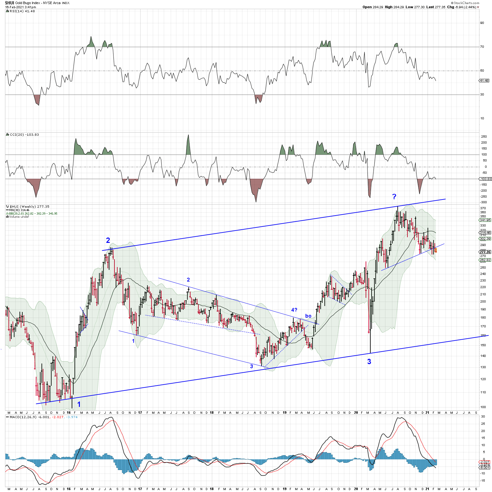
Have been sitting on this chart for a few weeks – was reluctant to post as the implications seem wretchedly bearish. The top and bottom rails are parallel. Point “1” on the chart is at the bottom for Gold and the miners way back in the opening days of January 2016. Today $HUI closed below its neckline. Its Tuesday, so there is plenty of time this week for $HUI to make a recovery.
There is a lot that has happened since the last Quarterly Report. We experienced one of the strongest short term declines in history for the US stock markets and the Coronavirus that will be talked about for many decades into the future. We also had a major breakout in the precious metals complex except for silver with the commodities in general tanking hard to the downside.
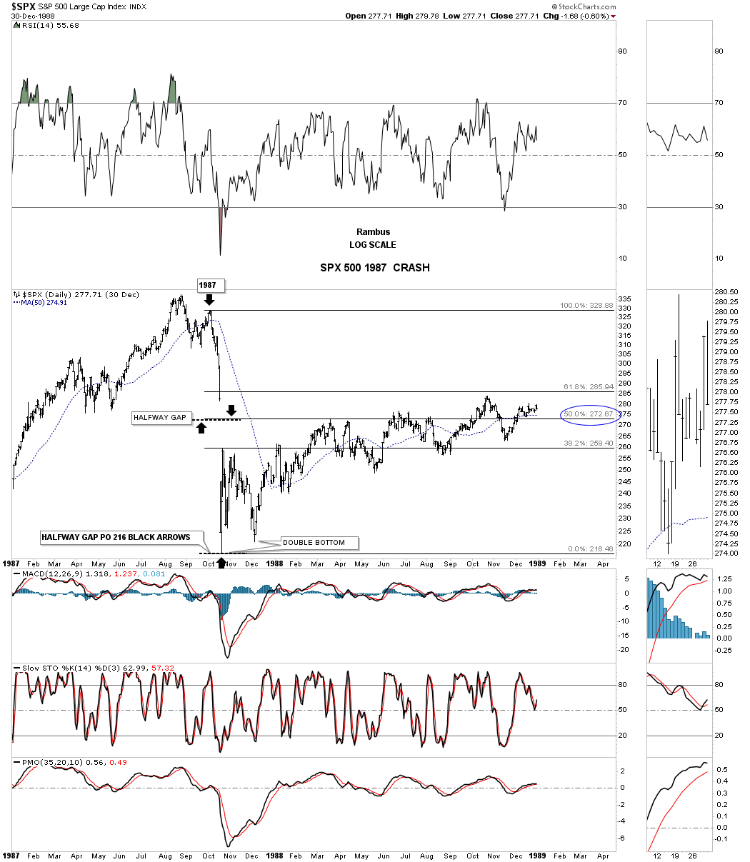
The 2020 stock market crash will be talked about a 100 years from now just like we talk about the Great Depression now. The great debate now is what is going to happen next. I sense the majority of investors are looking at the 1929 scenario to play out with another Great Depressing now upon us. The other scenario floating around is that we just witnessed something like the 1987 crash, which still has the biggest one day decline on a percentage basis in history of about 23% or so. Below is a weekly look at the price action leading up to the 1929 crash. This chart also shows you how human nature never changes by the same chart patterns that were formed back then, are the same chart patterns we see today almost a 100 years later.
Whenever you see a rising pattern where the top and bottom trendlines are slopping up you know you are in a strong trending market. As you can see there was a bullish rising wedge and the bullish expanding rising wedge that formed during the heart of the bull market. Then just before the 1929 top was reached the INDU formed an expanding triangle which is considered to be a pattern where investors are losing control of their emotions as the swings start getting bigger and bigger in both directions.
The roaring 20’s came to an end when the INDU put in a fairly small H&S top related to the size of the bull market. The initial breakout from the 1929 H&S top took only 4 weeks before to complete before the last countertrend rally, bearish rising wedge, really set the stage for the greatest decline for the INDU in history.

This next chart is 2 year daily chart for the SPX which shows the 1987 crash and what took place afterwords. After putting in the crash low on the left side of the double bottom the SPX traded sideways below the 38% retrace but never put in a lower low. Normally after a hard crash like this and the one we just experienced in 2020 the price action can stay range bound for a long period of time before the major trend can reassert itself again. There was a chart pattern that formed during the 1987 crash that looks very similar to the one that was made this year during the 2020 crash.
Note the big gap that was made on the way down that formed right in the middle of the crash which is called a halfway gap or breakaway gap. You can get a price objective by measuring from the last reversal point before the crash to the middle of the gap. You add that distance from the middle of the gap to get your price objective which was 216.
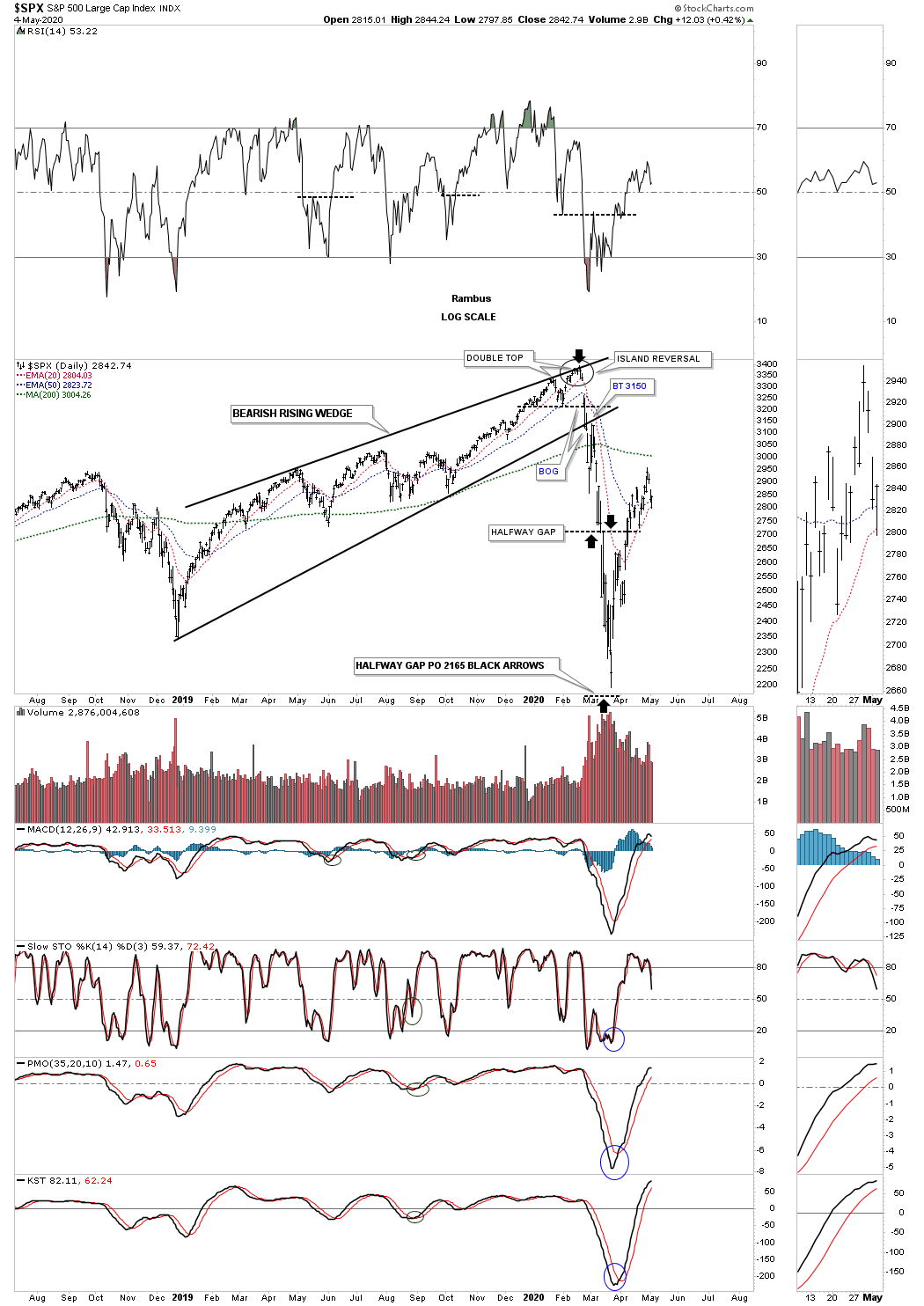
This next chart for the SPX shows the 2020 crash and how similar it is to the 1987 crash. Note the same setup to the 1987 crash by taking the last high, measuring down to the halfway gap which isn’t as pronounced as some of the other US stock markets, taking that distance and adding it to the middle of the gap to get your price objective down to the 2165 area as shown by the black arrows.
There is one more important bit of information on this chart I would like to show you. Anyone who has been following me for any length of time knows I was extremely bullish going into the all time high made on February 19th, 2020. Even on that day there was nothing on the chart to tell me that a disaster of major consequences would soon be upon us. The first real clue I got was when I recognized the small Island Reversal which isn’t that big of a deal but a short term negative. Then when the SPX dropped below the previous low a warning bell went off to look for a possible double top formation which is a reversal pattern. The breakout gap below the bottom rail of the 2019 rising wedge was my point to exit the bull market and wait for more information. At that time I mentioned that if the now bearish rising wedge played out as it should we could see a waterfall decline to where the rising wedge began to form in December of 2018. I really didn’t expect to see one of the greatest declines in history to follow but that is what happened. The reason I’m showing you this chart is because when the Chartology changes so do I, regardless of what I may think. Never underestimate the power of a reversal pattern no matter how big or how small it may be. We were able to avoid most of the crash by getting out early and actually made some money on the way down especially on the short oil trade.
Currently I’m neutral in regards to which way the major trend is eventually going to take hold. Until then I’m going to let the dust settle for a bit. In the meantime, below are a couple of rules I live by which may not make sense to some investors but makes total sense to me.
Let me start by saying, “The only rule when it comes to trading the stock markets is, “There Are No Rules.” The other important rule that I live by is that, “the markets are always right regardless of what I think.” It’s interesting to hear comments like, the markets don’t trade like they use to so its not any fun anymore. Even trading during the mania phase in the tech bubble parabolic rise wasn’t easy, or the markets can’t keep going up because of no volume or interest rates are too high or countless other reasons that only make sense according to traditional investing.
I personally fight everyday to keep an open mind to any possible scenario that may arise even if it doesn’t seem possible. I would venture to say that 90% of our members think I’m off the deep end because I believe there is a possibility that the 2020 crash low may already be in place and a new bull market could be setting up. How many are simply amazed by the strength the stock markets are showing? How can it keep going up with all the negative news about the Coronavirus and what its doing to the US and world economies.
Chartology is the study of chart patterns and human emotions which make up those chart patterns that are formed each and everyday. I’ve often said that we are playing a game of psychological warfare more than anything else. When the herd is moving one way it is very difficult as a human to move in the opposite direction because that’s our nature for survival. That works great in the real world but not so much when it comes to trading the stock markets.
I’v tried just about every trading discipline there is but I’ve always come back to building chart patterns and trying to interpret their meaning. From a Chartology perspective all the information an investor needs is in the charts. All the charts we look at everyday are made up from actual investors, institutions, mom and pop, the risk taker or the conservative trader with their hard earned capital on the line. It’s their view on the fundamentals or technicals or whatever it is that makes them want to invest in that stock that makes it go up or down.
The bottom line is that when a market or stock doesn’t do what you think it should be doing don’t blame it on the stock or the market because they are always right. It’s our interpretation of the information that is flawed. It can be a hard pill to swallow but that’s the nature of the game we choose to play. If it was easy everyone would be a millionaire, but then there would be no markets to trade.
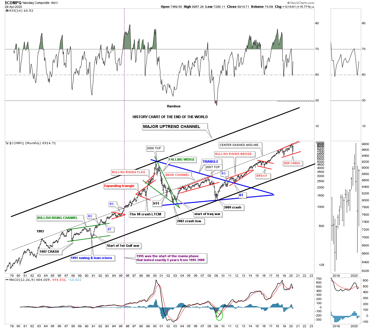
Last month when the 2020 crash put in the initial bottom I posted the, History Chart For the End of the World, that goes back to 1979. This historical chart shows all the end of the world events that I have personally traded through. I won’t go into a lot of detail since we just looked at this chart last month but for new members just start at the 1987 crash low which literally felt like the end of the world and is still the biggest one day decline in history on a percentage basis. Then just work your way to the right to see all the other history making events and chart patterns that felt like the end of the world when they occurred.
I view the center dashed midline as the most important line on this chart. It stretches all the way back to 1983 and kept the secular bull market in check until it came time for the tech parabolic move to take off beginning in 1995. In 1995 the price action was finally able to trade above the center dashed midline. With no overhead resistance the sky was the limit. After the 2000 top was in place the bear market crossed back below the center dashed midline once again where it turned back into resistance until the infamous 2007 top which led to one of the strongest bear markets in history. Since the 2009 crash low, which felt like the end of the world, its been very difficult for many investors to believe one of the biggest bull markets in history has occurred. Ask yourself a simple question. How much of the 2009 bull market have you actually felt comfortable trading, if any? How many reasons have you read that the rally was living on borrowed time or the fundamentals were sooo bad that there was no way the rally could continue.
So here we are again at another very important inflection point in regards to the 2020 crash low. Is this time going to be different and the end of the world is now upon us or are we witnessing another historical buying point? Note the small red rising flag that is forming just below the center dashed midline that is getting close to completing its 4th reversal point. We will get our answer if the top rail of the red rising flag and the center dashed midline are finally broken to the upside. Could we then see something similar to what we saw back in 1995 when the tech stocks went parabolic for 5 years? History has taught me not to bet against it.
Precious Metals Complex:
There are as many ways to play the PM sector as there are investors. Some will only buy the big cap PM stocks for safety. Others will only buy the mid cap producers. Some will only buy a mix of big caps and mid cap producers. And then there are the PM stock investors that will only play the juniors. Each has its own advantage depending on your risk tolerance. Some of you are wondering why is Rambus’s portfolio structured like it is with hardly any big caps miners?
After a great run during the tech bull market that ended in 2000 I was able to basically retire and build our dream home. After that bull market ended I was left looking for another area in which to invest. It wasn’t until early 2002 that I saw a chart for gold which was showing a very large base that caught my attention. Whenever I see a big base I have to study it more to see what is behind the price action. The more I looked, it became apparent to me, that a new bull market may be starting to form in the PM complex.
Keep in mind I knew very little about the PM complex back then as I only traded the big cap tech stocks. I only knew a few of the really big cap PM stocks like Newmont, Barrick, ASA and just a couple of others. I didn’t even know there was a sector called the juniors. It didn’t take long, after I immersed myself in studying all I could about this new area to invest, that I became hooked. I still remember my first trades in the PM sector which were Newmont, Barrick and ASA.
I kept studying this new and exciting area for me and found out about the juniors and the possibilities they could offer. I read several articles about how many of the juniors went through the roof in 1997 I believe, when BRE-X supposedly found the Mother Lode. Juniors were going up 100’s of percent and many going up 1000’s of percent. There are few areas in the markets that a sector can go up that much so I had to study more. The more I studied this little sector the more convinced I became, that for me, this is where I wanted to trade. The rest they say is history.
I already had the foundation for identifying chart patterns so it was just a matter of finding as many juniors as I could and look at their chart patterns. Since the first leg up in the new bull market had ended there were many juniors with some decent consolidation patterns already in place. I was lucky that I was able to catch most of the 2nd leg up in the new bull market before it ran out of gas and needed to consolidate its gains. When I put my first PM portfolio together I bought 10 juniors all under a dollar and hoped for the best. By the time the correction began that portfolio was up 273% in just under 8 months which was more than I had hoped for.
During the next impulse move up that began in 2005 I had bought 20 juniors all under a $1.00 and when that impulse move ended that portfolio was up 328% in less than a year. Needless to say I had found a new home in which to trade.
What I learned trading back then was that the tide would lift all boats to a certain degree with the juniors, that had good looking chart patterns, 100’s of percent. What I also learned back then was that when the impulse move ended it was time to get out of those juniors as they could give back a large chunk of the profits during the next consolidation phase.
So that brings us up to my current portfolio. One thing about the PM stocks is that it is a small universe and following it through the years you begin to learn about their individual characteristics and how they may behave during an impulse move. Some would call my current portfolio very speculative because I don’t have any really large PM stocks, but I do have a decent mix of some mid caps and juniors.
Sir Plunger’s 4 horsemen are going to do very well and make a lot of money for those that invest in those 4 stocks. For me personally and what I learned in the first half of this secular bull market that ended in 2011 was that the juniors is where I want to mostly trade. If I don’t make at least 250% to 300% on this trade, which I finished up the buying several weeks ago, then I will be disappointed. I hope it will be more but I’ll be satisfied with the 250% to 300% profits.
Another important lesson I would like to share is that once you are in a confirmed impulse move the last thing you want to do is try trading it. That was a lesson I learned the hard way though the years. For whatever reasons once you get out of a trade in an impulse move the idea that you are going to buy back at a cheaper price very seldom works out. My experience has been you usually pay up if you want to get that position back.
I posted this history chart for the HUI several weeks ago which shows all the consolidation patterns that formed during the first half of the secular bull market that ended in 2011. The red arrows show you where the impulse move actually began. As you can see most of the impulse moves between each consolidation pattern lasted for many months before they became exhausted. If you recall the last time I posted this chart I put the red arrow under the 5th reversal point on the 2016 triangle reversal pattern. I said I wasn’t going to wait for the breakout before I got positioned which so far has worked out well. The price objective for the 2016 triangle is above the 2011 all time high over 700 but I’ll be satisfied to reach the all time high before the next consolidation period begins.
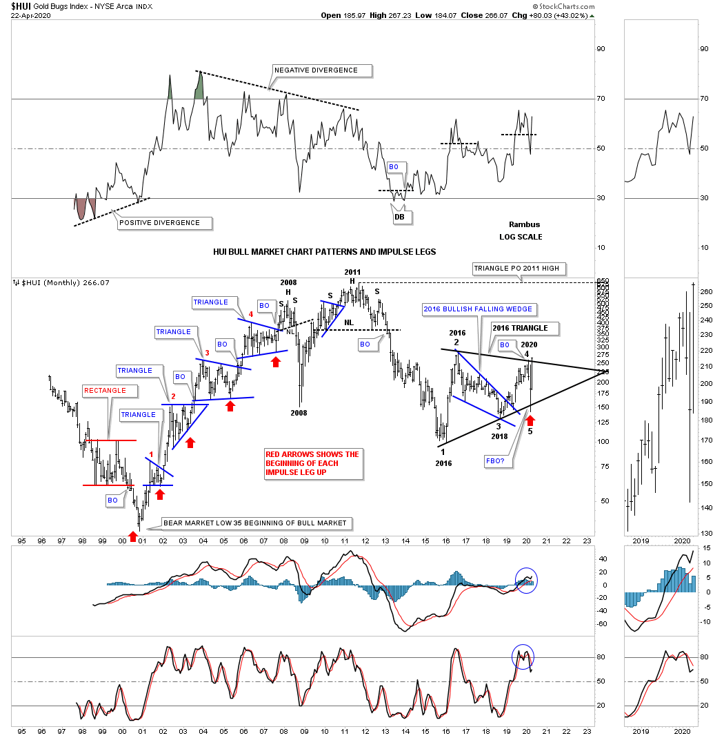
So how does the 2016 triangle reversal pattern look on the long term secular bull market uptrend channel? It has been forming right on the bottom rail of the 2000 bull market uptrend channel. Where will the HUI be trading if the top rail of the bull market uptrend channel is reached in the future?

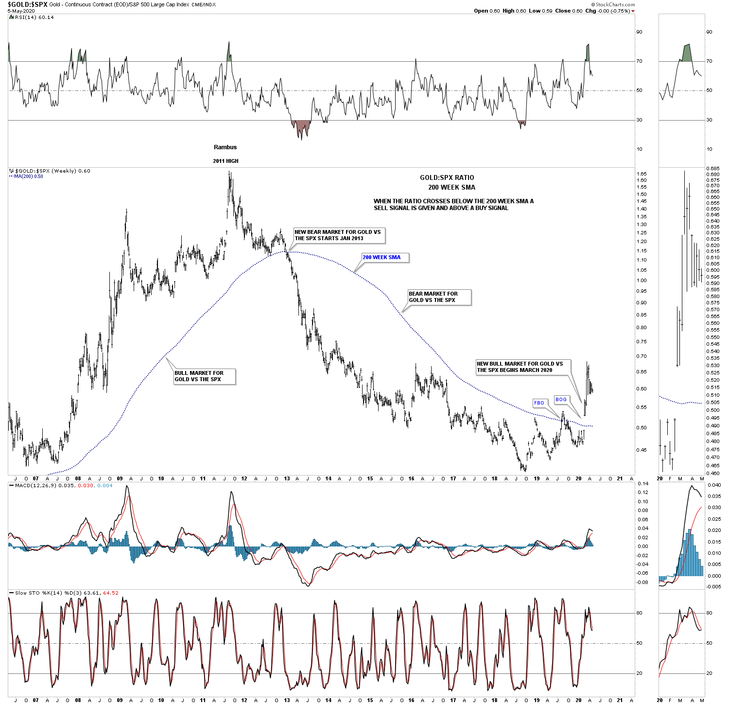
This next chart is a ratio chart that compares GOLD:SPX which gives long term buy and sell signals. When the ratio trades above the 200 week sma a long term buy signal is given and when the price action trades below the 200 week sma you are on a long term sell signal. Recently in March of this year the ratio finally broke out above the 200 week sma giving a brand new buy signal. The previous bear market sell signal occurred in January of 2013 over 7 years ago. This chart tells us gold is now set to outperform the SPX until the next sell signal is generated.
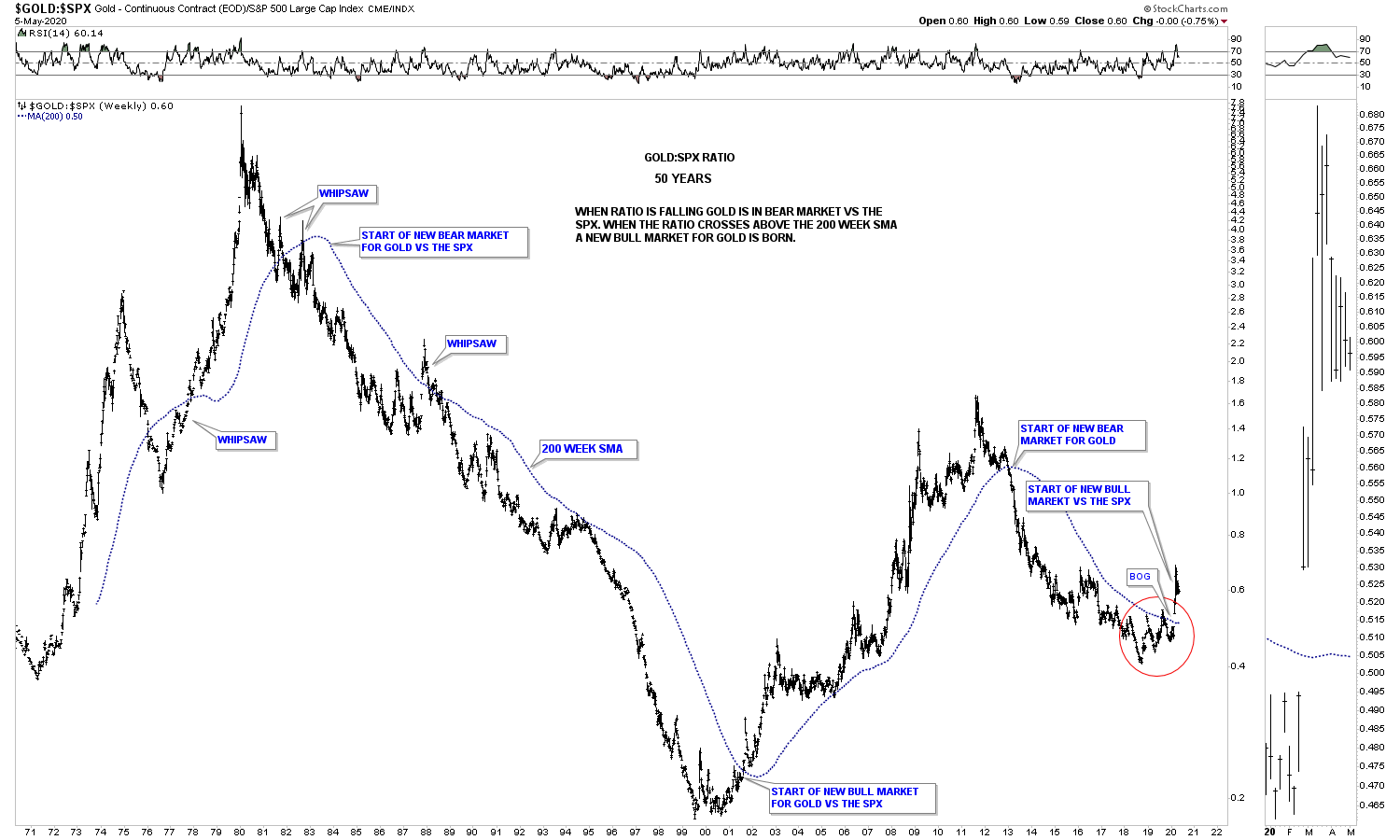
This next chart is the same as the one above but his chart goes back 50 years and shows all the long term buy and sell signals. As you can see once the dominate trend gets established it can last for many years. In over 50 years there has only been 3 whipsaws where the ratio traded over the 200 week sma only to trade back below it.
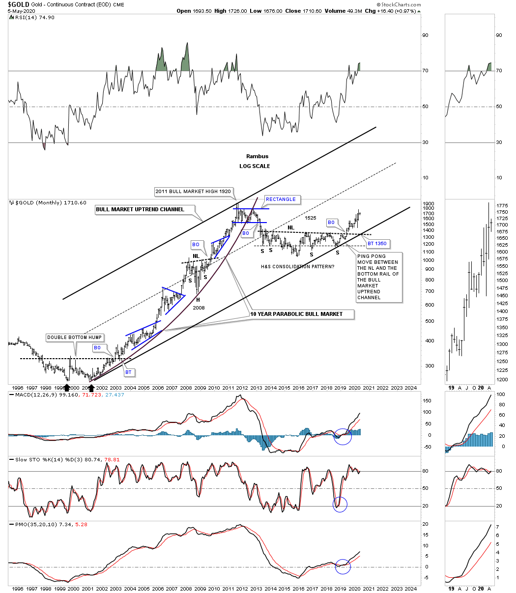
For those that want to see what a secular bull market looks like this long term month chart for gold shows the first phase of the secular bull market that ran from 2000 to 2011. Gold has been correcting the first leg up for almost 9 years now building out the massive 6 year H&S consolidation pattern. The 6 year H&S consolidation pattern could very well end up being a halfway pattern between the first leg up and the current leg up. Note the blue consolidation patterns that formed during the first bull phase and how each one of those blue patterns formed about the halfway point between each impulse move.
There is one subtle bit of Chartology on this long term monthly chart that is easy to see if you look for it. In any strong uptrend you will see higher highs and higher lows that is by definition an uptrend and just the opposite for a downtrend. If you start at the double bottom that launched the 2000 – 2011 bull market follow the price action starting at the right side double bottom as shown by the black arrow. Follow each monthly low all the way up to the 2008 H&S consolidation pattern. Not once during that entire move did we see gold make a lower low. During the formation of the 2008 H&S consolidation pattern we did see gold make a lower low which formed the head. Now follow the price action from the head of the 2008 H&S consolidation pattern up to the all time high made in September of 2011 and you will see higher lows all the way up.
Commodities:
After a long term bear market in most commodity related stocks we are starting to hear analyst talk about inflation. From a Chartology perspective the deflationary scenario is still in play but how much lower can this sector go? In tonights Weekend Report, I’m going to update some long term commodity charts we’ve been following for years to see where they are currently trading in their bear cycle.
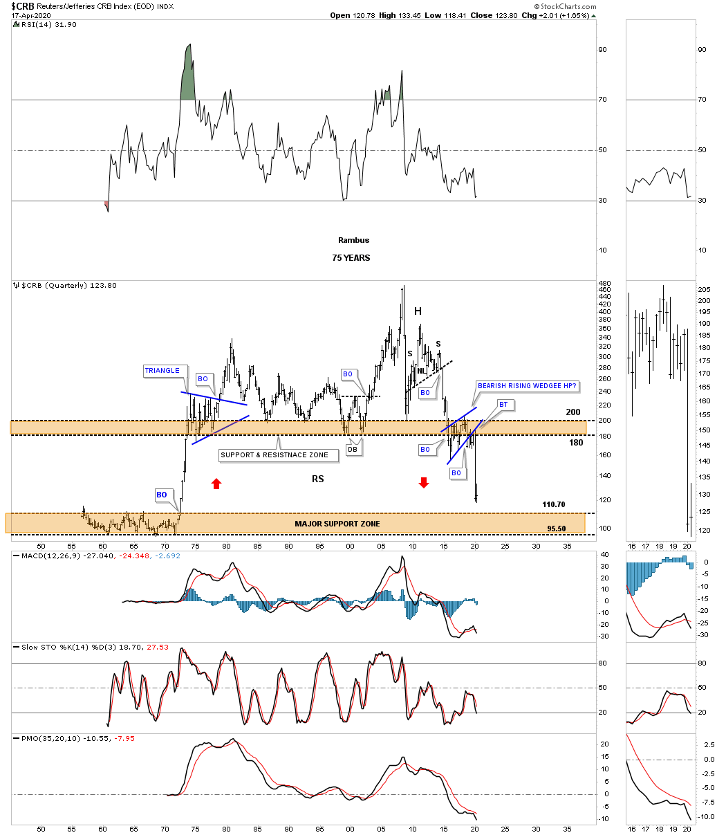
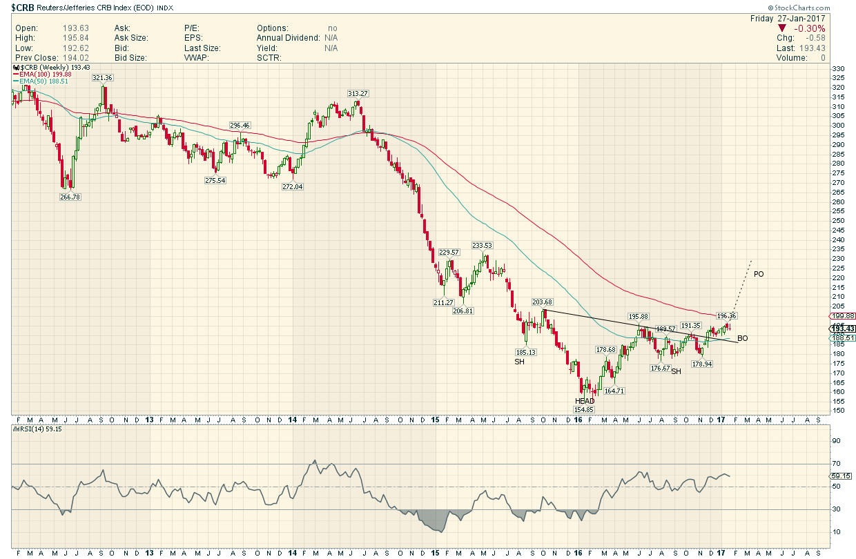
Lets begin by looking at one of the most widely followed commodity indexes the CRB. This 20 year monthly chart clearly shows the bear market began in July of 2008 which puts the age of its bear market at 12 years and counting. The initial crash, out of the 2008 high, was the same crash that the stock markets and PM complex experienced. The countertrend rally out of the 2009 crash low setup the next important high in the ongoing bear market which was the 5 year H&S consolidation pattern. The impulse move out of that 5 year H&S consolidation pattern took the CRB index down to the January 2016 low where we saw another countertrend rally that concluded in May of 2018 forming the head of the 4 year H&S consolidation pattern. The H&S neckline gave way in February of this year and has reached the minimum H&S price objective at 134.23. The CRB index has now reached an important point within its impulse move down where we could see either another small consolidation pattern start forming, similar to the blue expanding triangle halfway pattern in 2005, or some type of reversal pattern.

This is what I wrote back on August 23, 2019. This next chart for the CRB index is the infamous 75 year quarterly chart which shows the trading range that formed between the mid 1950’s to the early 1970’s. This chart shows how the H&S top and the bearish rising wedge fits into the big picture which could have serious negative consequences for the CRB index. If the current bearish rising wedge fulfills its measured move as a halfway pattern to the downside the CRB index will be trading all the way down into the brown shaded support zone using the BO to BO method. Just measure from the breakout below the neckline to the first reversal point in the 2016 bearish rising wedge. Then just take that measurement and add it to the breakout point of the 2016 bearish rising wedge to get your price objective. As you can see the current price action is now approaching the top of the brown shaded support zone which goes all the way back to the mid 1970’s.
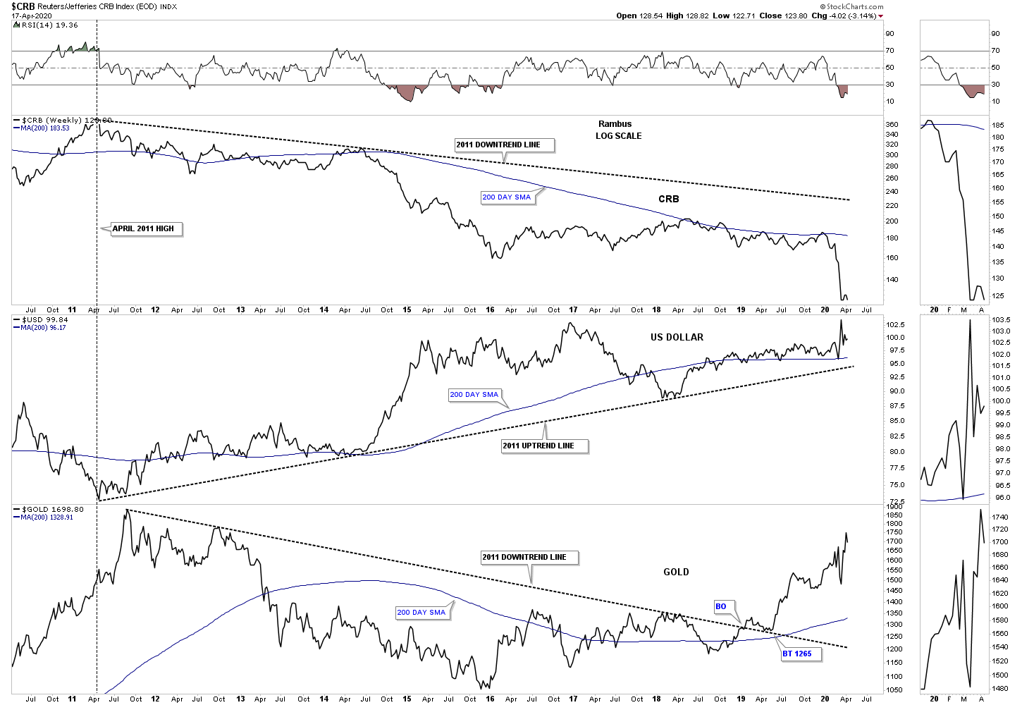
This next chart is a long term weekly combo chart which has the CRB index on top, with the US dollar in the middle and gold on the bottom. Since 2011 the CRB index has been moving inversely to the US dollar while gold has been moving generally up with the US dollar since the 2016 low. At this point a strong US dollar is still playing havoc with the commodities in general but not so much for gold.
One of the most important commodities on the planet is oil, WTIC. Since the parabolic move that ended at the 2008 high WTIC has been in a severe bear market going from 147 to the recent low just under 20. What is most interesting about this long term monthly chart is how the recent low came in at the H&S measured move price objective down to the 23.19 area which was also the bottom rail of the 2008 downtrend channel. I’m keeping a close eye on the shorter term daily chart looking for some type of reversal or consolidation pattern to form.
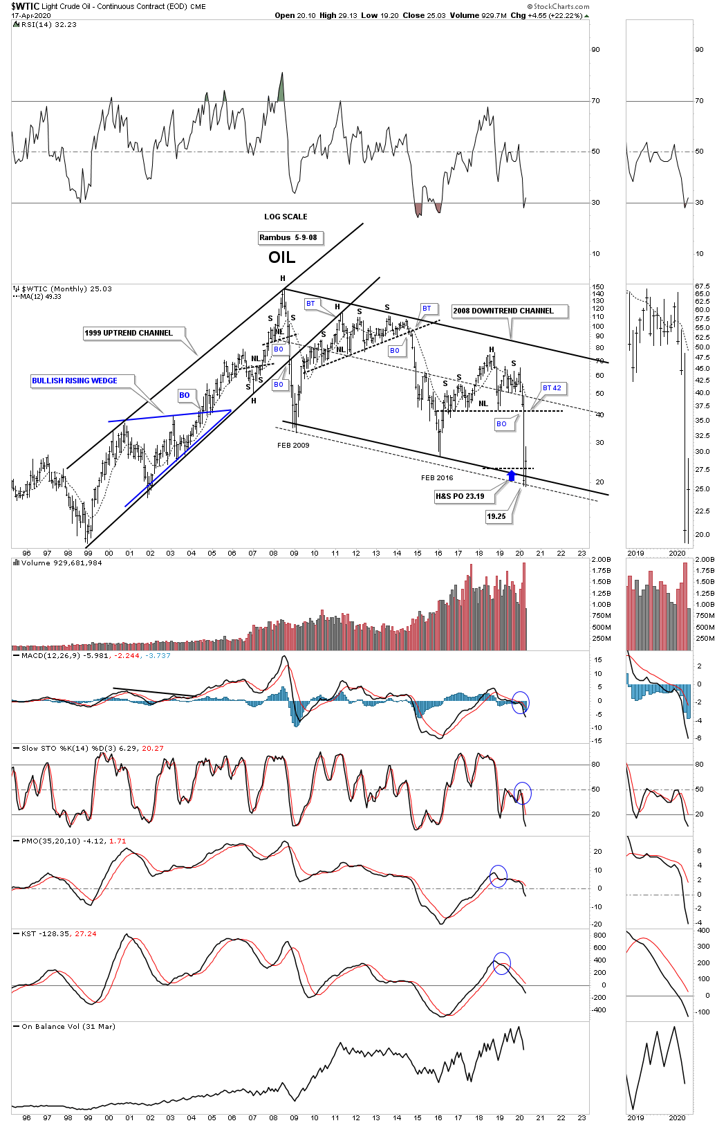
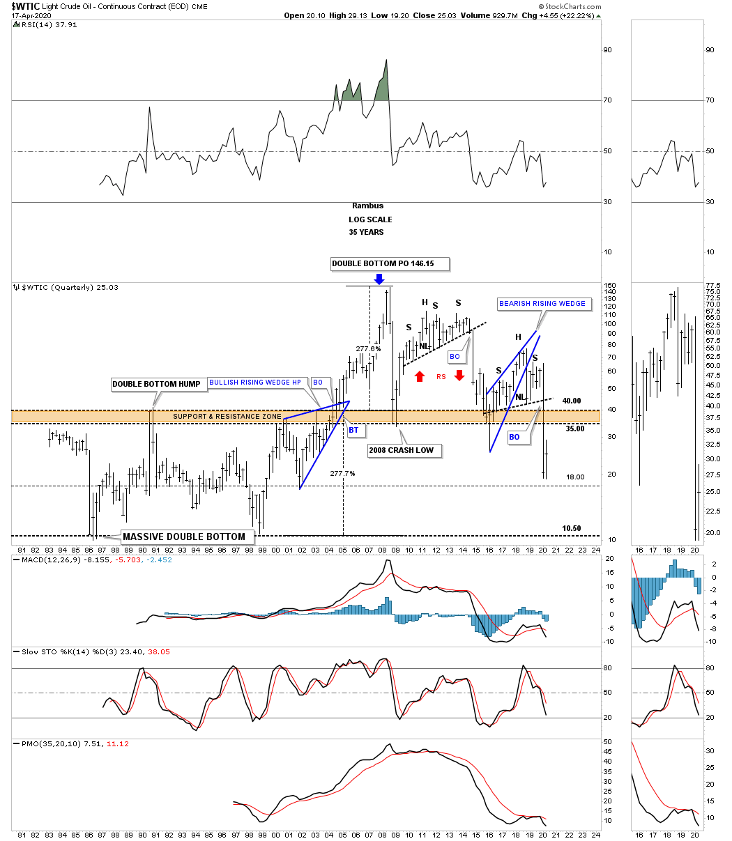
Just like the long term quarterly chart for the CRB index we looked at earlier the WTIC has a very similar pattern that goes all the way back to 1981 when the low in oil was 10.81. Note the massive double bottom which projected a move of 277% which was just a dollar or so off the all time high. I’ve often explained what a classic H&S top is. They start out with a rising wedge where the left shoulder and head form inside of the rising wedge with the right shoulder high forming close to the breakout point on the backtest to the bottom rail of the rising wedge. The short oil trade was our best performing leveraged trade during the 2020 crash.
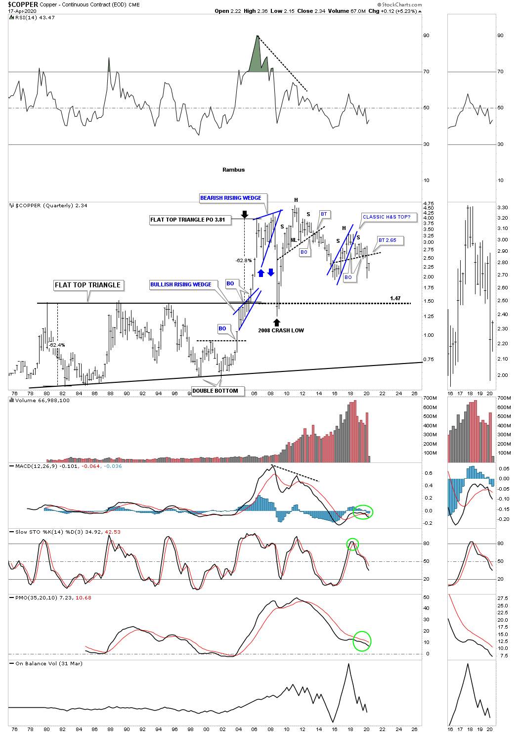
Since we are looking at long term quarterly charts for commodities we shouldn’t be surprised that many have similar looking charts. This long term quarterly chart for Copper shows a similar look to the WTIC which shows its recent H&S top is also a classic H&S top. You can also see the massive base that began to develop back in the late 1970’s which broke out to the topside in the middle of 2005 and reached its price objective at 3.81. Note how the 2008 crash found support right on top of that massive flat top expanding triangle.
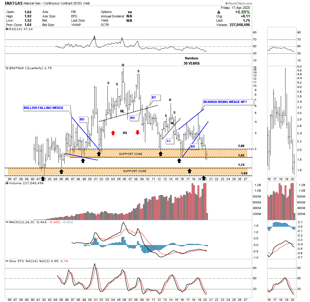
NATGAS, natural gas, is setup a bit differently in regards to its long term chart. The bear market for natural gas actually began in 2005 and has made a series of long term lower highs. When I first built this chart I put in two brown shaded support and resistance zones as the reverse symmetry was playing out so beautifully as shown by the back arrows. The upper brown shaded support zone has held support going all the way back to 1995. Is it going to hold support in 2020?
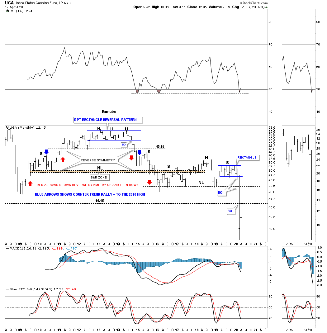
When we first opened up our doors at Rambus Chartology I would show this chart for UGA, gasoline, on Friday night after the market closed for the weekend. The trading range at the top of the chart ended up being a 5 point rectangle reversal pattern which ended up being the head for multiple H&S tops.
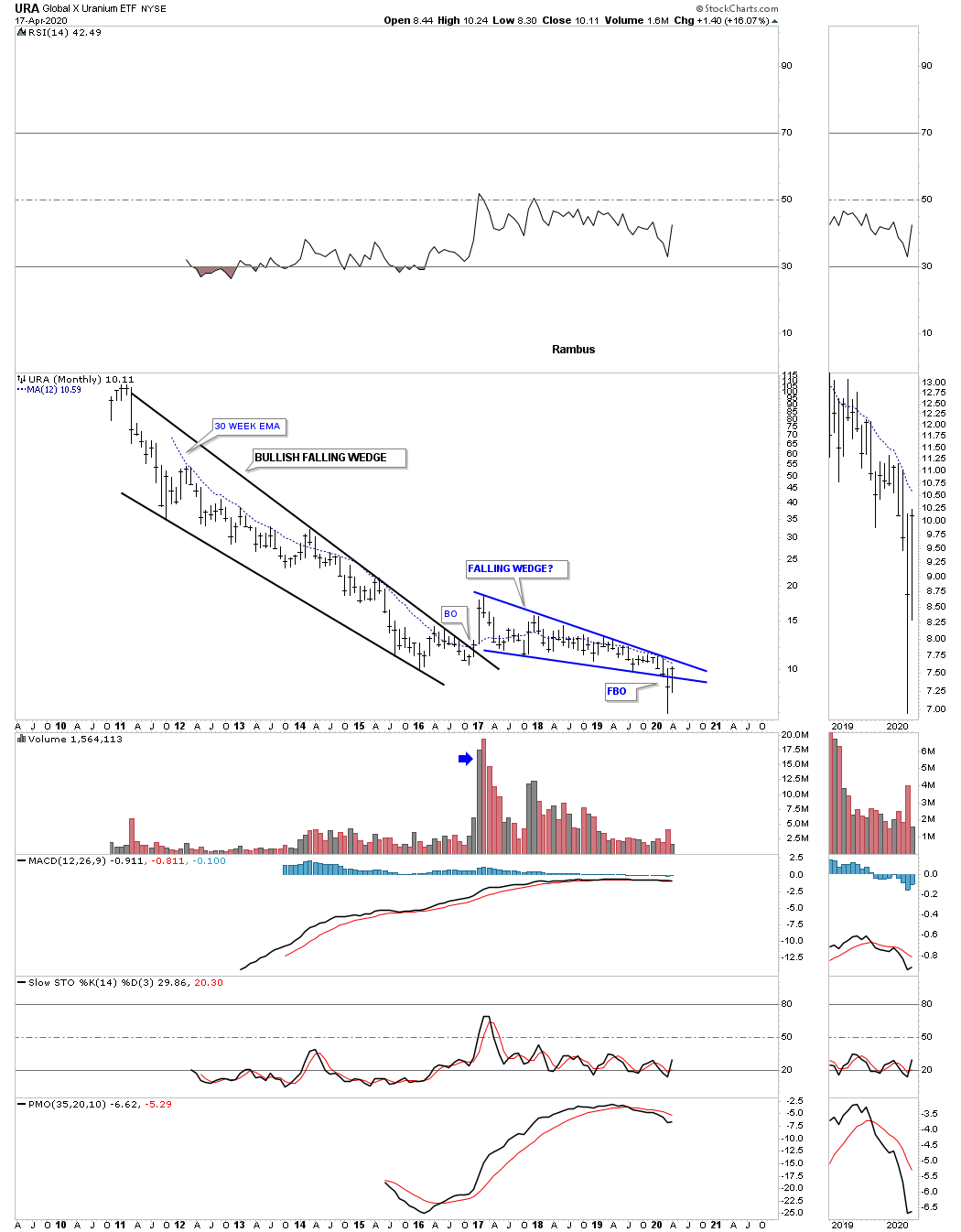
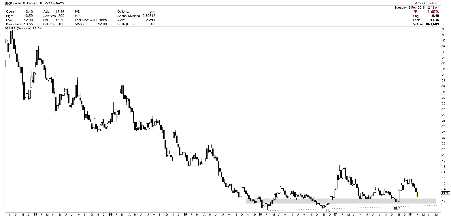
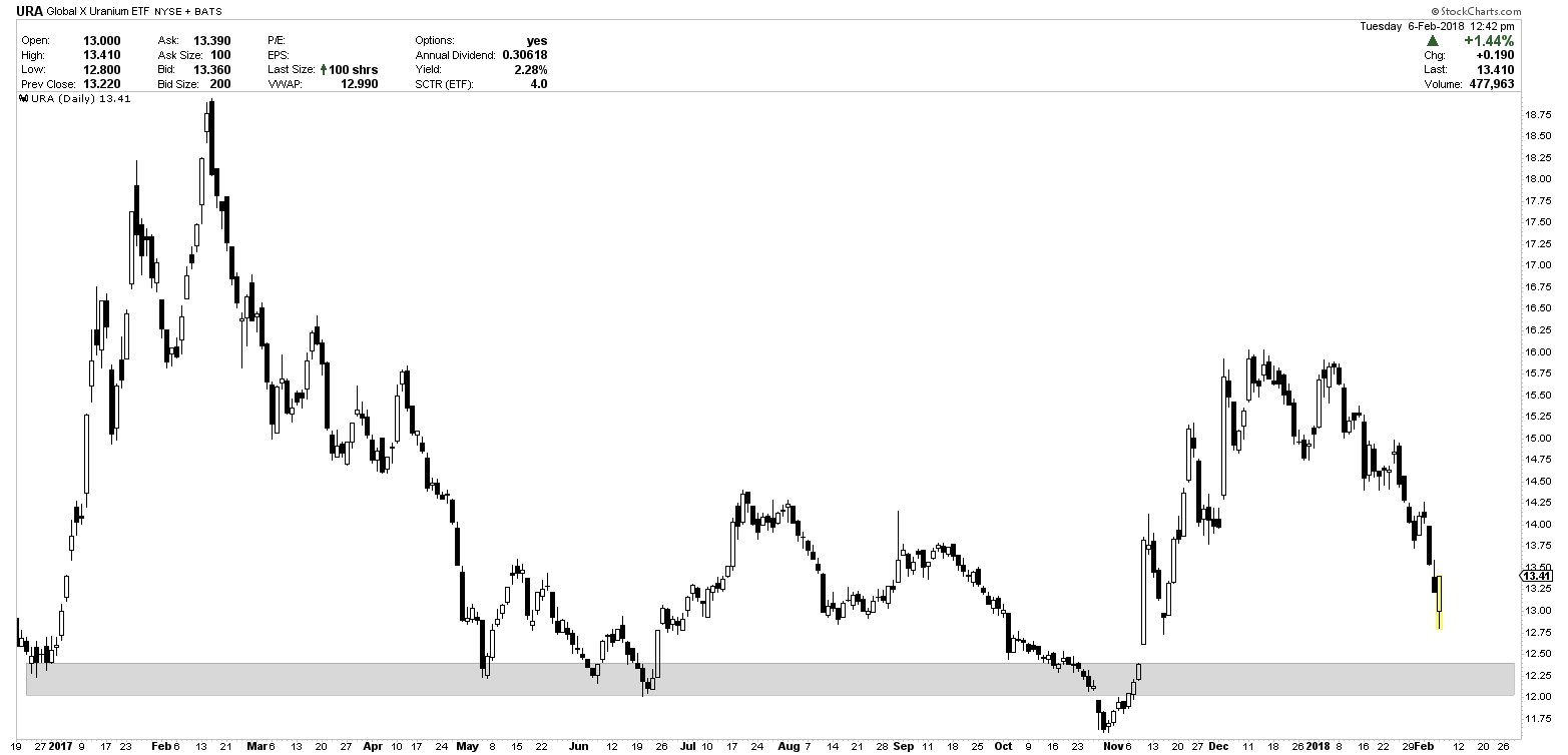
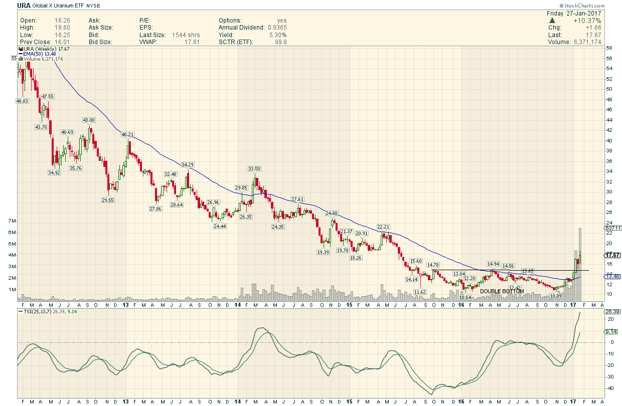
Lets finish up by looking at some different commodities and indexes. Last month the URA broke below the bottom rail of its 2016 falling wedge. So far this month the URA has managed to rally back up into the falling wedge negating the breakout for now. A move above the 30 week ema would help with a bullish outcome which is just overhead.
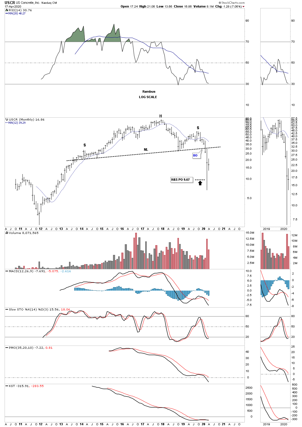
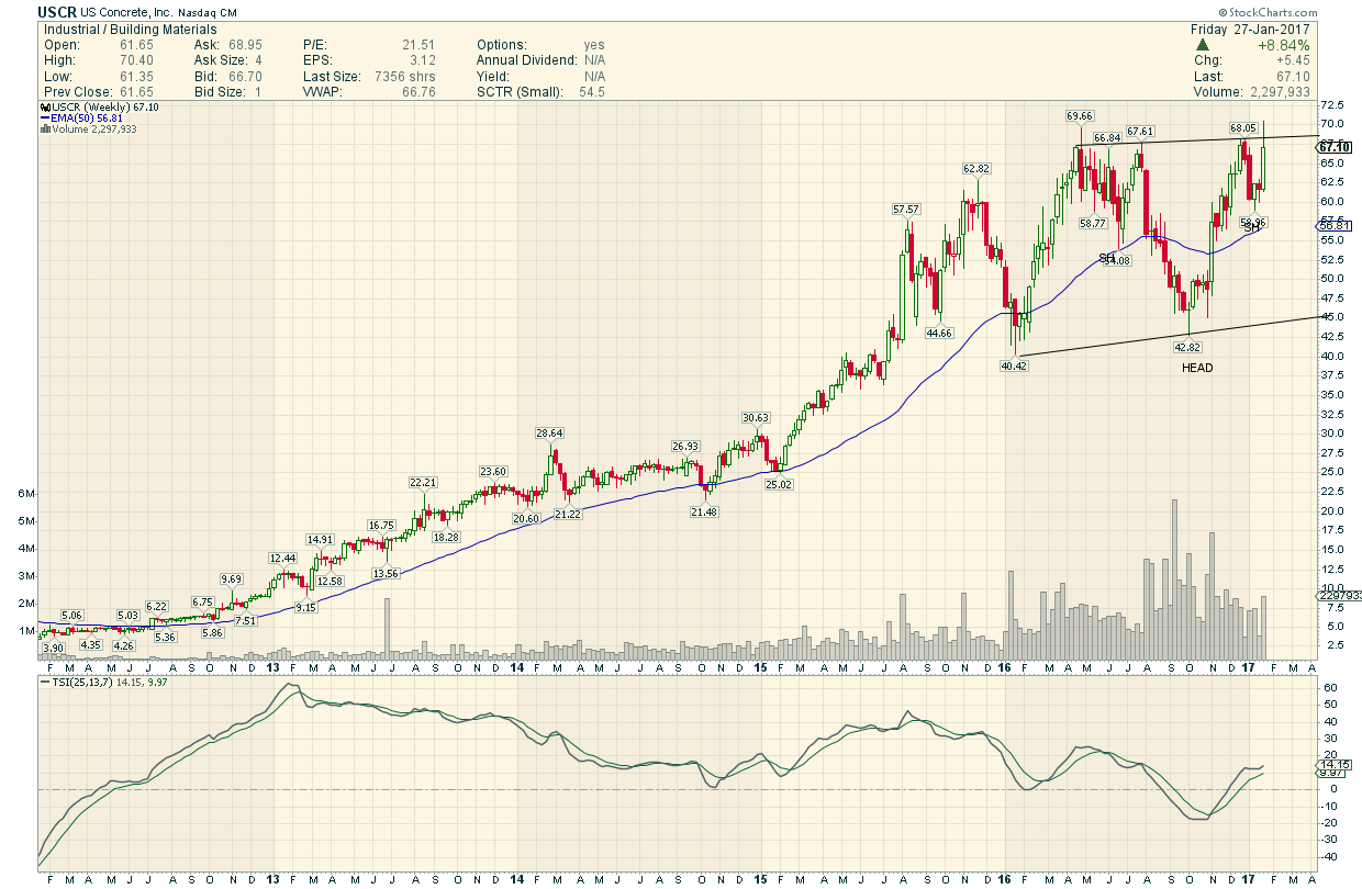
USCR, US concrete, has just achieved the minimum price objective for its H&S top after its massive bull market that began in late 2011.
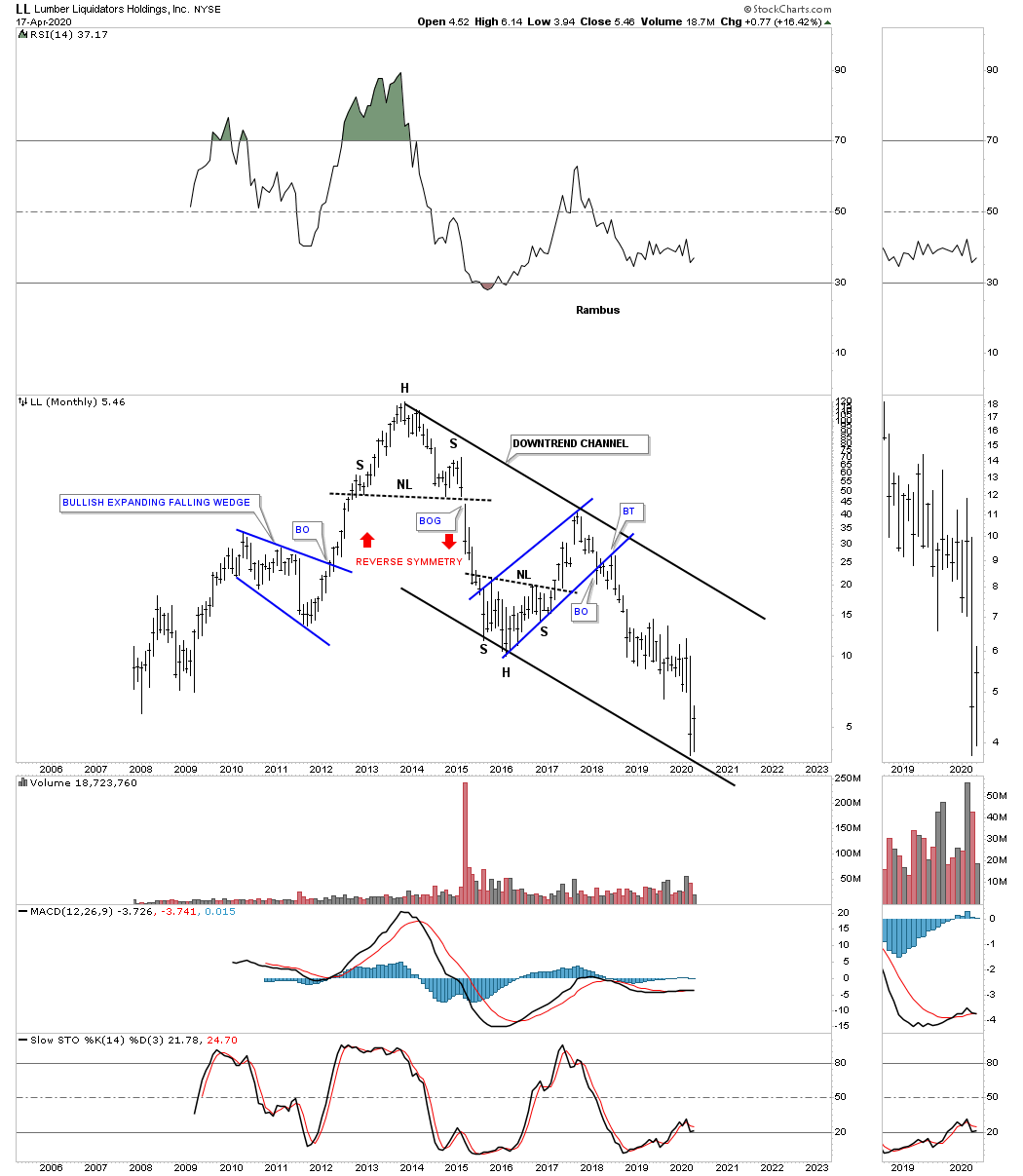
LL, lumber, has just hit the bottom rail of its 2013 downtrend channel.
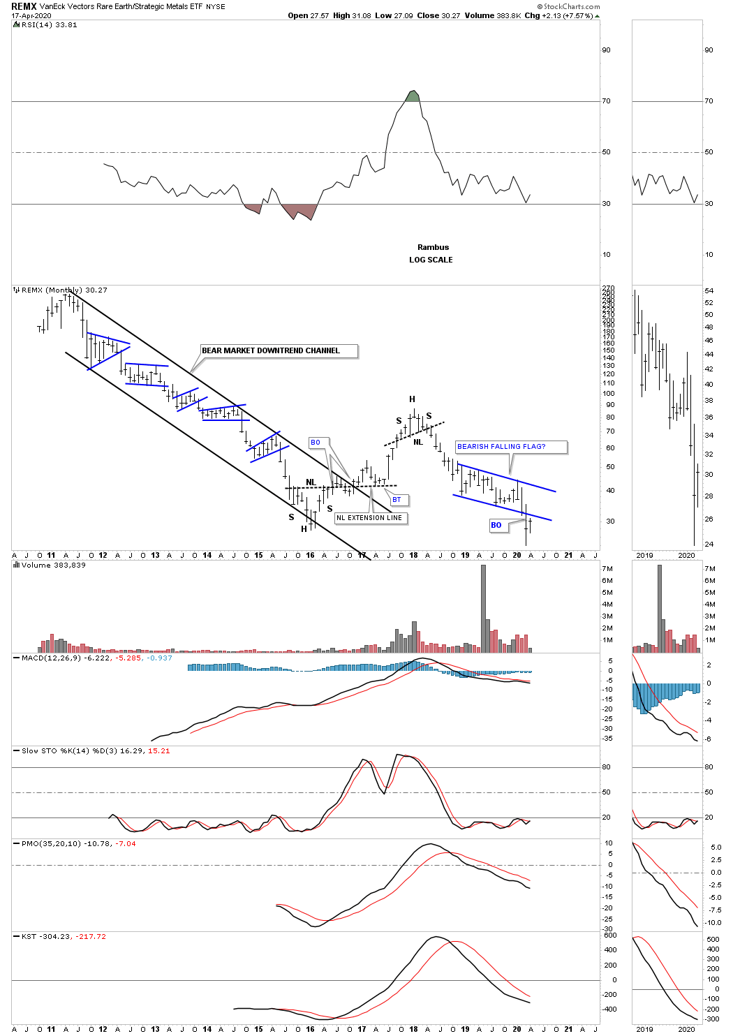
The REMX, Rare Earth etf, has experienced one countertrend rally during its lifetime going back to the 2011 high. Last month the price action broke below the bottom rail of a falling flag formation which is generally a bad sign unless the bulls come to the rescue and rally REMX back into the falling flag at a minimum.
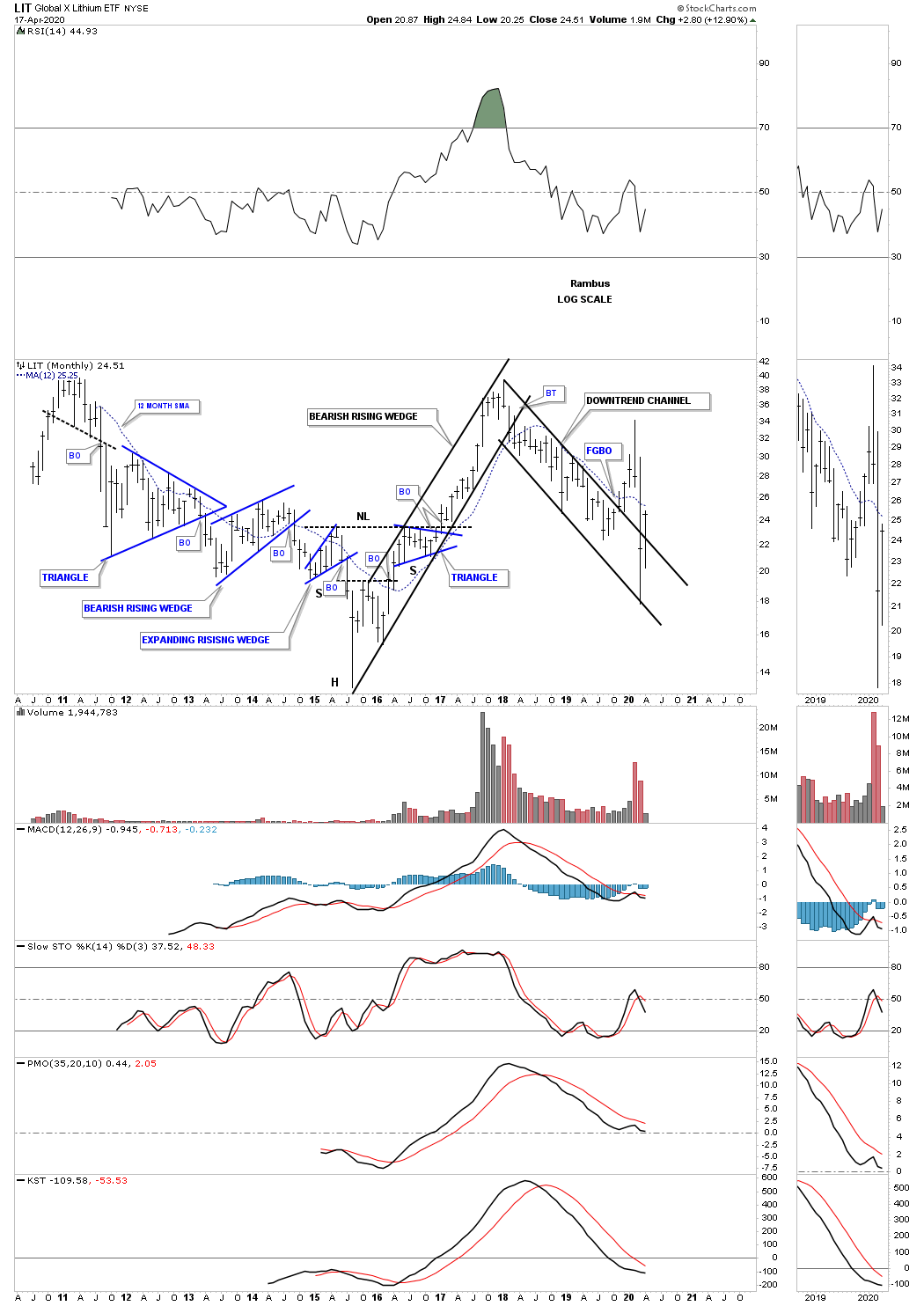
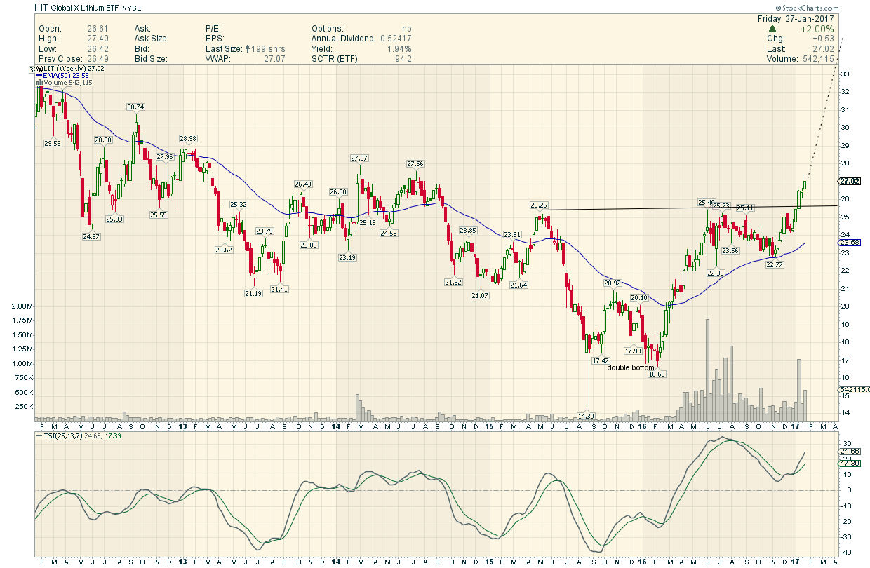
After putting in a false breakout gap last November the LIT, lithium etf, the price action negated that breakout when it traded back into the downtrend channel. This month the LIT is attempting to breakout again trading back above the top rail.
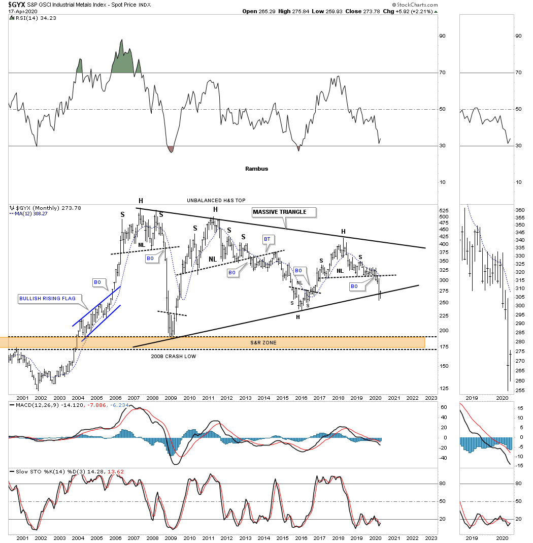
The GYX, industrial metals index, is trying to find support on the bottom rail of its massive 2005 triangle.
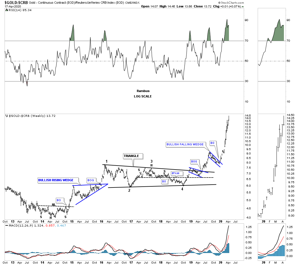
Below is a ratio chart that compares gold to the CRB index. How much longer can gold outperform the CRB index in such a big way?
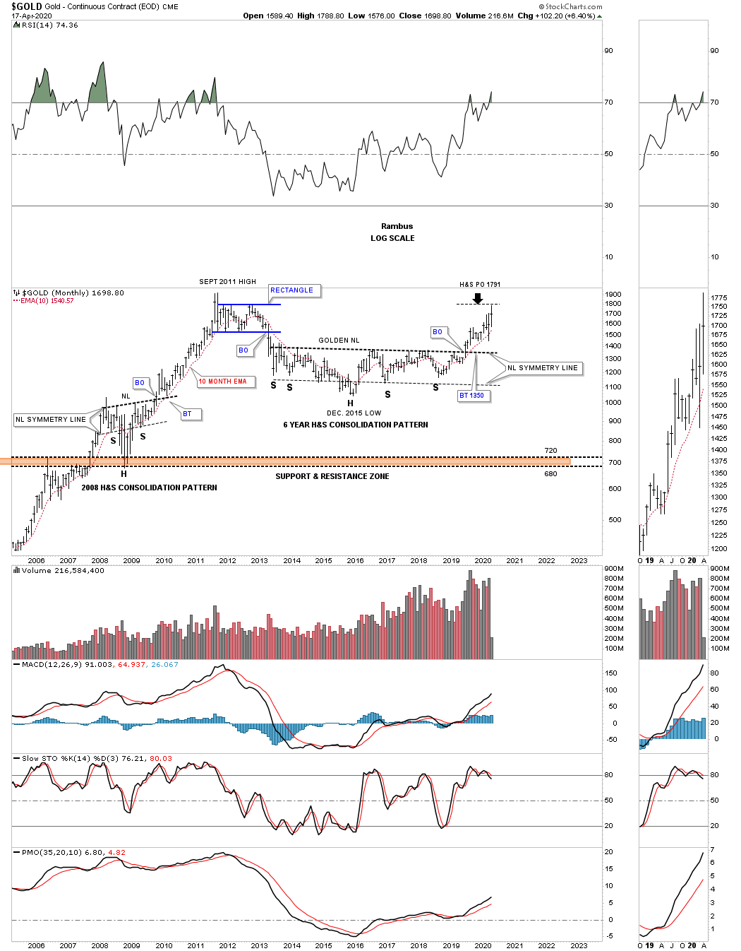
This last chart for tonight is a long term monthly chart for gold with the 2013 golden neckline. This month the 2013 H&S consolidation pattern minimum price objective has been met a 1791.
The bottom line is that most commodities have been in a bear market since their 2008 highs. Now most have reached their minimum long term price objectives which puts them at a critical inflection point where they can form a consolidation pattern to the downside which would most likely complete their bear markets. On the other hand they could be either starting to form a reversal pattern of some kind which could end their bear markets. Keep an open mind watching the shorter daily charts to see what kind of pattern builds out.
Stay safe and all the best…Rambus
2016 low most commodities have been consolidating that first impulse move down with most now breaking down in their second impulse move down which could be the final washout. What happens at the end of this current leg down remains to be seen. The odds will be high that before the next inflationary cycle takes hold we’ll most likely see some type of multi year bottoming pattern buildout.
The big question on all the gold investors mind is how is the precious metals complex going to behave during this time? Initially is looks like the PM complex will decline with everything else which would be normal. If this deflationary event is anything like the 1929 event then the PM complex will be the first to bottom. So for now lets just take it one step at a time and focus on the current environment and see what is possible.
There is a pattern that has been forming on most of the PM stock indexes I’ve been showing you since the end of last year when it started to show itself. That pattern really came to life 2 weeks ago which has made this pattern even stronger and closer to completing
The chart pattern I’m discussing is the 2016 triangle which began to form at the January 2016 low. During the formation of big chart patterns there is usually a smaller reversal pattern that forms at each reversal point which is important to know as it can give you a good reference point on where to look for a reversal point. As you can see on this daily chart for the HUI that the 2016 low formed a double bottom which led to the impulse move up that was almost vertical and burned out in August of 2016. For those who were members back then you may recall that was the first time since the top in 2011 that I got fully long the PM stocks.
At that 2016 high I began to look for some type of smaller consolidation pattern to start forming that would lead to the next impulse move if the bear market was over and a new bull market was underway. Instead of seeing some type of consolidation pattern forming I saw the infamous 2016 H&S top buildout which was the last thing I wanted to see. From past experiences I learned long ago never dismiss a H&S pattern either a top or bottom no matter how bullish or bearish we are.
I’m never well liked when I have to issue a sell signal when I see one of these H&S patterns form. Back in 2008 I had to leave Goldtent because no one wanted to hear a top was forming after an eight year bull run. It wasn’t so bad when that massive 2011 H&S top formed that ended the bull market as I was able to show the price action way ahead of the actual breakout. We would watch one PM stock break the neckline followed by some more until finally all of the PM stocks had broken their respective necklines. I can still remember we were waiting for Goldcorp to finally break its neckline as it was one of the strongest PM stocks back then.
The rest is For Members and not to be missed
https://rambus1.com/2020/03/22/weekend-report-204/
https://rambus1.com/membership-subscription-service-via-paypal/
platinum is up to back over $900, just as I suggested yesterday, which puts it mysteriously back over weekly cloud support.
the usd continues to dump and yen continues to ramp up.
all I am waiting for is a large pop in silver.
right now it’s all systems go and last week is shaping up to be a historic shakeout at least on par with January 2016. Hindsight….
In this Weekend Report I’m going to follow up from the Late Friday Night Charts, with some long term charts for gold and the HUI that were made literally years ago. These long term charts are important because they were made when the psychology of the PM complex was very different from what it is today, or is it? We know 100% for sure that the PM complex topped out in 2011 with silver putting in its bull market high in April with gold and the HUI putting in their final bull market high in September. It doesn’t seem possible but that was eight years ago already. Let that sink in for a minute.
During this eight year bear market there has only been one bright spot which was the eight month rally from January 2016 low to August of 2016 high. The rest of the time the PM complex has been trading sideways to down making very little progress to the upside. This type of slow steady grind to the downside eats away at investors emotions to the point where they will believe anything to end their frustration that began at the bear market top. It’s been eight long years and a bottom should be close at hand because that is long enough for a bear market they believe.
The markets don’t care what I believe or anyone else for that matter. It’s our belief system that gets us into trouble. How can the US stock markets keep going up when there are so many reasons it can’t keep going up, but the stock markets don’t care about what we believe. How can the PM complex keep going down in the face of all the negative reasons the world is coming to an end any day now. The markets makes absolutely no sense to most investors. This has to be, in order to have markets to trade.
Once everyone finally gets on the same page, at the end of a bull market or the beginning of a bear market, the markets will do their best to confound the masses. I say that like the markets are a living and breathing entity which in fact they are. The markets are made up of millions of investors each with their own agenda on how to make a killing. It’s the herd mentality that most of us think we are immune to but in reality we are all part of the herd whether we like it or not. Thinking outside the box is very difficult to do but it is mandatory if we are going to have any chance to be successful at playing one of the most difficult games on the planet to win.
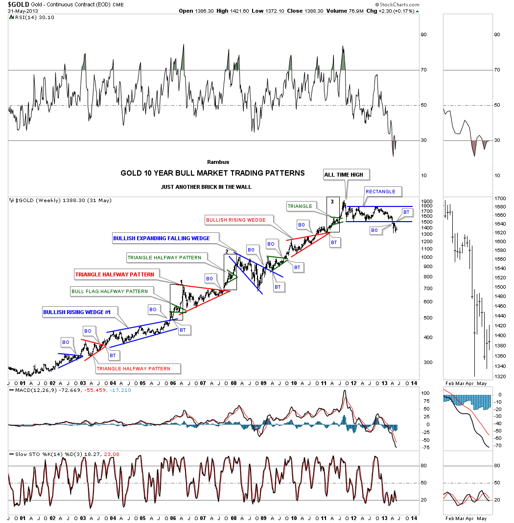
This first chart tonight is a 20 year weekly look at gold which shows its extraordinary bull market that began in 2001 and ended ten years later in 2011. During the bull market years I called this chart, “just another brick in the wall.” I often said during the bull market that investors will be studying this bull many years in the future just like we study the stock market crash in 1929. That ten year bull market in gold was a thing of beauty with one consolidation pattern forming on top of the previous one. There were big consolidation patterns along with very small ones as shown by the green triangles that formed in the middle of almost every impulse move higher. There were also many measured moves that worked out very well.
If Rambus Chartology had been up and going during the bull market years you would have known that I was one of the biggest promoters of that bull market based on the Chartology. Outside of the 2008 correction the ten year bull market made a series of higher highs and higher lows, one consolidation pattern forming on top of the previous one, which by definition a true bull market.
That beautiful bull market came to an abrupt end in September of 2011 after putting in a spike high. From that spike high gold had its first initial decline in its new bear market falling almost 400 points before finding support. From that first reversal point, in what turned out to be a six point rectangle consolation pattern, gold chopped sideways in a tight trading range and finally broke the bottom rail signaling the new bear market was alive and well. The breakout below the bottom rail of the blue rectangle coincided with the 2013 crash which caught most investors off guard. There were cries of manipulation, how could it be anything else. The Chartology was looking for a breakout below the bottom rail as the rectangle was forming below the 2011 high, which was strongly suggesting a new bear market was being born. As you can see there was a backtest to the bottom rail which confirmed the rectangle was a consolation pattern and ushered in the new bear market in no uncertain terms.
Next I would like to show you a variation of the same trading zone with this first chart showing you the possible bullish setup. We’ve been following this potential multi year H&S consolidation pattern for a long time now but the price action refuses to breakout above the neckline. It would be a very bullish situation if gold finally breaks out of this multi year trading range.
Complete Comprehensive Chartology of Gold and Gold Stocks …for members
https://rambus1.com/2019/05/05/weekend-report-180/
There is a most incredible chart at the end of this report….without giving away the particulars it has something to do with 38.9% !
wow Rambus !
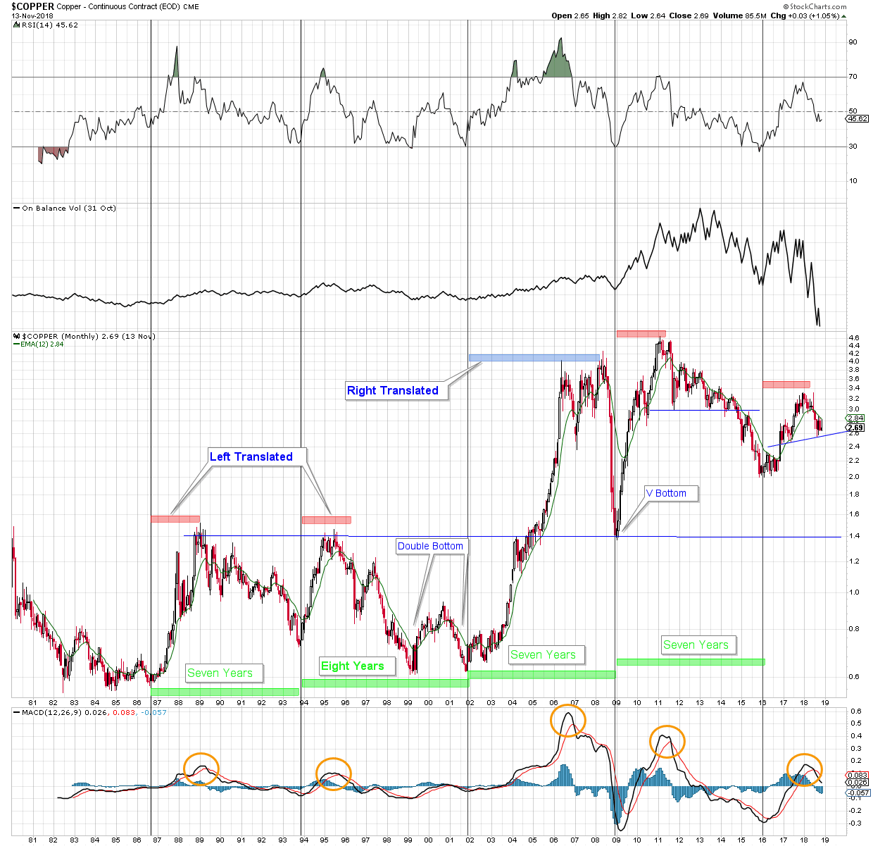
Its called Dr. Copper because its said to have a PHD in economics. Here is a monthly view of the $price of copper from 1980 to present. It seems evident that the price moves in a 7 or 8 year cycle, trough to trough – or at least it has for the last 4 cycles. Three of the cycles were left translated (LT) – that is, the price rose for a shorter length of time in the cycle than the decline. In the 3 LT examples the price climbed for about two years, then gradually declined to the 7 or 8 year low. The outlier is the right translated period from ’02 until ’09 when the price climbed for 6 years and then collapsed into the 7 year low.
That brings us to the present cycle that started in January 2016. The question is – has the price of copper peaked? For clues we might look to on balance volume (OBV) as compared to the previous cycle, and to MACD as compared to all previous cycles. Both suggest copper has already peaked at year 2 and is declining into a cycle low due in January 2023.
$Copper Monthly
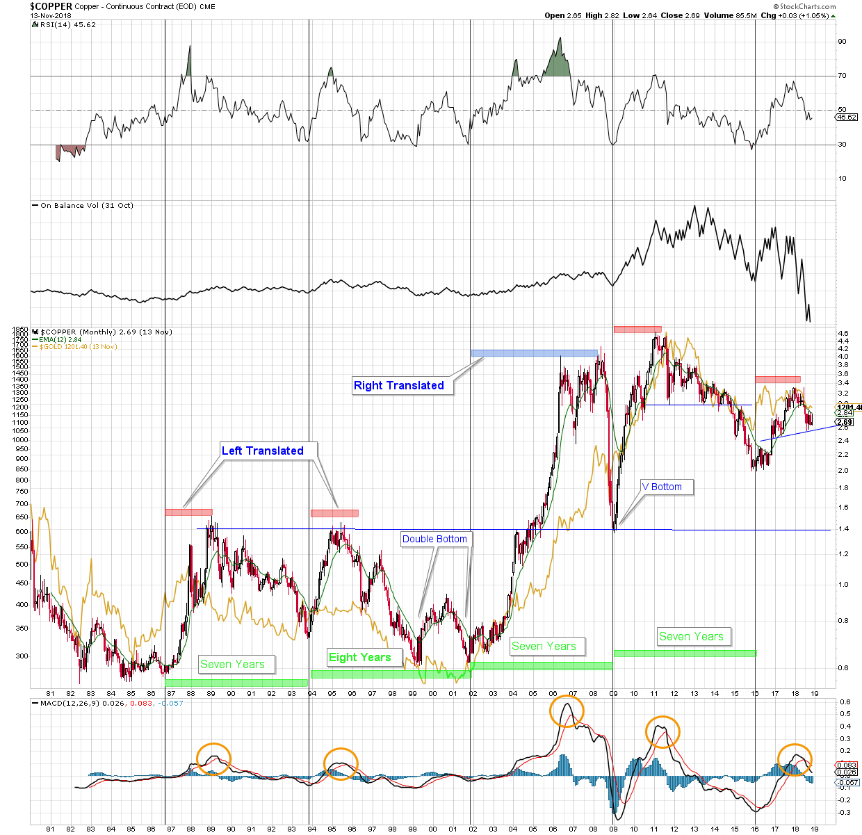
$Copper Monthly with $Gold overlay
What is interesting, and perhaps a little unsettling, is the correlation with the $price of gold. Its not perfect, but there is a correlation.
“Tonight I would like to update some of the PM stock indexes that have been trading sideways for about a month now frustrating both the bulls and the bears alike. This might seem counterintuitive but a rally that moves higher, consolidating along the way, has a better chance to succeed vs one that goes straight up. It’s not as much fun living through these chop zones, but this is the way the markets work. The January 2016 rally in the PM stock indexes was a lot of fun because the move was so vertical, but then came the pain starting seven months later at the August top which can still be felt today.”
For members
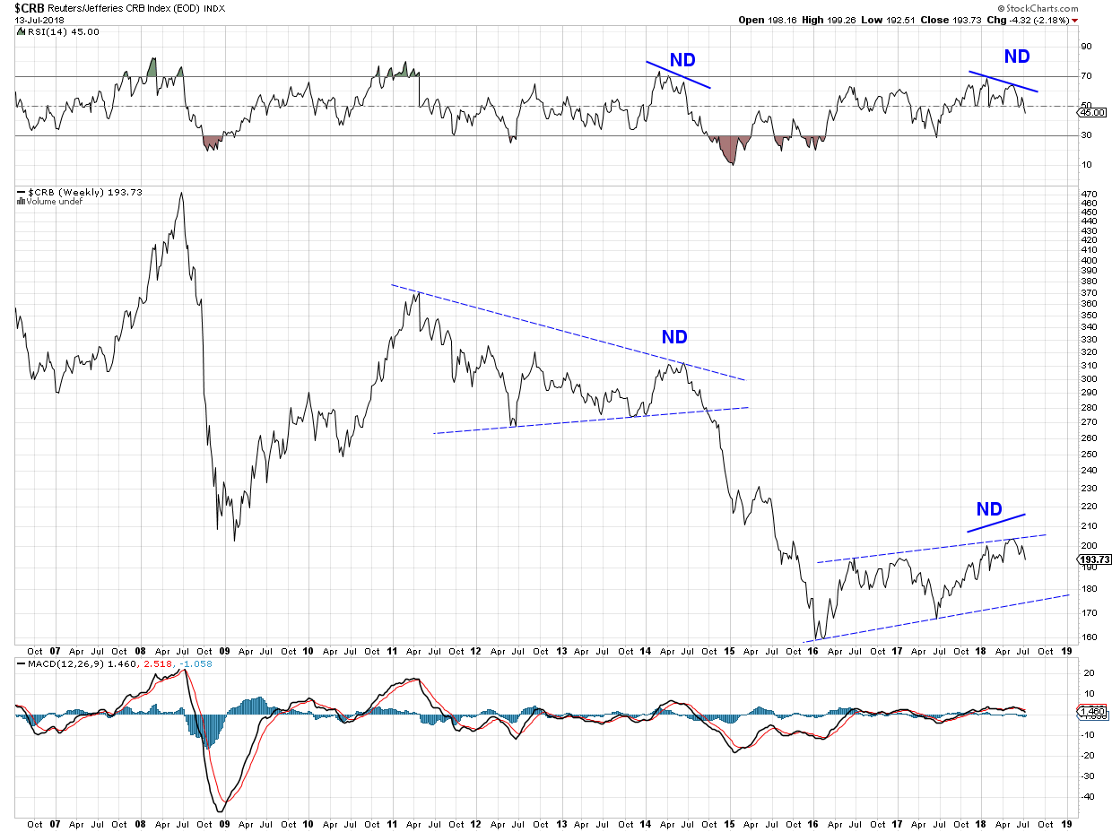
$CRB’s RSI negative divergence on the weekly chart suggest there is more to come for the recent down turn.
How much more? Could it reach the lower dashed blue trend line? The consolidation pattern unfolding since January 2016 looks like it could morph into a bear flag. But then, that would mean a serious deflation.
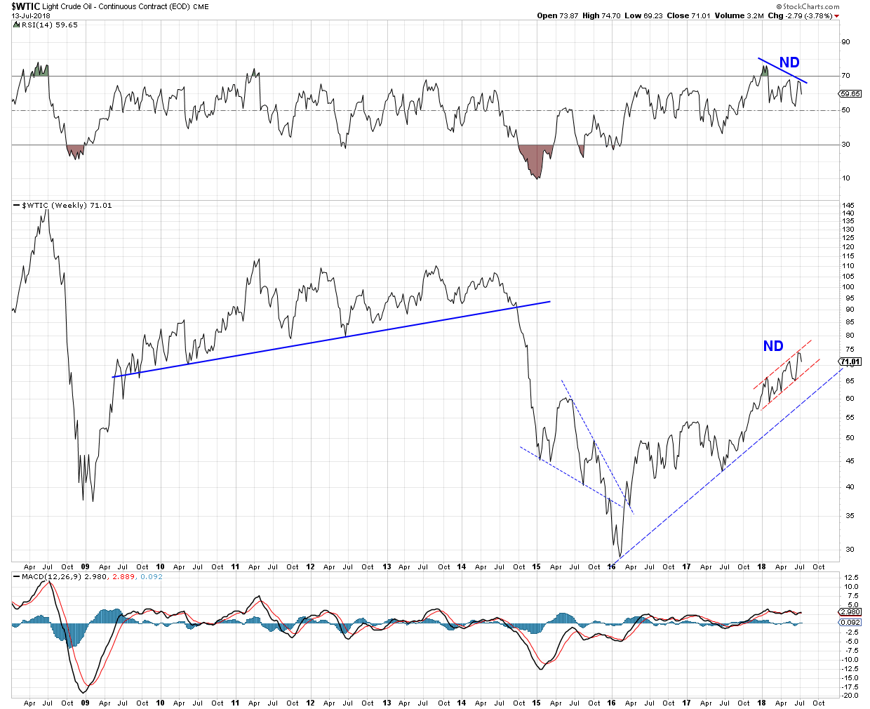
Is energy about to join the commodity downturn? $WTIC negative RSI is pointing in that direction. The lower trend line of the red channel is a possibility for now. The blue trend line is another.
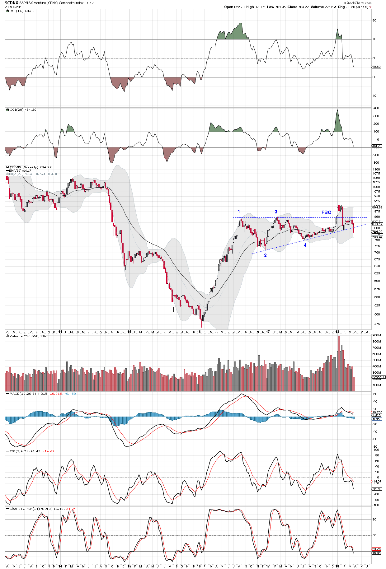
When a breakout is negated (FBO) then falls below the bottom rail of the consolidation pattern you can bet there is trouble ahead. The $CDNX rally off the January 2016 bottom has just completed a nasty reversal pattern. We need to ask why. Anyone care to take that one on?
Well I don’t know, but it sure looks to be setting up bottoming price action since early 2016. It appears to be printing higher lows and I can see some support above the grey dotted line and in the grey zone. Anything can happen, but I certainly will be looking for some demand to build up in that support zone. If so, I will consider an entry above the grey line and set a stop loss not far below the low of January 2016.
I am a shorter term trader but this one I would like to keep if it lets me. I will not act until price finds and confirms support, if that happens.
Since January 2016 when EVERYTHING started to go UP
Here is the score in the Currency Game.
Lately It doesn’t feel like it BUT
Who’s Da Boss for 2 years ?

World faces wave of epic debt defaults, fears central bank veteran
Ambrose Evans-Pritchard, 19th January 2016, telegraph.co.uk
Now behind some type of pay wall, long quote so you don’t have to bother trying to access it:
“The global financial system has become dangerously unstable and faces an avalanche of bankruptcies that will test social and political stability, a leading monetary theorist has warned. The situation is worse than it was in 2007. Our macroeconomic ammunition to fight downturns is essentially all used up,” said William White, the Swiss-based chairman of the OECD’s review committee and former chief economist of the Bank for International Settlements (BIS). Debts have continued to build up over the last eight years and they have reached such levels in every part of the world that they have become a potent cause for mischief,” he said. It will become obvious in the next recession that many of these debts will never be serviced or repaid, and this will be uncomfortable for a lot of people who think they own assets that are worth something,” he told The Telegraph on the eve of the World Economic Forum in Davos. The only question is whether we are able to look reality in the eye and face what is coming in an orderly fashion, or whether it will be disorderly. Debt jubilees have been going on for 5,000 years, as far back as the Sumerians. The next task awaiting the global authorities is how to manage debt write-offs – and therefore a massive reordering of winners and losers in society – without setting off a political storm. Mr White said Europe’s creditors are likely to face some of the biggest haircuts. European banks have already admitted to $1 trillion of non-performing loans: they are heavily exposed to emerging markets and are almost certainly rolling over further bad debts that have never been disclosed. The European banking system may have to be recapitalized on a scale yet unimagined, and new “bail-in” rules mean that any deposit holder above the guarantee of €100,000 will have to help pay for it.” [Bolding & Italics my own.]
Post GFC 1, US & UK taxpayers recapped their banks, European taxpayers didn’t recap theirs.
If you have any sizeable financial assets in the Eurozone, convert it into real, income-generating assets (real estate, farmland, etc), now IMHO.
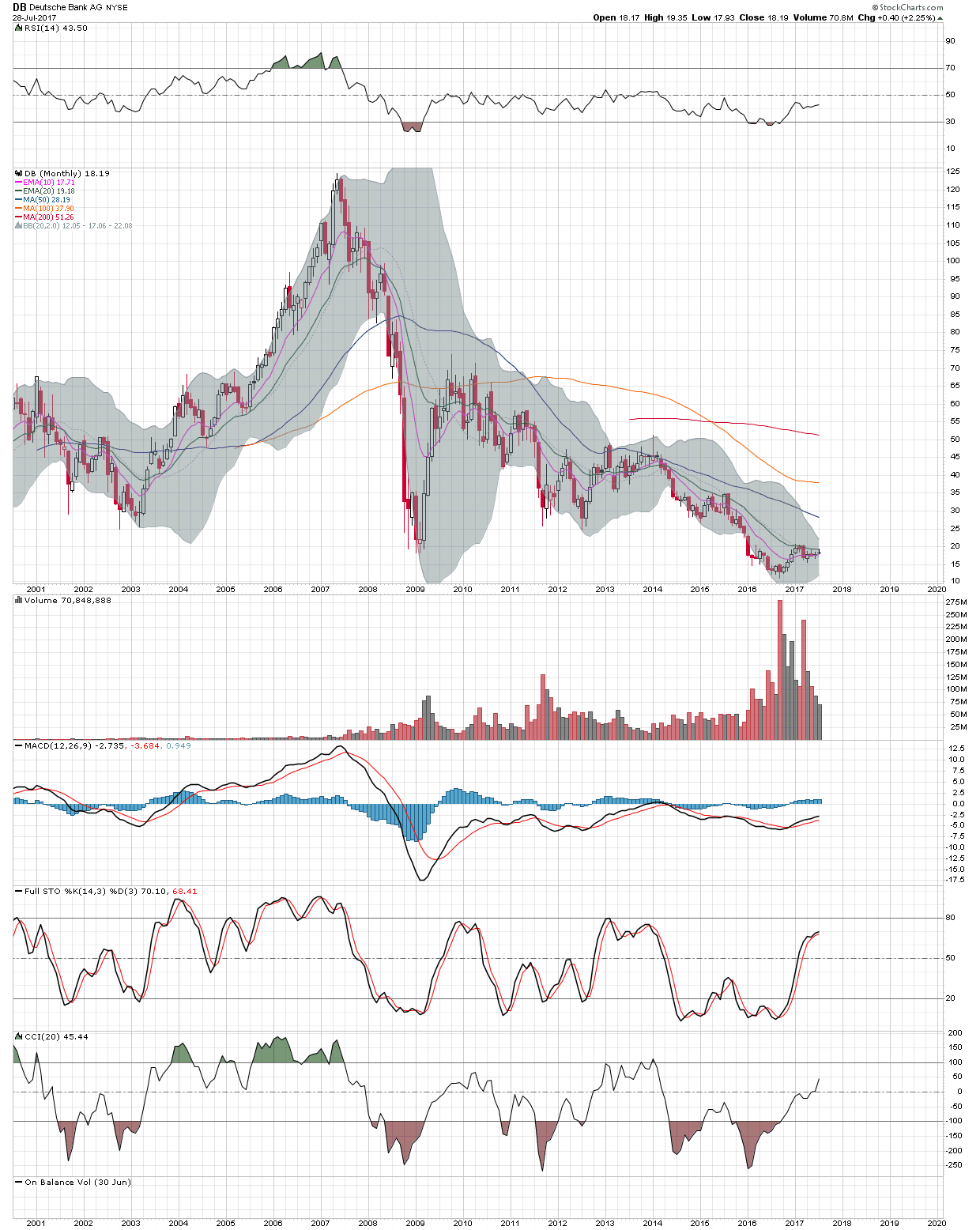
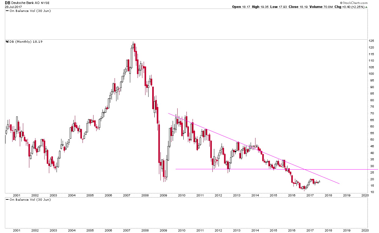
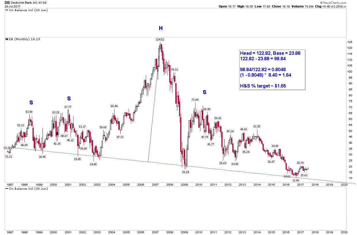
I’ve just assumed the neckline for DB is broken sometime in 2018 and is ~ $8.50. Maybe they can kick the can down the road until 2019, who knows really. Thankfully, DB looks bullish to me for the time being, heading up towards $25-$30.
“No one could have seen this coming…”
Looks like I picked a bad couple of decades to quit sniffing glue.

Have posted this silver fan line chart once before. It may still be of interest. Notice the three back tests to fan line #1 preceded a silver rally.
Ditto for fan line #2. The third fan line now also has 3 back tests – the latest BT sporting a long bullish hammer. This does not guarantee a rally in the price of silver, but then again a rally cannot be discounted…
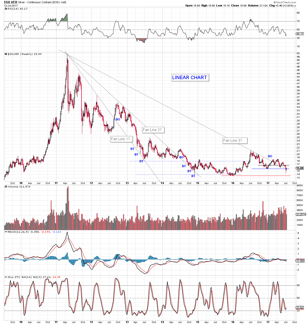
Here is a chart from Tips for Trading with Fan Lines –
https://tradingsim.com/blog/fan-principle/
A haunting thought is a pattern break downside, on HUI for example, that explodes upward when every man and his dog leans on the wrong side of the trade. Shades of January 2016. Fool me once, shame on you. Fool me twice, shame on me. (Is that how the saying goes, Mr. George W. Bush Jr.?)
Well, its a plan, although as the Scottish poet Robbie Burns wrote when his plough blade upturned a mouse’s wee home, “The best-laid schemes o’ nice an’ men Gang aft agley…”
OK, Mr. Market, let’s see what you got.
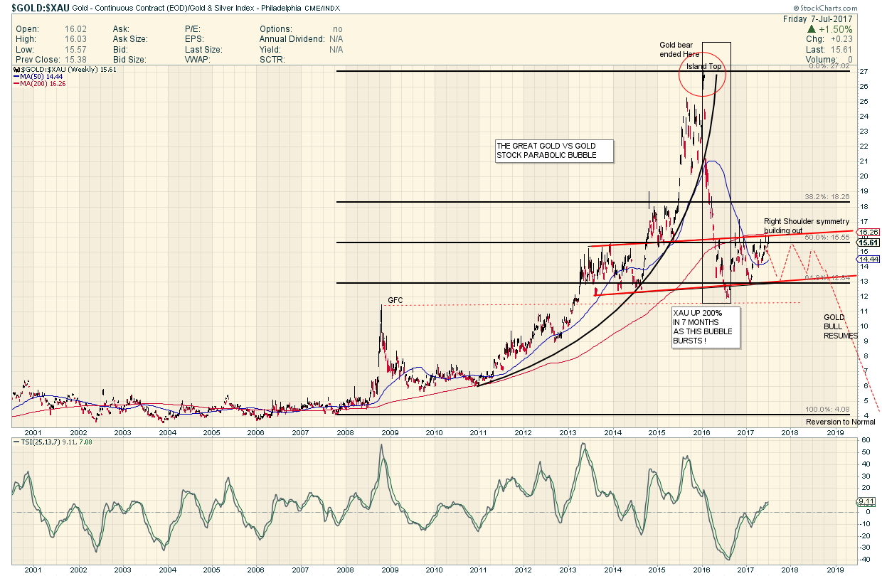
Rambus produced a similar chart back in 2016 when it appeared the Gold bear had ended.
He actually has been following this Gold:XAU ratio long before that as it was obscene but amazing how Gold Stocks
were lagging the Price of Gold all through the Great Gold Bull of the 2000s
He showed us that the Parabola had burst ( as they all must) and had a first bounce target at about 12…which has been the case.
From the Bubble peak in January 2016 to the target in August was the time when the Gold Stocks went Nuckin Futz.
Since then the ratio is building out what will likely be a symmetrical ( in price and time) right shoulder.
If so then we can expect another 12 months of sideways chop in the Gold market…THEN when this chart finishes its business…BAM…to the Moon Alice.
Year ye Hear ye….By the Powers Invested in me…. as Fullgoldcrown , I Hereby Decree…. The Great Bear Market
(2011 to 2015 ) has Ended …Long Live the Bull !
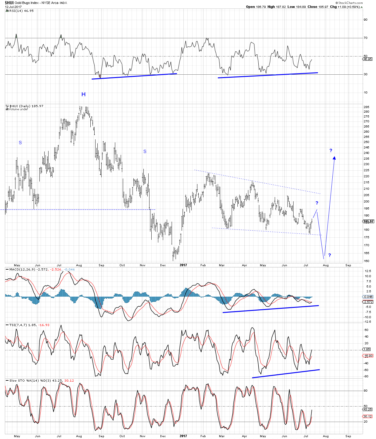
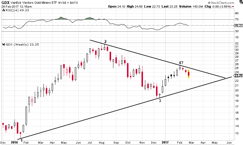
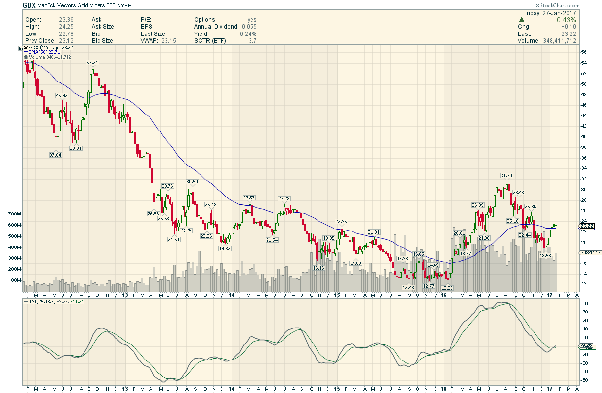
We clearly got a breakout of the major lower trendline this week on the GDX weekly linear chart. The question is: do we believe it? Well, from a chartology perspective we have to assume the breakout is legitimate until we are given a reason not to. But we would be remiss if we did not point out a few bullish indicators that could hint at an around the apex move higher, rather than a large decline to possibly test the January 2016 lows.
As far as GDX goes, the May low held this week but gold miner sentiment as measured by the $BPGDM is now much lower than it was in May. Patience with the miners has run thin and there may not be enough sellers left to push prices down much further.
Also, while GDX did break out of the triangle, it didn’t give us the big move many of us were looking for as of yet. In fact, the weekly Bollinger bands continued to narrow.
gold site…
This is absolute bullshit.
Could have made tons of $$$ in the general market – instead bleeding myself dry in this endless crap.
No relief in sight. Charts schmarts. So far, all the bull baloney has been a bunch of hooey, other than that big run-up from Jan 16 – August 16. Then we gave most of that back. Bull market? Bullshit market. The fact is, the opportunity costs alone are enough to make a grown man cry. Factor in the steady drip-drip-drip of losses, and it’s a crying jag.
Spock’s rocks, many could be bought now for less than January 2016.
Another comment from another gold site: “where is the money going to come from to drive gold prices and gold stock prices (heck, I’ll throw in silver along with that) UP.” No stinking millenial’s have the $$$ NOR the interest/understanding to start buying this crap. And our kind, mainly the boomers and those right behind, have already blown our wad. Wall Street is busy making fortunes while the sun shines…and it has indeed been shining for those invested in the general market.
And come on now, folks. How much of a hit do we have to take before realizing the light at the end of the tunnel is not just a train, it has already run over us.
Hope is not a strategy. It is the pit of death.
From Spock’s Website. Some interesting Facts.I am Posting… without the Matrix Portfolio… of course.
“Below is the SpockM portfolio, based on Fridays close, end of April. Points to note:
1. 30 rocks, none included in the VanEck ETFs (GDX and GDXJ)
2. SpockM rocks are mostly explorers and early stage developers
3. SpockM portfolio up 284% since January 2016 (GDX: up 69%, GDXJ: up 88%, over same time period)
4. Over last 2 weeks, SpockM portfolio is up 2%, GDXJ is down 10%
The figures speak for themselves.
Note: If you happen to own a PM stock, and VanEck is on the register for more than 5% equity in the company, then seriously consider selling the stock, or shorting it as a hedge. Find something else outside their influence. VanEck are a wealth hazard in this sector.
Spock
Completing Odd Job’s Post:
Where we postulated some old Charts comparing the beginning of THIS Bull Phase with the beginning of the 2001 Bull
2001 Bull : Behold 4 Impressive Impulse Moves followed by deep and long Consolidations ( to digest them)
2016 Bull…That was a huge and rapid Start to the Baby Bull..Now the Indigestion Period .
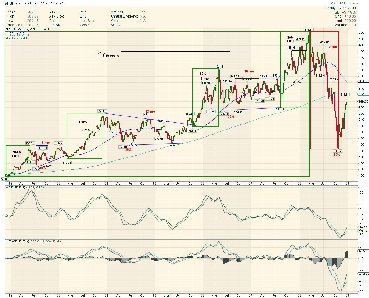
We can now compare the First Leg Up in 2001
(160% and 6 Months) and Consolidation (40% max drop and 9 months)
With the present First Leg Up in 2016
(186% and 7 months) and Consolidation ( 44% max drop and 10 months (speculated) ) This could be longer .
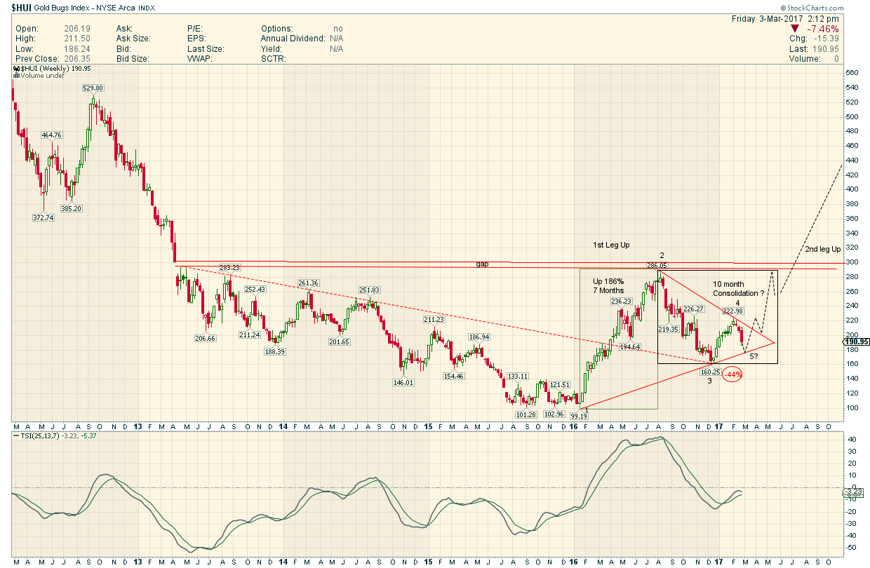
If you are a Bull and believe we started a new Bull Market in January 2016 …But you have become unnerved and doubtful due to this seemingly outsized and harsh consolidation…study this Chart of the inner mechanics of the Amazing 2001 to 2008 Bull Market…! Then have a Great weekend
Thanks a ton Odd Job for revisiting this important concept.
This chart is perhaps a little bit premature but…
…I have a feeling that whichever way this triangle resolves may determine if the big move up since January 2016 was the start of a new bull market or just a big bear market rally. I’m looking to buy some around $21 in mid-late March in the hopes that it will test that bottom rail and then take off like a bat out of Hades when it breaks out of the top rail. I know, gold bugs and their wishful thinking.
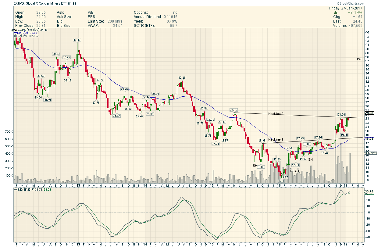
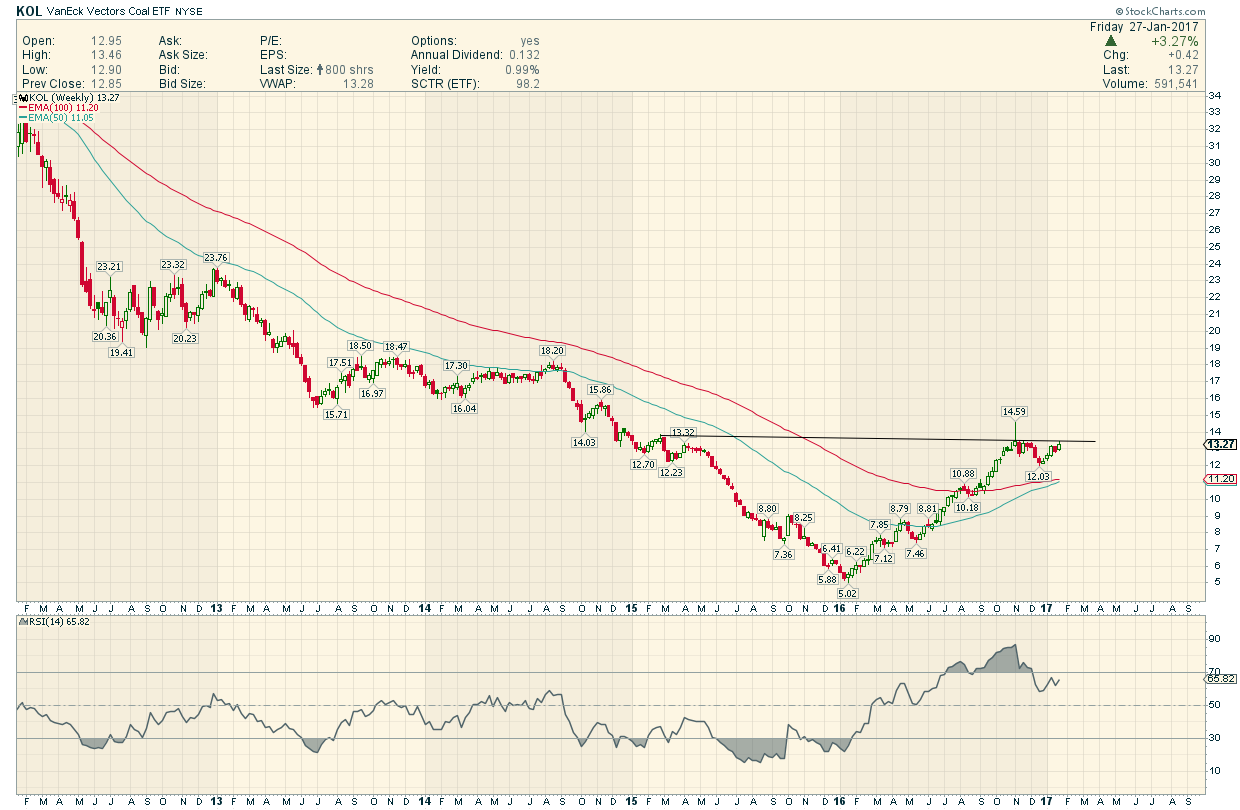
Notice a THEME here ?
EVERYTHING Real Started a V Bottom move in January 2016 ( When Trump was just a Joke)) , and has generally moved UP without a Correction .
for a year now ( Can you spot THE Notable Exception ?)
This is really something ! These Charts are showing Gorgeous Breakouts and near breakouts. How do we explain this Epic Move afoot in real stuff which all started with an epic bottom and all at the SAME Moment !?
Jus scroll down and look at the bottoms ..all exactly the same time !!
And how do we explain the present disconnect in said notable exception ?

All these charts Inspired by Rambus Work. (Nobody that I have seen else has spotted this)…and I ask How Come ?
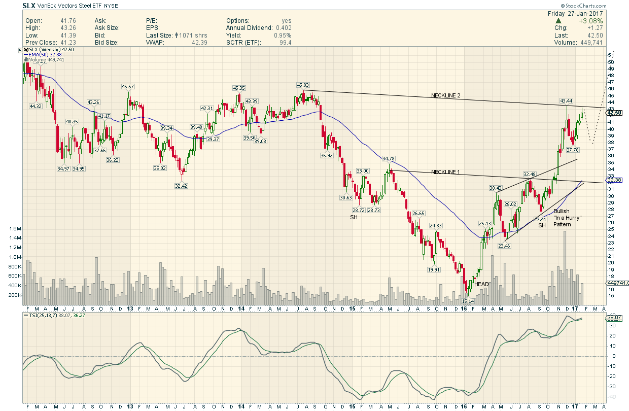
Steel Stocks
Copper Stocks
Coal Stocks
Lithium Stocks(Batteries)
Uranium Stocks
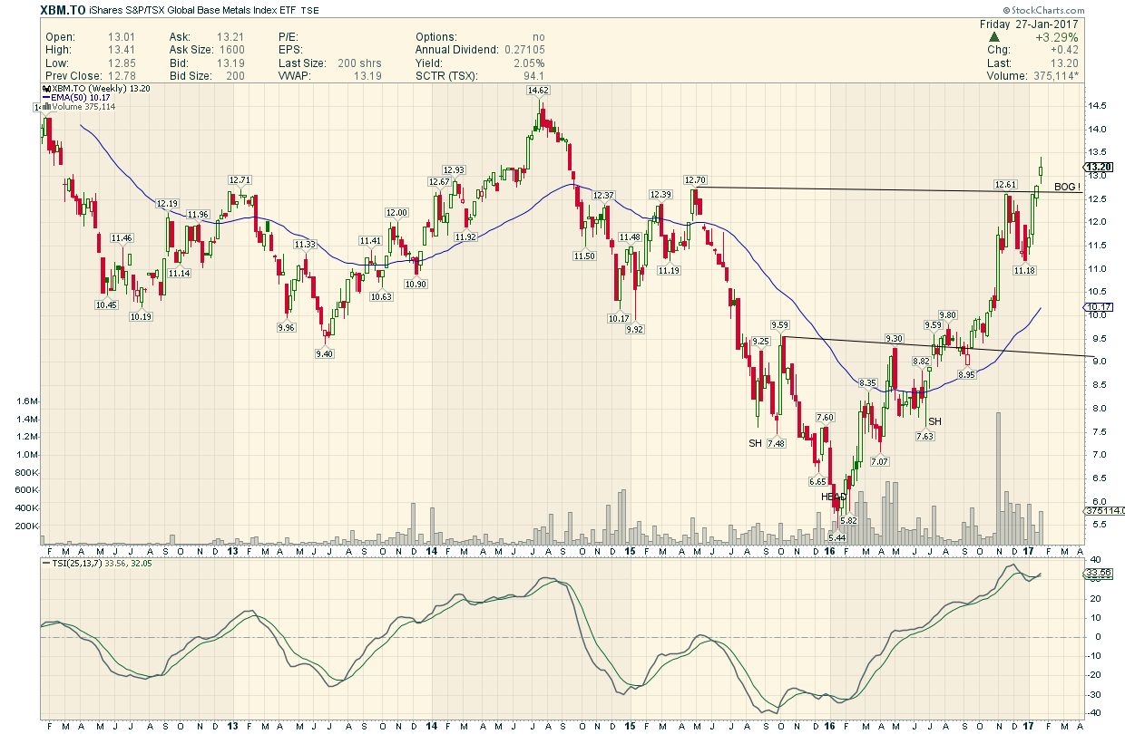
Base Metals Stocks
Pulp and Paper Stocks
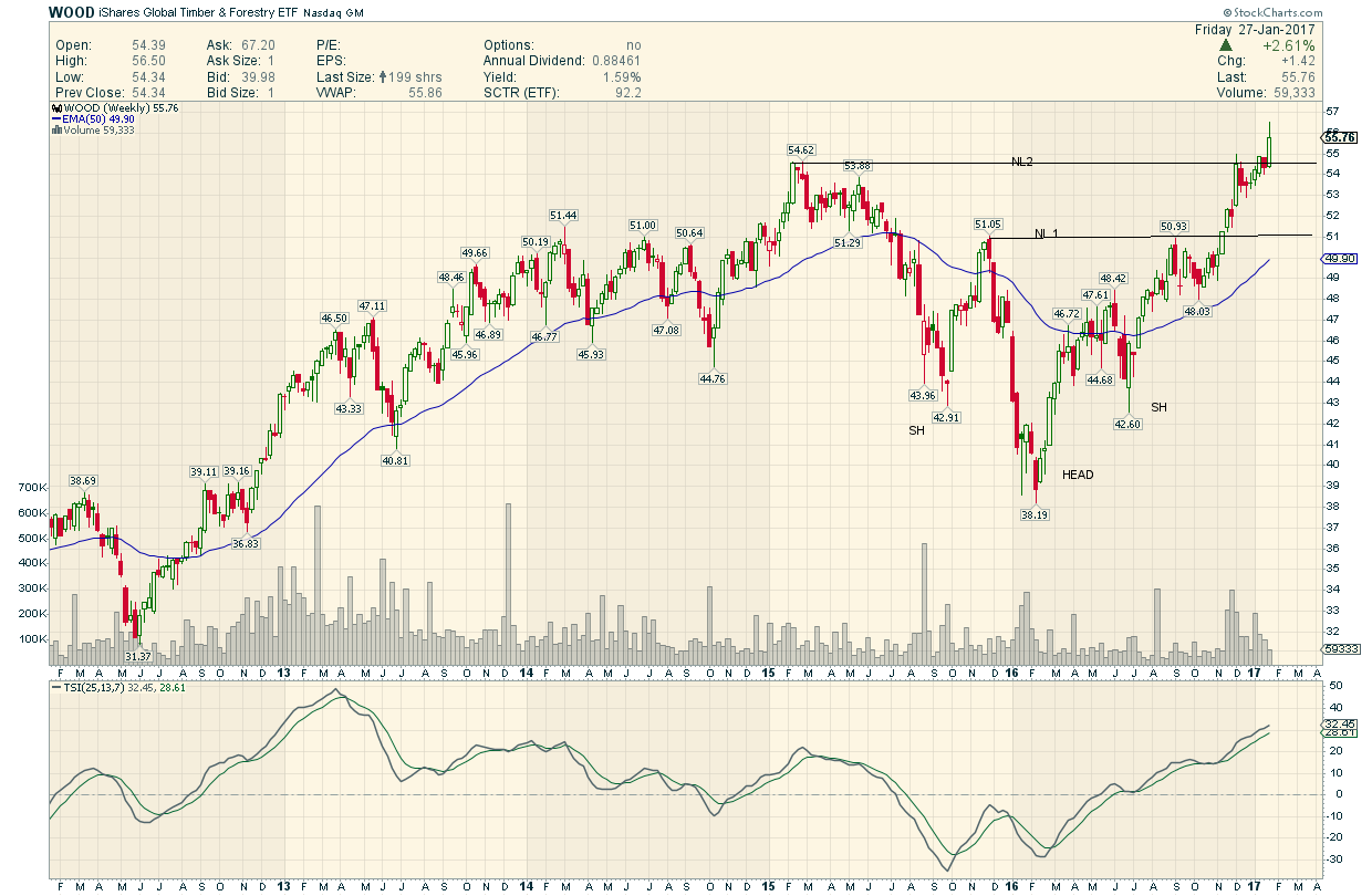
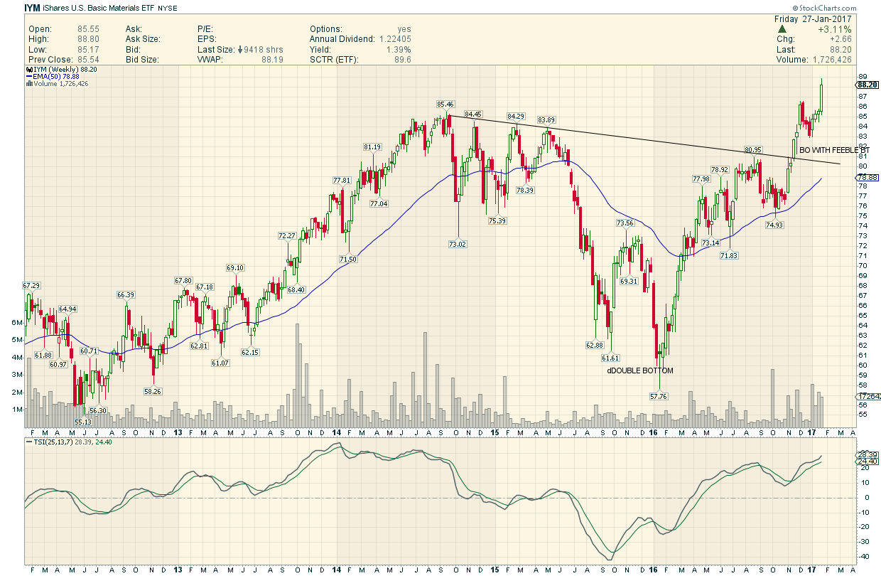
BASIC MATERIALS
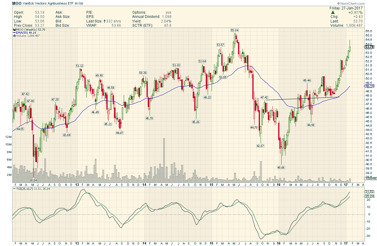
AGRICULTURE STOCKS
Energy Stocks

Concrete
Commodity Index
Gold Stocks
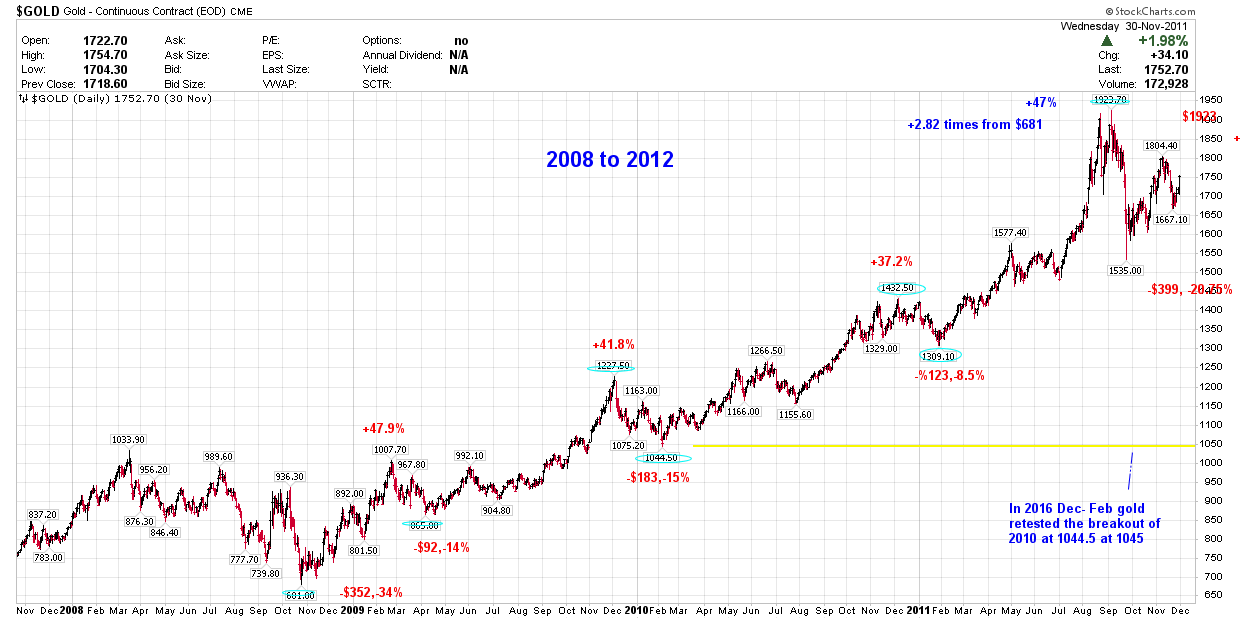
Looking back in January 2016 gold tested the breakout of 2010 at 1044.5.
So that must be bottom and gold nay resume its bull trend???? to new high???